ISAC 20.6
ISAC Features
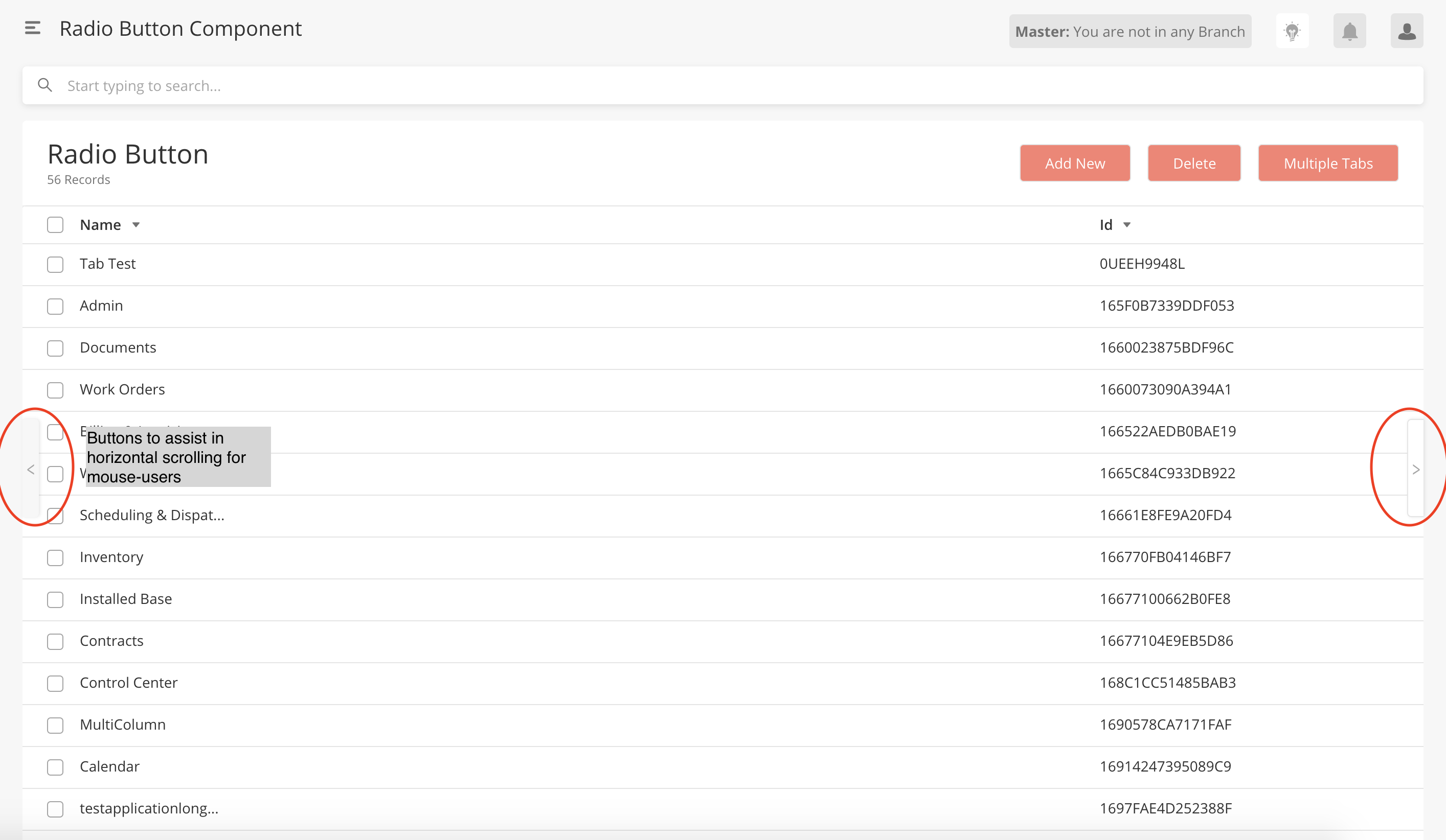
Assisted Horizontal Scrolling on Data Grids
Horizontal Scroll buttons on wide data grids on main pages are introduced to help who are mouse-users or on Windows OS to view data easily. Users can now quickly and simply the data instead of scrolling to the end of the data grid to view the horizontal scroll bar.
When a data grid is wide (i.e. user needs to scroll view all columns) and the number of records in the data grid is bigger than a page, the Horizontal Scroll buttons are displayed.
User can click on the right or left horizontal scroll buttons to navigate within the data grid
This feature is only available on main pages
During Solutioning, refrain from building main pages that have many columns. Information Architecture must be optimized to show all crucial information within one screen without the need for scrolling.
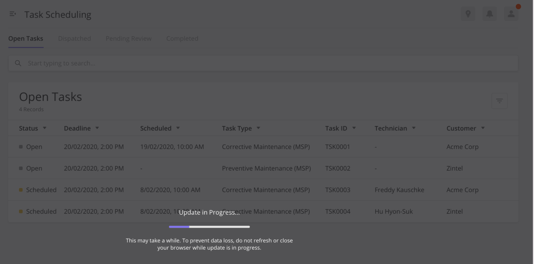
Automatic Platform Upgrade (BETA)
The ISAC platform is now automatically upgraded when there are new updates. Previously users must clear the cache before each release to enable the platform updates to load.
The automatic update is triggered when a user:
Logs into the application.
Moves from one web app to another.
Refreshes the browser
A splash screen is shown with a progress bar when the update is in progress. Once the update is completed, the browser refreshes to complete the update. If multiple tabs from the same hosts are open, all the tabs will refresh once the update is complete to make sure that the user has the latest version in all the tabs.
Prior to this release, the Service Worker updates were queued in the user’s browser settings which may cause users to not receive the latest platform updates and the full frontend functionality. To ensure that users had the latest release, users had to regularly clear their cache with every ISAC deployment.
Automatic platform updates are now possible by implementing automatic Service Worker updates. A Service Worker is a script that the web browsers execute in the background that enables deep platform integration, like rich caching, push notifications, and background sync. From this release onwards, users can now get automatic platform updates without manually clearing their browser cache as the ISAC frontend build now triggers the automatic Service Worker update.
For more information on this implementation of platform updates through Service Workers: Debugging Service Workers
Users must clear the cache one last time before seeing the actual changes.
There is a slight lag while updating the new ServiceWorker which will be enhanced in the future)
This feature is still in BETA
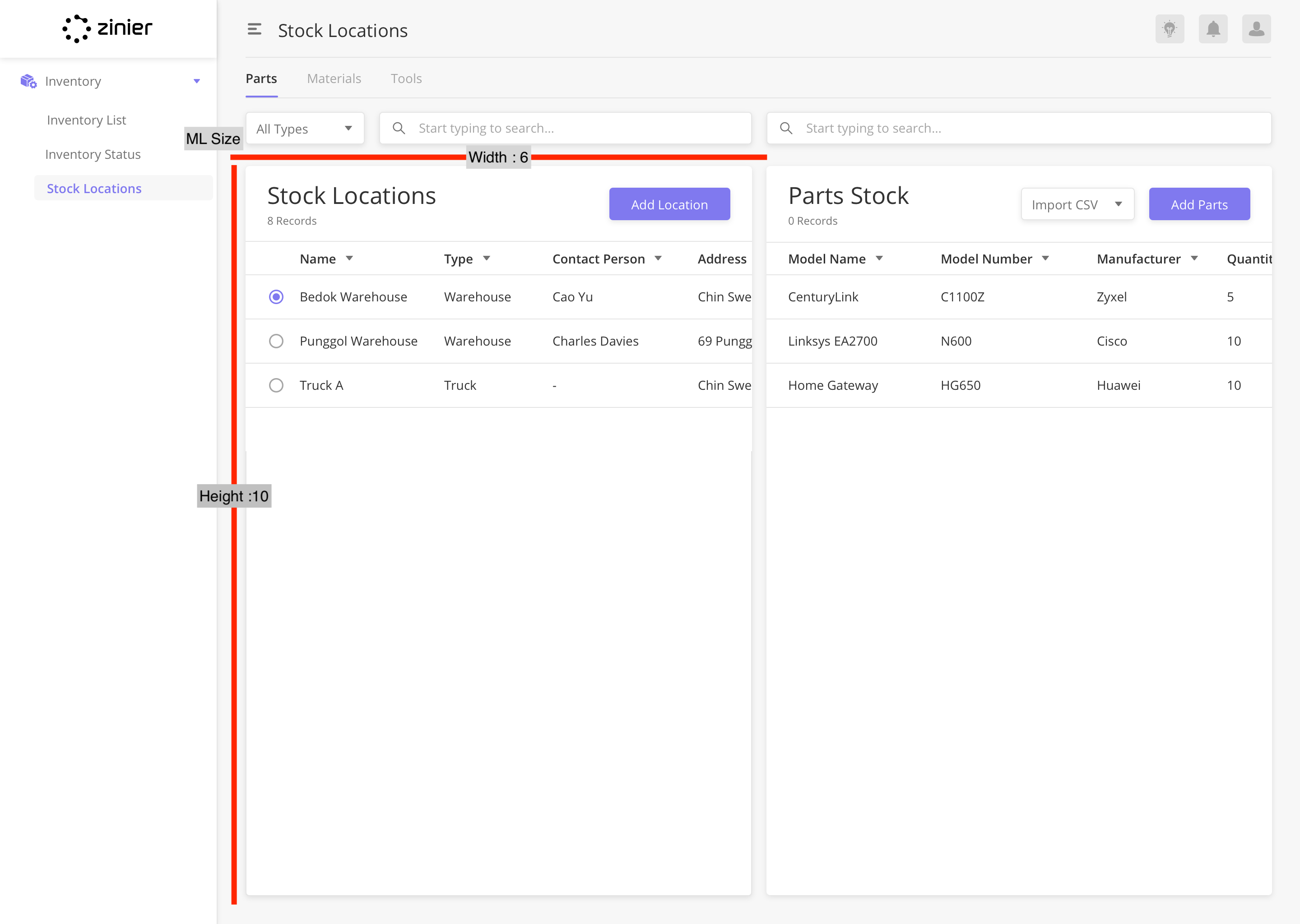
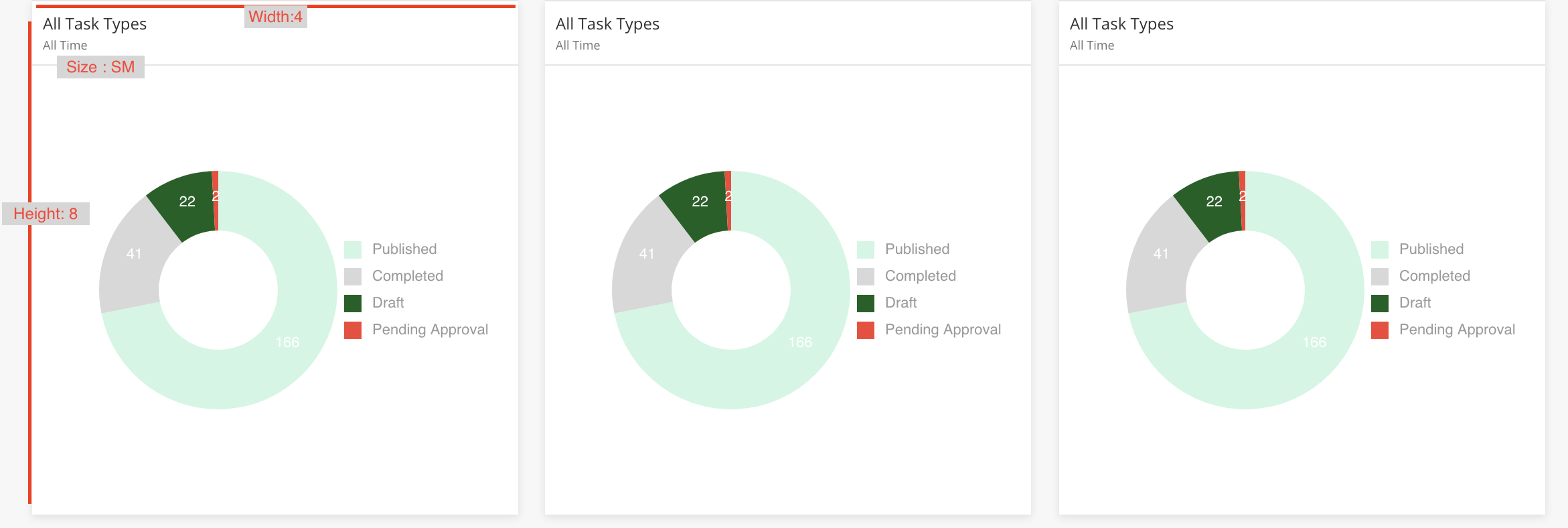
Multi-Column Layout 2.0 Enhancements
Multi-Column Layout 2.0 is a layout of multiple components within the main page where a multi-column layout consists of made up of two components or more. Multi-Column layout pages require interaction between each component on the page where the size of each component within the pages must be configured.
Enhancements include:
‘ML’ size to accommodate designs for the Inventory page where width is 6, height is 10. This sizing is ideal for a layout with two data grids place side by side by side.
SM size to accommodate designs for MCL page with two widgets on top of a data grid. SM sizes follow a Width:8, Height: 4 and is ideal for a layout with three chart widgets on top of a datagrid.
Support for platform action on selection in data grids in MCL2. SA can call platform action like refreshDatagrid on the selection of a row in a datagrid within MCL 2.0. For example, FSE can configure the datagrid to refresh on a selection (radio or checkbox)
Margin fixes on MCL 2.0
Padding fixes on MCL 2.0
Subtitle support for Widgets in MCL2.0
Decision Action Type
Actions are things that happen in the frontend as defined by the Solution Admin in the page definition. For example, A SA can configure custom actions within the actions array in the page def and call actions in sequence during actionOnLoad or actionOnClick
In this release, a new action type, decision, has been added. Decision actions have a trueStep and falseStep. Based on the parameters and logic built by the Solution Admin, only the consequential action is performed.
ifTrueStep: "action.A"
ifFalseStep: "action.B"
Example
{
  "name": "decision1",
  "type": "decision",
  "actionDef": "function(pageContext){if(condi){return false;}return true;}",
  "trueStep": [
    "@actions.onSubmit",
    "@actions.setConfigValueNull",
    "@actions.setConfigValueNull2",
    "@actions.deleteData"
  ],
  "falseStep": [
    "@actions.setConfigValueNull2",
    "@actions.refreshDataGrid1"
  ]
}
Implementation Details : https://zinier.atlassian.net/browse/ZPW-416
View Selected Rows
In this release, rowstoselect to be populated PageContext data is now supported to enable users to see the desired selected rows on loading the side panel.
Currently, we are only allowing `rowstoselect` to be populated by query or API.
Implementation Details : https://zinier.atlassian.net/browse/ZPW-525
Dynamic Filters: List Filter (BETA)
A new filter type, List Filter, which can be applied to data grids and widgets are now supported.
With this filter type, users can now see the available options within the column and select the values they want to include or exclude in the filter.
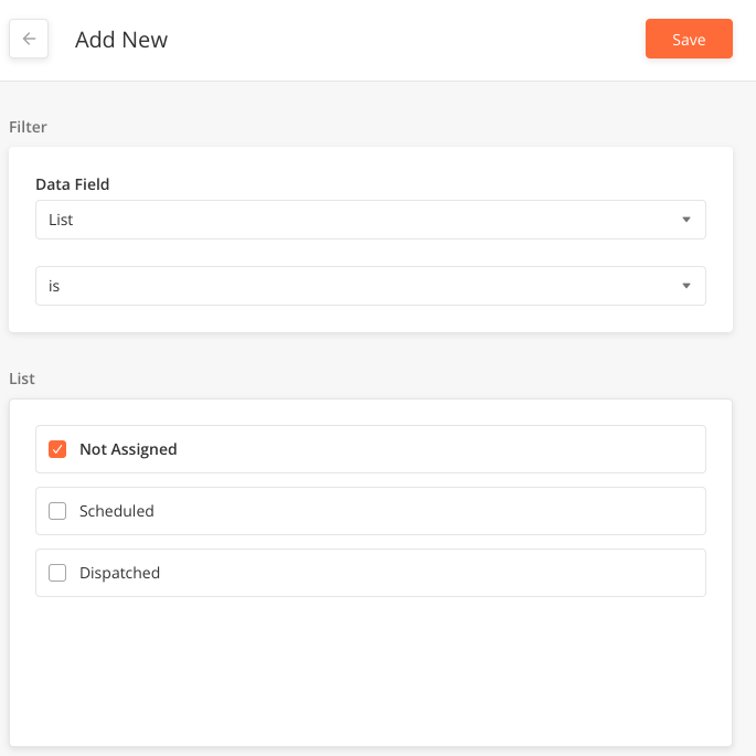
Solution Admins can configure list filter by:
Adding a model to be filtered in page definition
CODE"modelToBeFiltered": "ZPriority",Mapping table header id to
listfiltertype underdynamic filterobjectCODE"dynamicFilter": { "priorityName": "listFilter0", "mainstatus": "string", "workorderPlannedDate": "Date", "workOrderTypeName": "string"
Implementation details: Dynamic List filter cases
This feature is still in BETA
List filters can only work with Data Grids populated by query/read and not workflows
Administer Mobile Workflows on Tablets
Mobile Workflows can now be rendered on tablets which enable users to do the same work in both mobiles and tablets.
With the introduction of the entity config, hybridWorkflowEnabled, you now have the option to execute mobile workflows on both mobile and tablets. When this entity config is set enabled (set to true), the platform fetches both the Mobile and Tablet projects when a user logs in from a tablet.
Entity Config Details
What | Description |
|---|---|
Config Key | hybridWorkflowEnabled Note: This key is void for a mobile user, as a mobile user is always be shown mobile projects. |
Config Scope | mobile |
Value Type | Boolean |
Config Value | This value determines if mobile workflows are executed for both mobile and tablets.
|
Encrypted | No |
Implementation details - Render Mobile Workflows on Tablet
For existing orgs, this config must be added and set as true
From the next release, this config will be automatic
Define the Default Send-From Email Address
Org Admins/Solution Admins can now define the email address that send dynamic notifications to end-users.
Previously, the send-from email address cannot be changed and set as ‘no-reply@zinier.com. With a new entity config, smtpSetting, Solution Admins can now change this email address.
Config Details
What | Description |
|---|---|
Config Key |
|
Config Scope | |
Value Type | json |
Config Value |
CODE
|
Encrypted | No |
Implementation details - Custom SMTP Support
Solution Admins should make the necessary updates to notification object and notify nodes for config changes to be reflected
Components
This section contains a list of new and updated components.
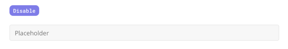
Read-Only Component
A new read-only state for side panel components that gives better UX compared to the ‘disabled' state. This state is for fields that only needs to be read by the user and can be configured in page definition.
Solution Admins can configure the read-only state in the component definition. To add a read-only component, add ‘readOnly’: true in the json def. It can also be fetched from jslib.
readOnly is supported in these components:
Input Component (text, integer)
Long Text Component (Description)
Address Component
DateTime Component
Time Component
Static Dropdown
Searchable Dropdown + Advanced Search Component
Radio Button Component
A read-only state is different from a disabled state
Read Only for Input Component | Disabled for Input Component |
|---|---|
 |  |
Technician Schedule Component Enhancements - FSE Support
To support FSE 2.3 Release, the Technician Schedule Component has been enhanced with the following:
Solution Admins can now configure an icon beside the technician’s name based on a specified parameter.
UI Fixes
Font family is now consistent with the platform (Open Sans)
Padding after wifi icon beside technician name
Height of the task card now matches the design
SA can choose to turn on the drag and drop functionality.
This component is going through iterations. WIP Documentation - Scheduler (WIP)
Dynamic Pop-ups
Solution Admins can now configure different pop-ups based on different conditions.
For example in FSE, when users click Deactivate, a script is executed to identify if the record (Work Order, task, customer, or technician) can be deleted.
If the record can be deactivated, users see a pop-up where they can choose to deactivate or cancel.

If the record cannot be deactivated, users see a pop-up that displays the reason why it cannot be deactivated.
Solution Admins can now configure:
Pop-up title by static value, Jslib or page context data
Pop-up message by static value, Jslib or page context data such as “Deactivating @workorderID will cause the workflow to fail”
Button text by a static value
Show/hide messages based on user-defined conditions
Show/hide of buttons based on conditions
Pop-up type: 2 buttons or 1 button based on conditions
For more information: Dynamic Pop-ups
Widgets Improvements
Auto Refresh in Widgets (BETA)
Individual widgets can now be refreshed every 30 seconds.
To enable this, Solution Admin must add an autoRefresh key in the widget. 30 seconds is not configurable. It is now controlled by the platform
autoRefresh=true
When users are on a specific page/module with widgets that have autoRefresh turned on, the refresh read calls loads the latest data
When the user is away from the widgets/page, read calls are not triggered
autoRefresh=false
No read refresh is happening on the widgets.
When the widget does not have the autoRefresh key added, the default value of the autoRefresh is false.
This functionality is only applicable for Dashboard pages. MCL1 and MCL 2 is not part of this feature implementation at this time. This would be implemented in future sprints.
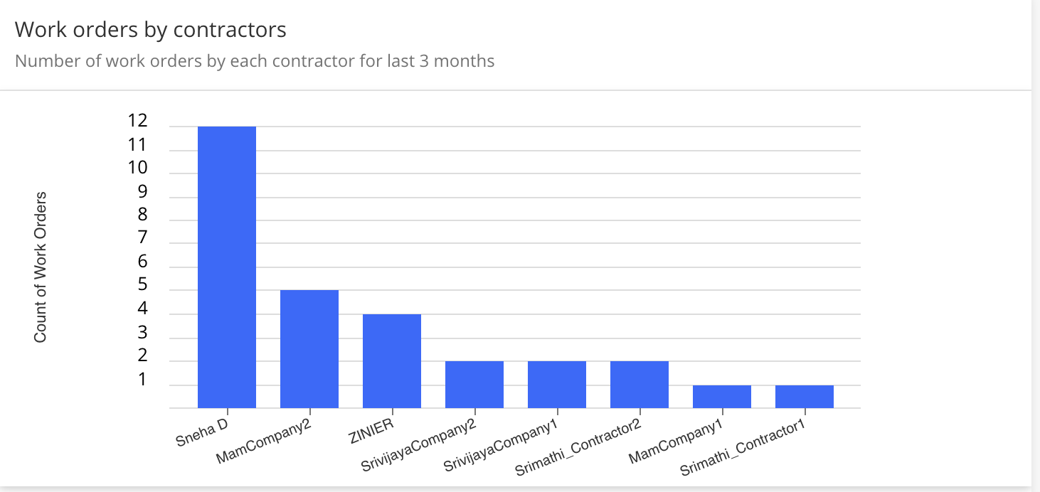
Advanced Settings for Chart Widgets
With a new "advancedSettings" key in the widget definition, Solution Admins can now do advanced UI configuration for all Chart Widgets (Bar Charts, Line Charts, Heatmap, etc) which is supported by the library (nivo.rocks) used in Zinier.
Common use cases
Configure spacing between bars in the bar chart
Configure how the legend looks like
Configure padding in the widget
Configure layouts within the widget'
Configure how the axis looks like within widget
For example, in this Bar Chart, we have rotated the axis label so that the labels do not overlap.
Example of Bar Chart
"advancedSettings": {
    "theme":{
      "axis": {
        "ticks": {
          "text": {
            "fontSize": 10
          }
        }
      }
    },
    "axisBottom": {
        "tickRotation": -22
    }
}
More examples of how to use Advanced Settings can be found here - Advanced Settings
As Advanced Settings is a flexible functionality, please make sure to test any implementation of this functionality thoroughly.
Bug fixes
[ZPW-236] - Strings before login screen not localized
[ZPW-390] - Cross Site Scripting Vulnerability in Org Config -> Entity Config.
[ZPW-392] - Cross Site Scripting Vulnerability in Org Config -> Notification Type.
[ZPW-393] - Cross Site Scripting Vulnerability in Org Config -> External System -> Add New.
[ZPW-394] - Cross Site Scripting Vulnerability in Org Config -> Translations -> Add New form -> Title & Translations field.
[ZPW-396] - Cross Site Script injection in "Work Order Types", script execution can be viewable in "Active Work Orders page."
[ZPW-412] - Design Bug : Advanced Search UI bugs
[ZPW-420] - [SQLi Attack] - Email field in /forgot-password link is open for SQLi attack.
[ZPW-437] - UX & Security Concern - Don't keep "Remember Me" check box selected by default.
[ZPW-452] - Datetime component should have the option to return local time
[ZPW-461] - When the user is on the side panel which might have the nested grids, opening the Add / Edit on this panel is closing the entire parent panel and then opening the nested side panel grid
[ZPW-464] - Any non-privileged user [Mobile User, Project User, Project Admin] can access users, groups & Query Console through direct link post login.
[ZPW-486] - Static data Grid - datagrid search-case sensitive
[ZPW-488] - Navigating from nested side panel to parent side panel is not retaining data on the pageContextStack. Issue is caused because of the development done on the lazy loading of the page
[ZPW-490] - Use the correct bucket region while creating the S3 service interface object
[ZPW-517] - nestedpanel to panel pagecontext not accessible
[ZPW-537] - Localization: String update for Request Log and AI ML
[ZPW-546] - Side Panel's action Icon not aligned on scroll
[ZPW-556] - Performance Issue: With the latest changes on Raman, Opening any side panel is taking 3 seconds to trigger the read call. And takes at least 2 to 3 seconds to load the data on the side panel.
[ZPW-557] - Inputs object for Grid is null when we have value in pagecontext
[ZPW-562] - searchable dropdown advanced search grid pgctx not getting added
[ZPW-570] - Success message displayed with the actions from new user module is sticky though the user is changing web apps/web modules
[ZPW-572] - Models - Add Field side panel - User click on back arrow add new side panel pop-upis showing button text as undefined instead of "Yes, Continue"
[ZPS-187] - Sandbox: When a user is clicking on the RESET action, RESET is giving the status as FAILED all the time.
[ZPS-191] - “getZendeskPayload” Api failing
[ZPS-226] - Solution Bundle: Model Index and model index fields are not created as part of bundle creation
[ZPS-235] - [SQLi Attack] - Email field in /forgot-password link is open for SQLi attack.
[ZPS-244] - Models: JsonText and JsonArray field has limitations of Varchar(255)
[ZPS-253] - Sandbox: Need Proper ErrorCode to handle the logging out & redirecting to the login page For Archived sandbox user as the current errorCode-SYS2001 is not suitable for loggingOut the User
[ZPS-271] - Sandbox: In the SandboxOrg, Physical tables columns are getting altered after Refresh action for the newly created modelFields from the SandboxOrg
[ZPS-283] - Need to check the regex validation issue - Facing these at the time of sandBox reset.
[ZPS-295] - On the Sync Buffer Logs, if the Retry All option is failing to successfully process the record, attempting to Retry again is failing with Record version is invalid error
[ZPS-296] - Web App modules are auto sorted on the FSE web apps with the getWebAppModules calls.
[ZPS-305] - /user/forgotPassword is open for SQLi attack.