Dropdown
The dropdown component allows mobile users to select a single value from the list of options. It works similarly to the single select component.
The best practice is to use the Single Select component when there are only a few options available for the user to choose from as it requires only one click to choose an answer. If you have more than 3 answer choices, use the Dropdown component as it takes up less vertical space.
Configuration
To configure the component, drag it from the Component List to the Mobile Canvas to add it to your page. Next, open the Configuration Panel by either double-clicking the component or selecting it and clicking the “Edit” button that appears upon selection. The section below explains the configuration settings associated with the component.
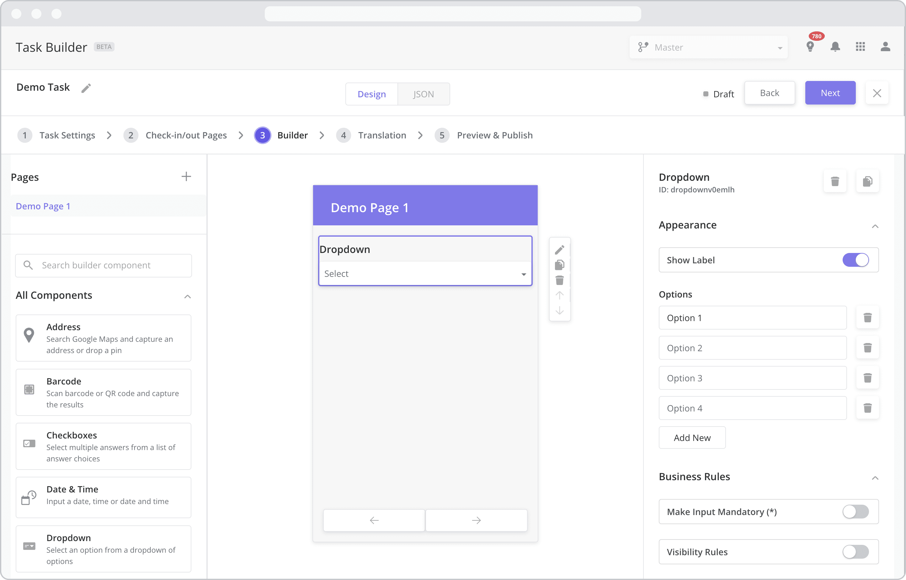
Appearance
Show Label: Enable this toggle to show a label above the component. Disabling the toggle will remove the label. In the example above, the label is enabled and written as “Dropdown”. To edit a label, simply double-click the label from the Mobile Canvas to bring up the in-line text editor.
Options: Enter the answer choices in the order they should appear in the dropdown menu.
Adding Additional Options: To add additional answer choices, click the “Add New” button at the bottom of the Options section.
Deleting Options: To delete an answer choice click the “Delete” button next to the answer choice.
Business Rules
Make Input Mandatory(*): Enable this toggle if you wish to make it mandatory for mobile users to fill in this field before navigating to the next page of the task.
Visibility Rules: Enable this toggle to set up Visibility Rules which allow you to show or hide a component based on inputs captured from a component elsewhere in the task.