Forms & Checklists
Streamline your work day by capturing, enhancing, and managing the data connected to each task.
Robust Data Capture Capabilities
The Zinier platform helps you capture any and all data from the field as part of a task. All of the basic data capture components exist including checklists, text input, comment boxes, drop-downs, photos, videos, and more.
Text Input Allows users to capture text within a Mobile Page. Text Inputs can be one of 3 types: Text Input, Number Input, Password Input | 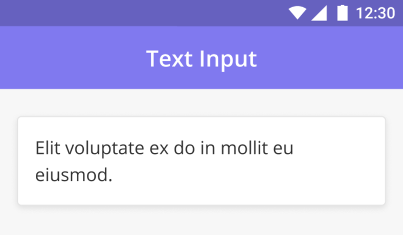 |
View Text Text Component is a read-only field that contains the text. For example, the Titles and Headers for all pages make use of this component. The text can have different alignments - Left, Right, Center, and Justified. The Header and Paragraph Text components support Tap to Call / Email / Go to URL. Through this feature, numbers, email addresses, and URLs are highlighted. Tapping on these highlighted fields redirects a user to the phone's native phone calling, email application, or browser, respectively. | 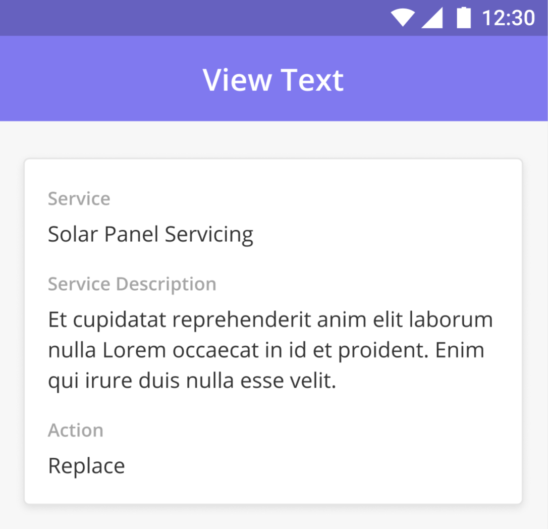 |
Absolute Date and Time Input Absolute date and time components are useful when you want to show the same date or time at any timezone. Apart from this feature it works and looks the same as the input date or input time component. It is helpful when a few team members are in different timezone(s) but want to see the exact time or date | 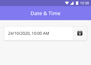 |
Date and Time Input This component captures the date and time. Tapping on it brings up a calendar and a clock popup. It would display both the date and time in the input field. The time specified in the component configuration must be in the UTC Time zone. The time displayed to the user will be in the corresponding timezone and locale of the user's device. | 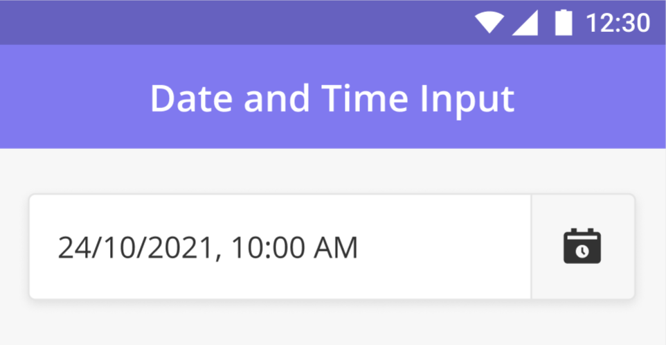 |
Time Input This component captures time only (without date). When a user clicks on this component, it displays a clock where the user can enter a time and specify if it’s AM / PM. The time specified in the component configuration must be in the UTC Time zone. The time displayed to the user will be in the corresponding timezone and locale of the user's device. | 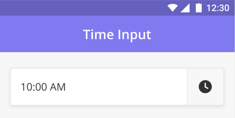 |
Date Input When a user clicks on this component, it displays a calendar where the user can select a date. When you only want to capture the date, use this component | |
Buttons The button is a clickable component that enables a user to perform an action such as submitting a task or navigating from the current page to the next. |  |
Jumbotron The Jumbotron component is a combination of Icon and Text that acts as a header that helps users quickly understand a page's context. | 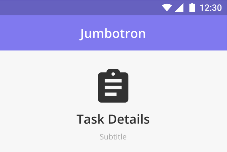 |
Card Component The card is a configurable component that is designed to show information about a subtask or otherwise with different levels of details. | 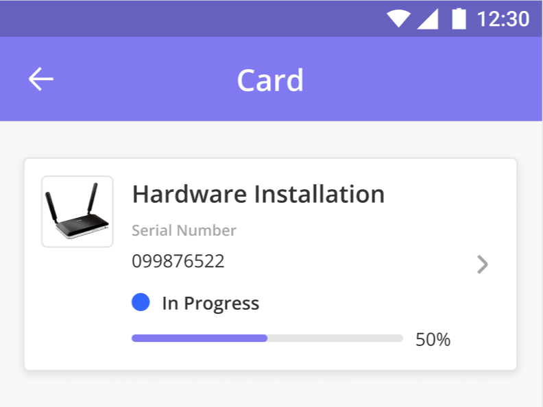 |
Collapsible Content Box The Collapsible Content Box enables long chunks of text to be 'hidden away' unless the user presses the downward-facing arrow. Any and all components can be added to the Collapsible Content Box. | 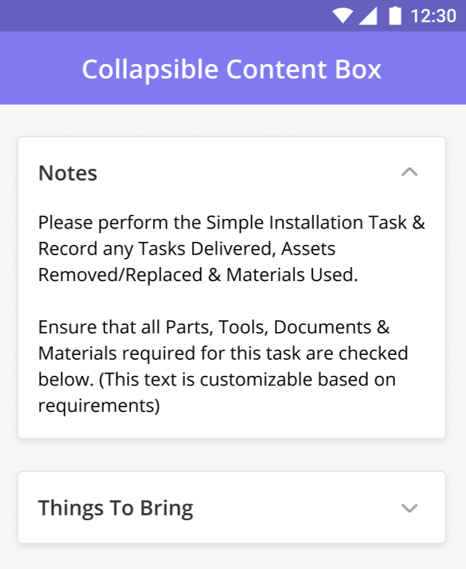 |
Divider The Divider component acts as a partition between different sections of a mobile page. It appears on the screen like a horizontal line. | 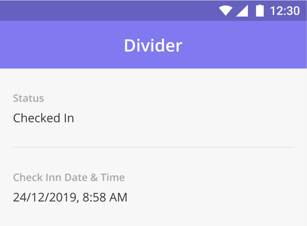 |
Data Grid Data Grid allows data to be added to or displayed in a table. For Example, when a Spare Part needs to be added to a task, the Technician can do so by selecting the type of part and entering the quantity required. This will then be added to a Table as seen in the image. | 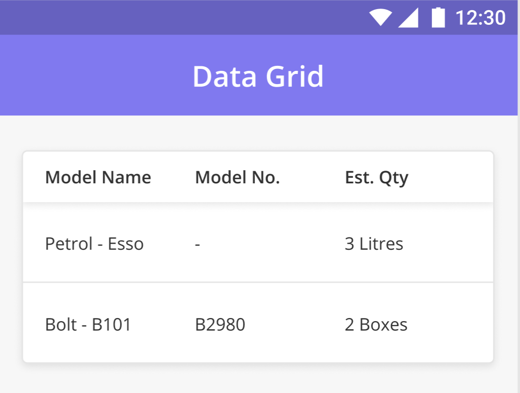 |
Data Grid Color Indicators NEW (23.4) You can also configure the text color of a field, color indicators for statuses, and color tags that give the text in a particular cell a background color. These formatting capabilities allow you to highlight important data visually so technicians have an easier time focusing on what's important. | 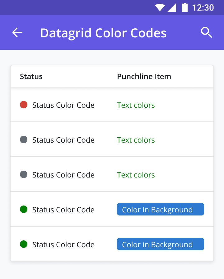 |
Dropdown Dropdown Component allows mobile users to select a value from the list of options on a mobile page. | 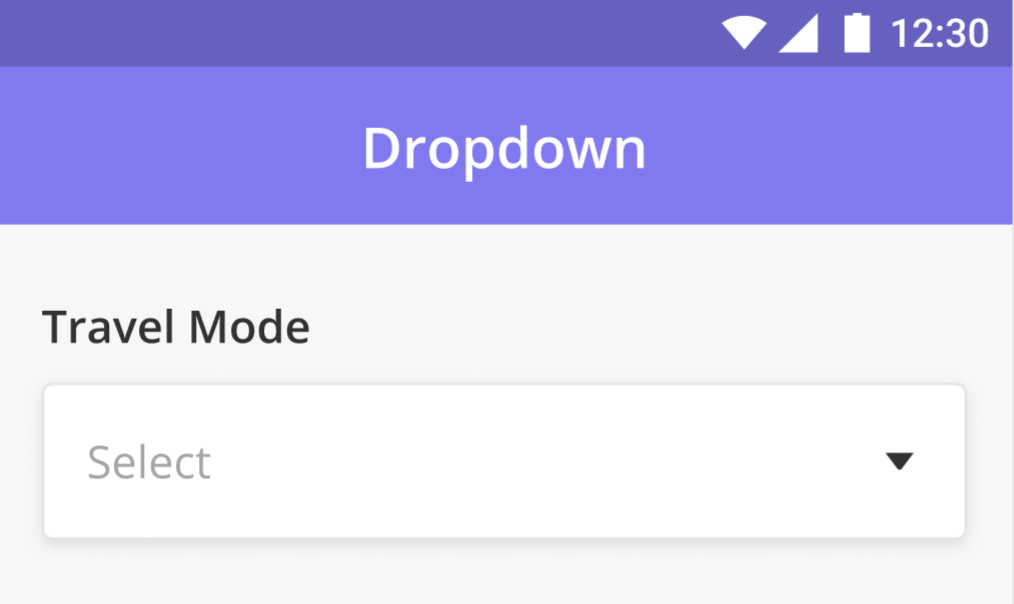 |
Radio (Single Select) The Single Select Radio Buttons allow users to select only a single option from a list of options. It is good to use it when there are only a few options available for the user to choose from. NEW (23.9) Color Coded Selection: Radio buttons can also be configured to assign a color code to each answer option using the color selector (or entering a HEX code). Tying a color code to an answer choice can sometimes make it easier/faster for technicians to make a selection. | 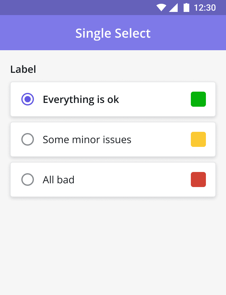 |
Single-Select (from a list) This component enables users to select single items from a given list. For example, if a technician needs to select parts used to complete a task, he or she can view the list of parts and click the radio button beside the required part. | 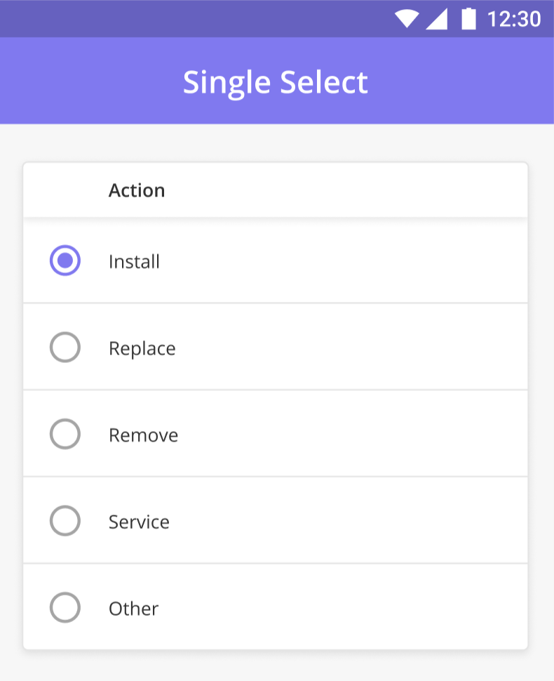 |
Checkbox Multiple Choice (Checkbox) is a way of presenting a list of options where the user can choose more than one option. This component can be used to activate or deactivate a certain function. | 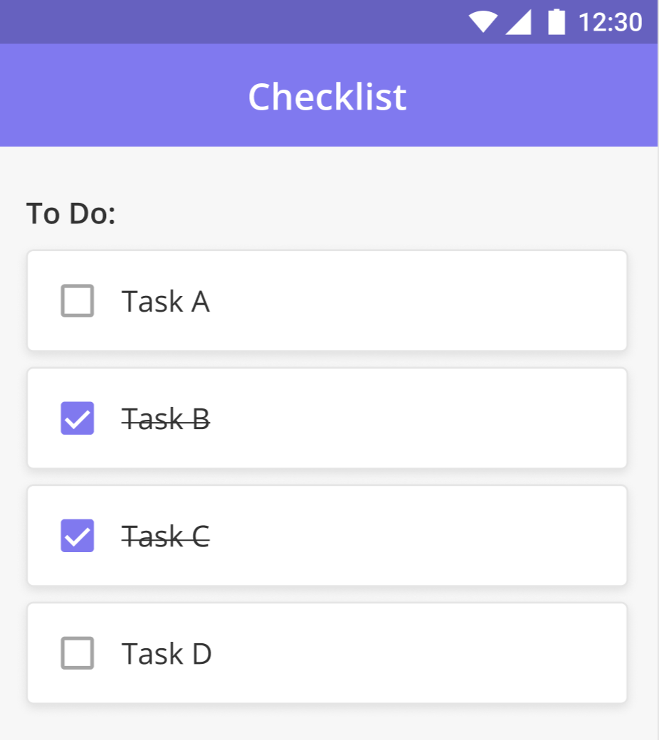 |
Multi-Select (from a list) This component enables users to select multiple items from a given list. For example, if a technician needs to select parts used to complete a task, he or she can view the list of parts and click the radio button beside the required part. | 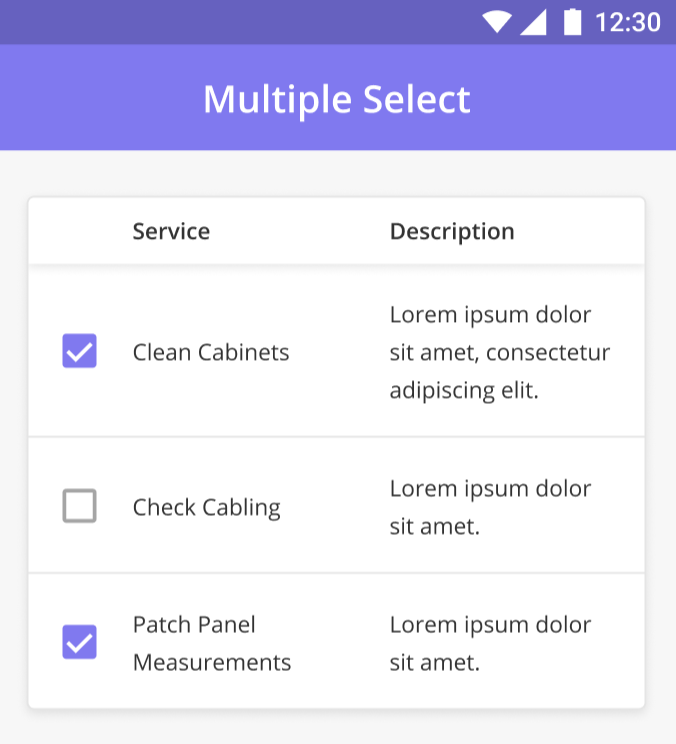 |
Document Viewer (PDF / 3D Models) Document Viewer allows Mobile users to download and preview different types of documents. For example, a Technician can download and read additional manuals required for an ongoing task. The Document Component is capable of previewing the following document types: PDF, 3D Models (.obj, .stl, .dae) | 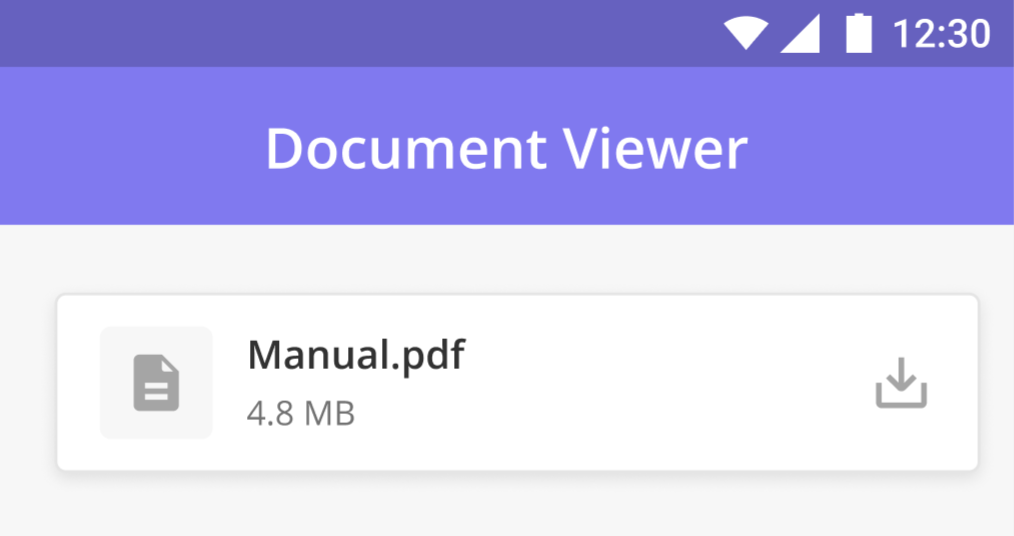 |
File Upload Allows the Mobile app user to upload a file from their device to the Zinier app server. Sample use case: A technician as a mobile app user wants to upload a file to the Zinier platform. They are allowed to upload any file like image, video, document, etc. This component also allows the download of an existing file. Sample use case: A technician has to fill up a form (like a word document or Excel sheet) during their task and upload it as well. | 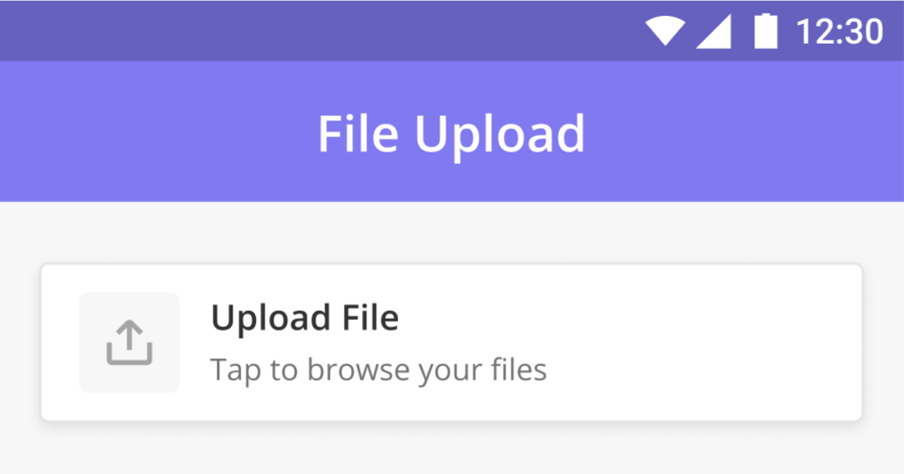 |
Media Upload with Comments Combines a media checklist component with a text input comment box. This component is especially useful when the user wants to attach comments to the Photos or Videos uploaded by them. NEW (23.9) Saving Pictures to your Phone’s Photo Gallery: By default, photos taken in the field are now stored to your phone’s photo gallery for access later on. | 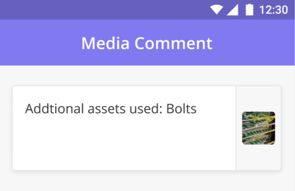 |
Multiple Media Component The MultiMedia component is designed to cater to the requirement of having multiple photos or videos. For example, if there is more than one photo required on a page then we need to add 5 or more photo components. We may make the first photo component required and others can be optional. This use case can be better handled using multiple components. We can provide multiple components with a photo component. Users can add any number of photos to it. NEW (23.9) Saving Pictures to your Phone’s Photo Gallery: By default, photos taken in the field are now stored to your phone’s photo gallery for access later on. | 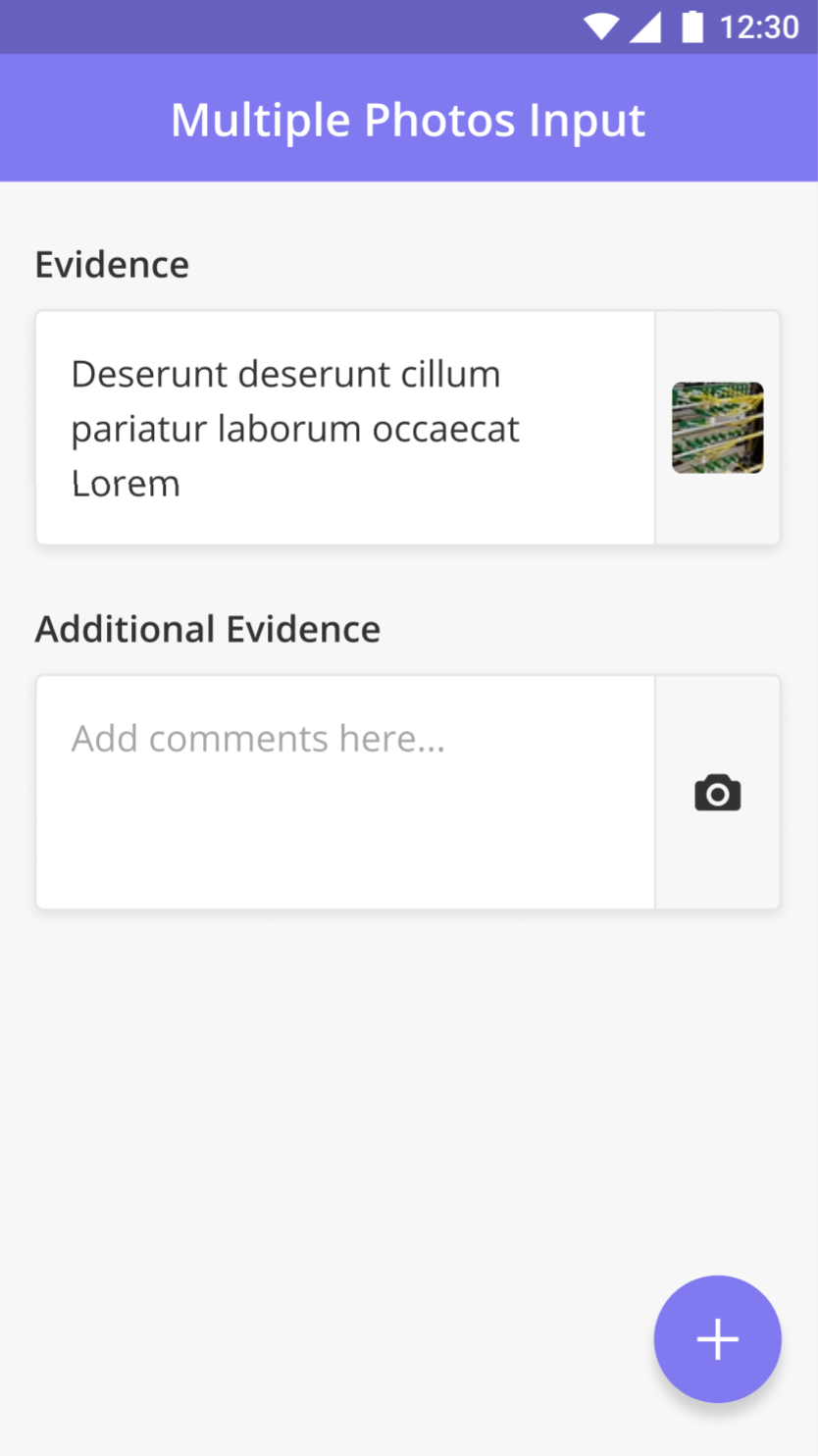 |
Photo Input Photo-related components are used to request the mobile app user to capture a photo via camera or upload images from their device gallery. NEW (23.9) Saving Pictures to your Phone’s Photo Gallery: By default, photos taken in the field are now stored to your phone’s photo gallery for access later on. | 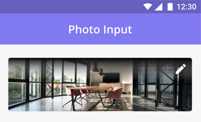 |
Photo (Checklist) Allows for multiple photos to be uploaded from the field. NEW (23.9) Saving Pictures to your Phone’s Photo Gallery: By default, photos taken in the field are now stored to your phone’s photo gallery for access later on. | 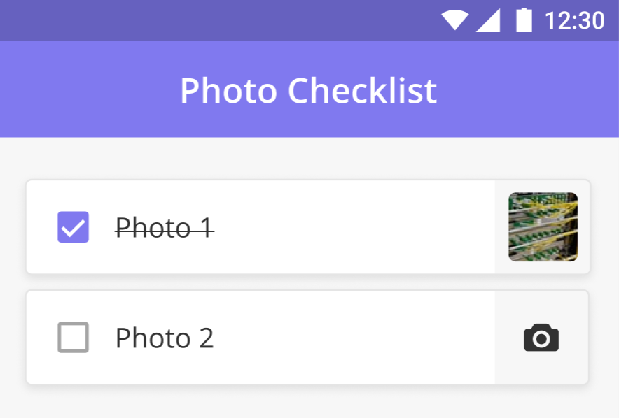 |
Display Image The Image Component displays an image that has been uploaded via the Zinier web platform. For example, when a Technician wants to view the current or previous state of an asset at the Customer Site, the Image Component enables the image uploaded by the Web User to be displayed on the Technician’s device. | 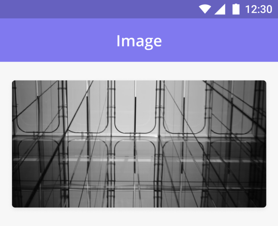 |
Video input Video-Input Component allows a Technician to capture a video using the device camera or upload a video from the device gallery. The file format of the video is .mp4. It also allows the user to add, preview, change and delete a video. | 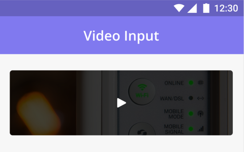 |
Map (Single Point) Shows a map to the user with a specific location. A red bulb-shaped marker point is shown at the specified location. When a user taps on the marker a short address can be shown in the popup on the marker which looks like a tooltip. The map can display a maximum of one point. | 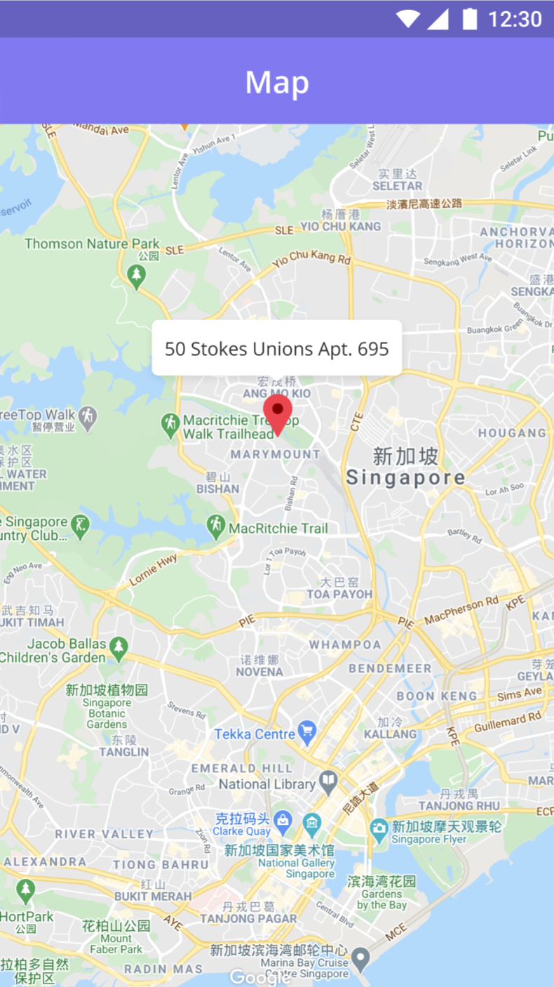 |
Purpose-built for Field Service
From geo-tags and timestamps to the ability to capture signatures and scan barcodes in the field, Zinier’s robust mobile capabilities are designed with field service execution in mind.
Geo-Tag and Time-Stamped Photos Photos taken as part of a task can be geo-tagged (capturing the lat/long of the location where the photo was taken) and time-stamped for audit purposes. Photo Markup and Annotation Technicians can annotate and markup photos taken during a task. Image Annotation allows technicians to add text, shapes, arrows, lines, and more to a photo to help technicians visually communicate with the backoffice. | 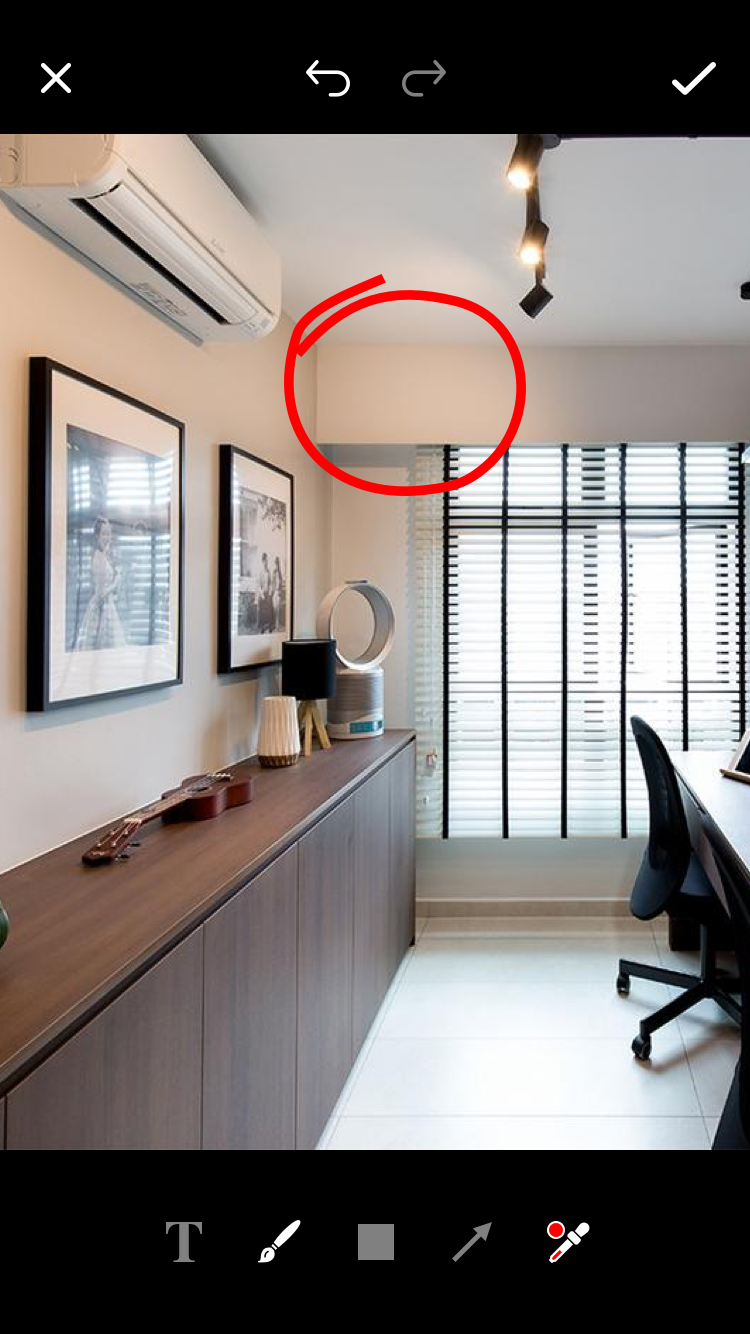 |
Barcode / QR Code Scanner Scan barcodes of assets and inventory instead of having to enter them manually. | 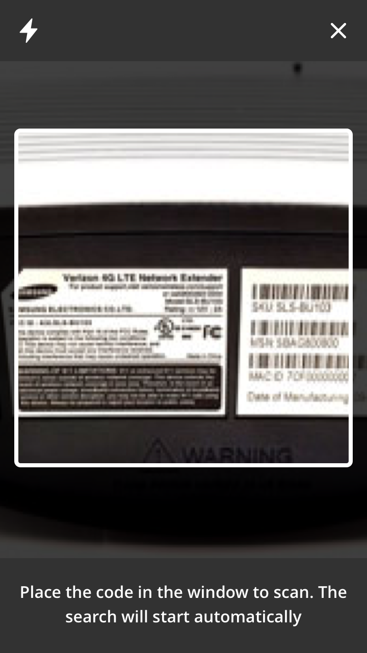 |
Capture Signature Use this component to capture a signature (i.e. a customer’s signature) using the touch screen of your mobile device. | 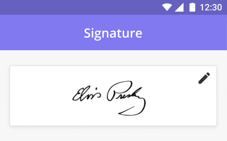 |
Capture Signature (Checklist) Use this component if you want the user to take the signature as a compulsory requirement. Can be combined with other checklist components. | 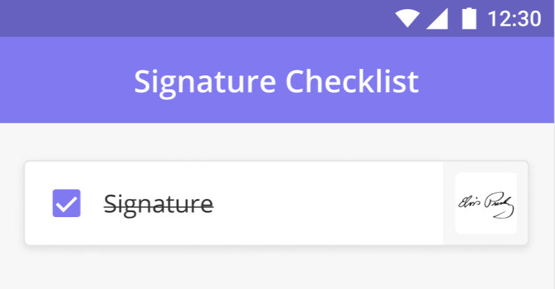 |
Interactive Map (Multiple Points) The interactive map component enables users to view a segment on a map with multiple points on it and associate each point with a separate page or subtask. This feature is useful in cases like patrolling or segment Maintenance Tasks when a Technician is expected to walk along a particular segment and check the status at multiple defined points along the way. You can also use the component to present other geospatial data such as inventory locations, other points of interest, etc to a technician. | 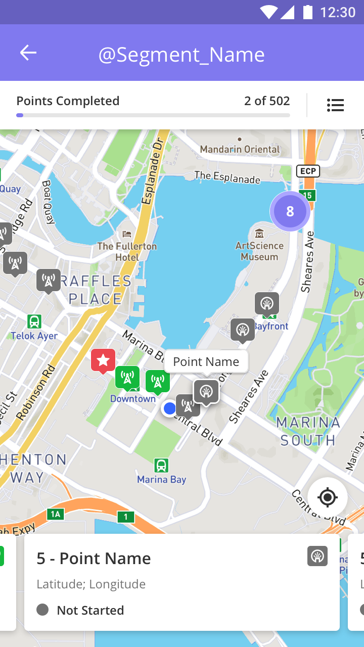 |
Capture Address Component Capture an address or a specific lat/long on a map and store the address and coordinates in the system. Useful when logging maintenance requests at specific locations. | 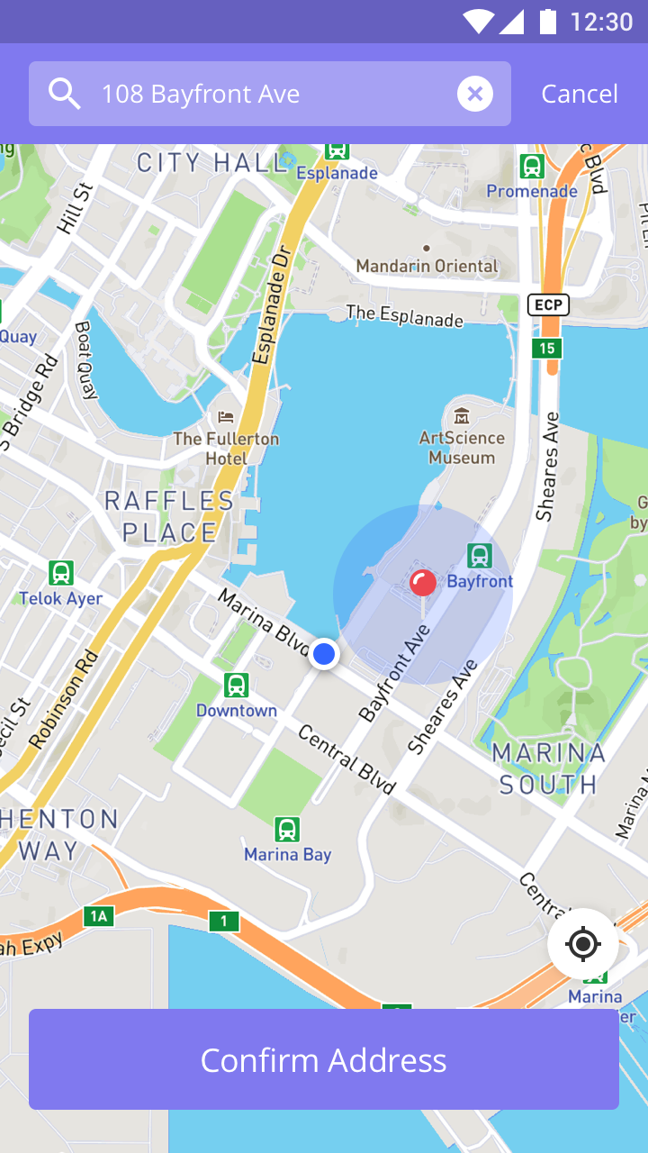 |
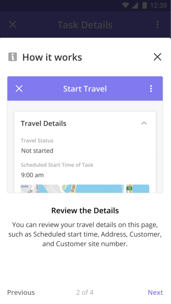
Onboarding Guides Onboarding Guides help Solution Developers guide new & first-time users to understand the process & the various options available when they use the Mobile App. The onboarding card supports media content which allows solution developers or trainers to embed content in an easy-to-consume fashion.
|  |
Extensive Media File Support Media files as well as documents can all be viewed in the mobile app. We currently support the following file formats: Images - JPEG/JPG, PNG Videos - MP4 Documents - PDF, OBJ, STL, DAE MS/Other - Other file types (.doc, .docx, .xls, .xlsx,) can be downloaded, but viewing them can be done only through any third-party apps. | 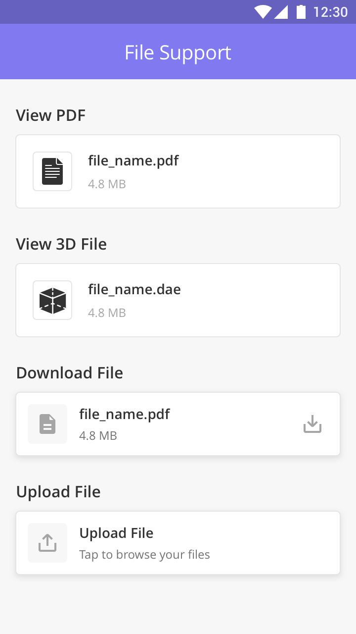 |
Checklists Create checklists for Technicians to complete critical activities. Checklists can include plain text or photos, videos, and signatures. | 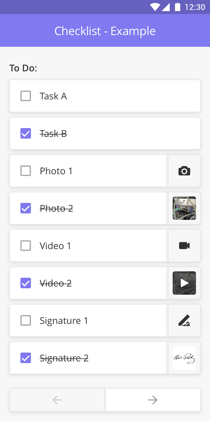 |
Business Rules and Logic
Components within a mobile task can be configured using advanced business rules and logic allowing you to show or hide components based on inputs completed elsewhere in the task.
Show / Hide
Solution Admins can configure components to be visible or not based on user-defined logic. For example, a Solution Admin might only want to display a field if a specific dropdown value is selected in a previous dropdown component.
Required / Not Required
Solution Admins can configure components as required fields, meaning the fields must be filled or an error message will appear below the field notifying the mobile user that it must be filled in.
Enabled / Disabled
Solution Admins can configure components to be enabled or not based on user-defined logic. For example, a Solution Admin might only want to enable a field if a specific dropdown value is selected in a previous dropdown component. If that value is not selected, the component will be visible but not actionable.