ISAC Platform Web 20.7
Features
Support for Workflow input in Searchable Dropdown Component
Solution Admin can input Searchable Dropdown Component with workflow instead of just a query.
To populate Searchable Dropdown by workflow, ensure the following in your component definition:
The
searchByOptionskey which renders the searchable dropdown data in Searchable Dropdown component and the Advanced search Grid is configured correctly and includes these mandatory keys:dataSourceId-"process/start"sourceType- “api”dataToBeSent- Workflow you want to runcolumns- List of the columns you want to show as table headers in Advanced Search data grid
ExampleCODE"searchByOptions": { "dataSourceId": "process/start", "sourceType": "api", "columns": [ "workOrderTaskId", "taskTypeName" ], "dataToBeSent": { "apiResponseParams": [ "count" ], "inputVar": {}, "processId": "NI7F9488VO", "apiResponseFormat": true, "contextVar": { "filter": "{$workOrderTaskId} like {@searchText} AND {$workOrderTaskId} IN {@id} ", "statusFilter": [ "workOrderTaskOpen", "workOrderTaskScheduled", "workOrderTaskReopened" ], "orderBy": "", "id": "@pageContext.testdata", "batchSize": 50, "userId": "{@userId}", "getCount": true }, "apiResponseObject": "schedulingAndDispatchData" }
If SA needs an extra filter for the Workflow you want to run, the filter must be predefined in the contextVar of the workflow.
Workflow populated dropdown: SA must add
@searchTextin the filter and add that as a key inside inputVar of the Workflow.There is no need to add from json -searchByOptions-contextvar. It is dynamically added when we do a search).
For example,
"filter": "{$workOrderTaskId} like {@searchText} AND {$workOrderTaskId} IN {@id} "In this case,
@idis part of contextVar. In the workflow inputVar, assign the same for@searchText.after
ANDin the filter, you can add custom inputs.
Support for Workflow input in Advanced Search Component
Users can now use a workflow to generate the Advanced Search data grid which opens when they click Advanced Search.
To configure the Advanced Search data grid by workflow, do the following in your component definition:
Ensure that
isAdvanceSearchkey that contains all the details of the Advanced Search functionality is configured correctly.Ensure that under the
rowsToSelectkey, you have these values:dataSourceId - "process/start"sourceType - “api”dataToBeSent -Workflow you want to run
Add this mandatory keys under `
isAdvanceSearch`CODE"selectedRowAdvanceGrid": "selectedRowAdvanceGrid1", "rowsToBeSelect": "selectedId1", "rowsToSelectSourceId": "process/start", "rowsToSelectSourceType": "api",
filterhere this key should be outsiderowsToSelect.This filter is primarily used for filtering data from the workflow for more customization. (Any thing if u want to pass dynamically then those should be passed fromsearchByOptions--> contextvarIn this
dataToBeSent>contextVar>"filter": "{$workOrderTaskId} IN {@id} "This filter must be provided to get the already selected ids from dropdown."id": "@pageContext.selectedId1",always should be there in sidecontextVar."@pageContext.selectedId1",we can use to get the already selected items in dropdown.Then we can assign to our desire variable insidecontextVar.
Example
"isAdvanceSearch": {
                      "filter": "{$workOrderTaskId} IN {@id} ",
                      "rowsToSelect": {
                        "dataSourceId": "process/start",
                        "sourceType": "api",
                         "dataToBeSent": {
                          "apiResponseParams": [
                            "count"
                          ],
                          "inputVar": {},
                          "processId": "NI7F9488VO",
                          "apiResponseFormat": true,
                          "contextVar": {
                              "filter": "{$workOrderTaskId} IN {@id} ",
                            "statusFilter": [
                              "workOrderTaskOpen",
                              "workOrderTaskScheduled",
                              "workOrderTaskReopened"
                            ],
                            "orderBy": "",
                            "id": "@pageContext.selectedId1",
                            "batchSize": 50,
                            "userId": "{@userId}",
                            "getCount": true
                          },
                          "apiResponseObject": "schedulingAndDispatchData"
                        }
                      },
                      "selectedRowAdvanceGrid": "selectedRowAdvanceGrid1",
                      "rowsToBeSelect": "selectedId1",
                      "rowsToSelectSourceId": "process/start",
                      "gridHeaderText": "nothing",
                      "rowsToSelectSourceType": "api",
                      "searchKeys": [
                        "workOrderTaskId"
                      ]
                    },
For more information, see [ZPW-74] - Advanced Search & Searchable Dropdown component: Support for workflow input
Switch Component
The switch component is a new component to enable or disable fields on Zinier and can be used for boolean fields. The switch component can be used in the sidepanel body and header.
Solution Admin can configure :
Label Text (Title) of Switch Component. Localisation supported
Placeholder text of Switch Component. Localisation supported
Set and store the value of switch component statically or dynamically via pageContext. When moving across side panel tabs, switch value is saved locally.
Enable actionOnChange of switch component
Disable the component
Example: FSE
Sample JSON
{
                  "id": "field-multiRecord",
                  "type": "switchComponent",
                  "label": "@lang.['MultiRecord','MultiRecord']",
                  "value": "@pageContext.content.metaData.multiRecord",
                  "disabled": false,
                  "hidden": false,
                  "placeholder": "is file multi Record ?",
                  "actionOnChange": "@actions.updateMultiRecord"

                }
For more information, see : [ZPW-92] - Switch Component V1.0
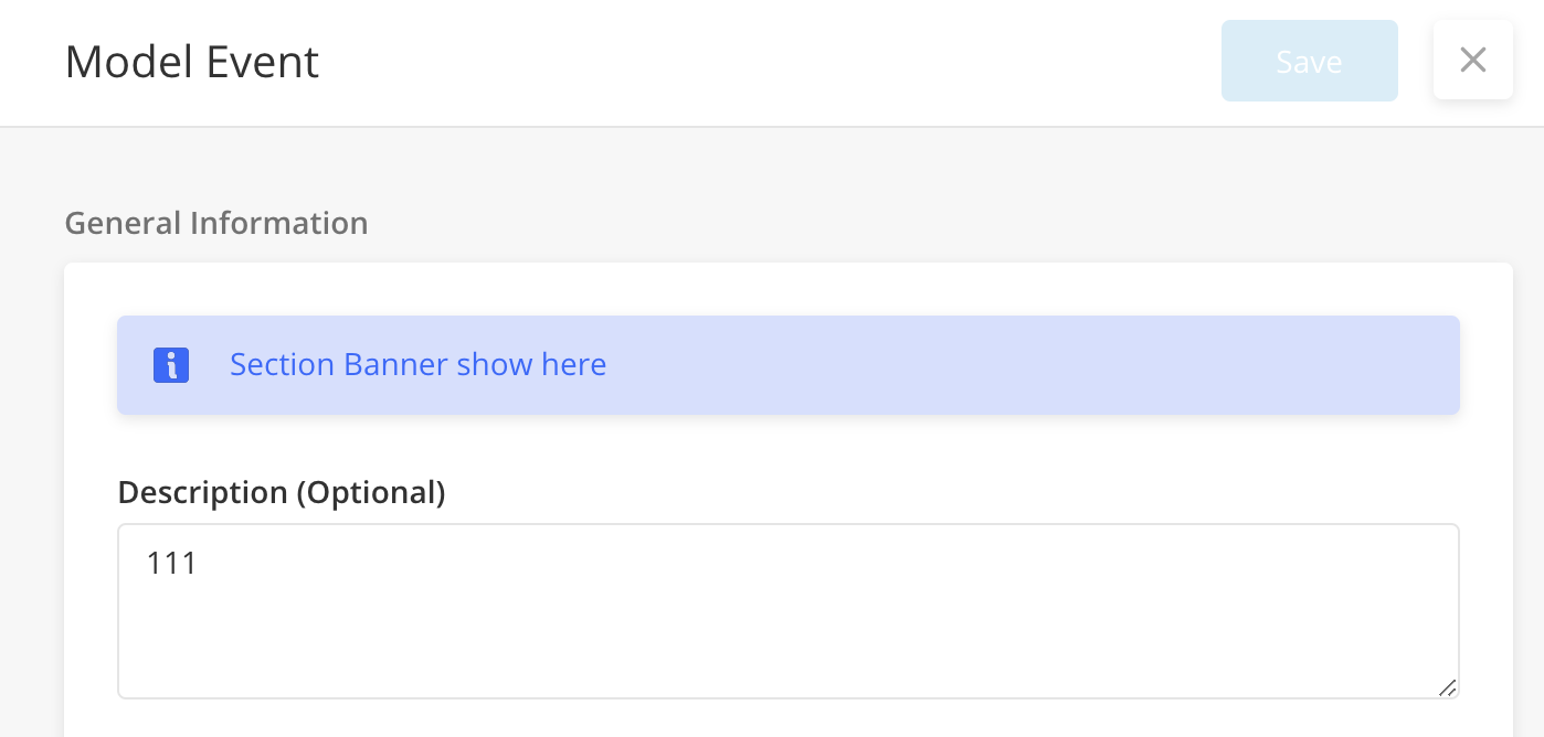
Contextual Banner
Contextual Banner is a component that can show information based on users’ input in a side panel. The banner can also alert users with more context or information on their input.
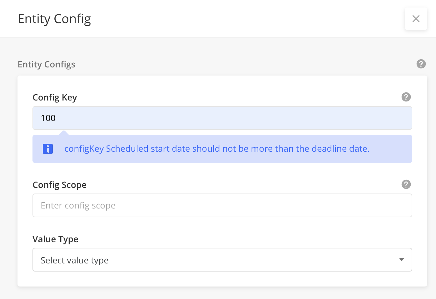
For example, when a user is trying to set up a task’s time for a:
Customer site that is different timezone than his local timezone. Contextual Banner can show this message so that user is aware there is a difference in timezones.
Task that is after the WorkOrder deadline. Contextual Banner can show a message that the task is set later than the work order deadline
Users cannot close the contextual banner with the x button. When users change the value of the component which does not match the show criteria, it then disappears
Contextual Banner Type: Component
Component: Related ONLY to the value in a Component. Appears below a particular component.
Sample JSON: Component Contextual Banner
{
    "disabled": "@jslib.isFieldDisabled",
    "id": "configKey",
    "type": "input",
    "label": "@lang.[\"Config Key\",\"Config Key\"]",
    "value": "@pageContext.configKey",
    "contextualBanner": {
        "alert": "@jslib.configKeyBannerAlert",
        "message": "@jslib.configKeyBannerMessage"
     },
    "placeholder": "@lang.[\"Enter config key\",\"Enter config key\"]",
    "displayOrder": 1
  },
Contextual Banner Type: Section
Section: Related to the section. Appears on top of the section.
The different types of section Contextual Banner, success, info, danger, or warning can be configured under alertType.
Sample JSON - Section Contextual Banner
"children": [
{
  "id": "sectionAlert",
  "type": "sectionAlert",
  "sectionBannerAlert": "sectionBanner",  (Note: this is jslib variable name)
  "alertType": "info"
},
{
    "disabled": "@jslib.isFieldDisabled",
    "id": "configKey",
    "type": "input",
    "label": "@lang.[\"Config Key\",\"Config Key\"]",
    "value": "@pageContext.configKey",
    "contextualBanner": {
        "alert": "@jslib.configKeyBannerAlert",
        "message": "@jslib.configKeyBannerMessage",
        "sectionBannerAlert": "@jslib.sectionBanner",
        "sectionBannerMessage": "@jslib.sectionBannerMessage",
     },
    "placeholder": "@lang.[\"Enter config key\",\"Enter config key\"]",
    "displayOrder": 1
  }
  ]
For more information, see Contextual Banner.
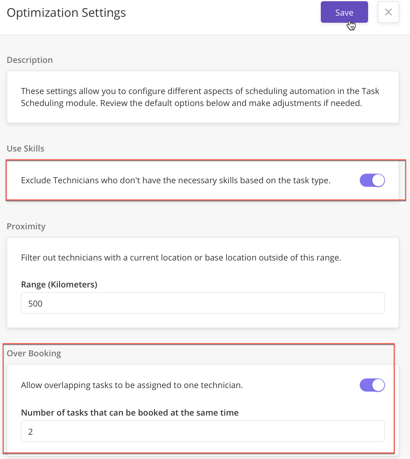
Technician Schedule Component Enhancements - FSE Support
To Support FSE 2.4, these enhancements have been made to Technician Schedule Component to enable Solution Admins to configure:
Calendar Date view and default view: The offset time in hours and the default view on load of schedule component (day, week, month)
Display tooltip when hovering over the icon next to a technician's name: An icon and a tooltip on hover of an icon beside the technician name
Click Technician name to open a side panel: Side panel to open on click of technician name
Custom Event to fetch start/end DateTime: A start date and end date to load only tasks between those dates on initial load of the scheduler and on-click of day view, week view or month view.
For more information, see:
[ZPW-529] - Schedule Component - Click on technician name to opensidepanel
[ZPW-493] - Schedule Component - Calendar Date view and default view
[ZPW-495] - Schedule Component - Show End date in task card
[ZPW-635] - Schedule Component: Custom Event to fetch start/end dateTime
[ZPW-759] - Schedule Component : hover tool tip for icon beside technician name
Side Panel Tab: Support for a side-panel tab within a nested panel
A nested side panel now supports multiple side panel tabs.
Users can see the stored data in multiple tabs and data is rendered from the pageContext. All the data on the main panel mks be rendered correctly on navigating from a side-panel tab in a nested panel, irrespective of the tab position.
Dynamic Scroll for Widgets
Users can now see all the data on the widget even if the data excess the widget’s width. When the volume of the data exceeds the x-axis, there is now a dynamic horizontal scroll to enable users to see all the data on the x-axis.
Dynamic Filter support in Sidepanel grids
Side panel grids now support dynamic filters. With the dynamic filters support for side panels grids, users can:
Apply one or multiple dynamic filters to grid in a side panel
Click the back button and return to the parent tab in the side panel
About Zinier
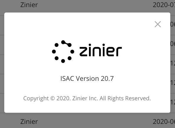
Users can now quickly view the platform version they are using from their account menu.
To view the About Zinier
From the right side of the Web platform and click the User icon > About Zinier.
From here, users can see - ISAC Version: Displays the version of the platform it is using
User Analytics page (BETA)
This feature is in BETA and is actively going through iterations
A new page, User Analytics is now accessible from Users > User Analytics to display a report on user statistics in the org.
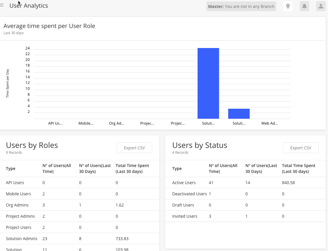
This page displays basic details on how many users are using Zinier and how much time on average they spend on the web ONLY. Users can export data grids in CSV
Users: Export Changes
Export Improvements for Users data grid include:
When exporting users, User only sees relevant fields
User cannot export irrelevant model data for users
There is an open issue on exporting Groups. This will be fixed in the next release.
Data grid ‘Records’ Subtitle
Solution Admin can now configure how the ‘X records’ subtitle look like if there are 0, 1, or many records in the data grid.
To configure, add these keys to the data grid component definition
 "subHeaderText": {
      "singularText": "@lang.['fseWorkOrder','Work Order']",
      "pluralText": "@lang.['fseWorkOrders','Work Orders']",
      "noDataText": "@lang.['nowrkorder','No work order available']"
    }
Multi-Column Layout 2 UX/UI Improvements
Improvements in the Multi-Column (MCL) 2.0 includes:
Infinite scroll in Data grids
Extra border fixes
Width alignment fixes
Absolute Date and Absolute Time Component
For fields that must be saved as Absolute Date or Absolute Time like shift hours, or public holiday, Solution Admin can now choose to use Absolute Date or Absolute Time component which stores the date or time input by the user directly into the database without converting to UTC.
Absolute Date
Example: If a user selects 2nd May 2020 from the calendar, it returns only 2020-05-02. To use this Absolute Date, include this key in your component definition:
"type": 'absoluteDate,Absolute Time
Example: If a user selects 20:00, it returns the same value(without any UTC conversion). To use Absolute Time, include this key in your component definition:
"type": 'absoluteTime,Note: If you want to use Absolute Date or Time in side panels and grid, you must add the types in all the JSONs.
For details, see Min, Max Date, Absolute Date and Absolute Time Setting and configuration information
Support for Min and Max date implementation
WIP
[ZPW-301] - Support min and max date checks using the new org config for date and time to support various date format and 24-hour format
Bug Fixes
[ZPW-405] - No character limit in most of Text Field & Text Boxes; resulting internal server error 500 & can't login when exploited.
[ZPW-452] - Datetime component should have the option to return local time
[ZPW-453] - Time component should return only time selected, instead of both date and time
[ZPW-538] - @jslib.dynamicHeaderText is not working for the side panel header localisation. User is seeing the code instead of the localised strings
[ZPW-573] - [Login Screen] Aggressive caching of Org Name & Email.
[ZPW-630] - When model attribute is removed from the export data wizard component, getMetaDataDef call is throwing 500 in this case, overlay is displaying on new web app if user navigates away
[ZPW-664] - User managment : Confirm Invite Pop-up Not needed
[ZPW-693] - Schedule Component : Colour of tasks when there are multiple tasks in the same day
[ZPW-698] - On the dashboard widgets, when the export data option is selected from one widget, success message display is duplicated on all of the available grids on the selected module
[ZPW-711] - Applying dynamic filter with "is" condition on the widget loaded with workflow is resulting in some error occurred
[ZPW-714] - Centralise logo: "poweredByZinier" logo is getting disappeared from the UI after performing Page refresh.
[ZPW-719] - Account Settings : Mouse hover hand icon issue
[ZPW-740] - After upgrading install & upgrade button, success message is displayed but the page is frozen in the same state for more than 1 min without any indication for the end user on the next steps.
[ZPW-743] - sidepanel Isuue: data not reflecting on control on first page load
[ZPW-771] - Map Component tool tip: Need to close the tool tip on click of grid row
[ZPW-796] - MCL2 : Extra border appearing on widget/data grid if data is less or subTitle not provided
[ZPW-799] - The dynamic side panels platform is loading is displaying the success / warning messages from web page updates
[ZPW-802] - MCL-Width is not aligned with left and right
[ZPW-818] - Input Component : Entering < , > or & in the input causing text to change
[ZPW-834] - Date component is selecting one day in the past, selecting 1st July is selecting 30th June
[ZPW-835] - Date component and time component format display issues
[ZPW-1117] - Dynamic Filters Side Panel Support : Applying/removing a filter shows incorrect UI panel loading for 5 seconds
[ZPW-1122] - When we render same component(same order) in main panel and nested sidepanel .Issue found in main panel
[ZPW-1125] - [RAMAN] "Cancel & Logout" button is not defined in "Updated Terms & Conditions and Privacy Policy" dialog.
[ZPW-1129] - For "edit" text in the zinierPlatform, alphabet “e” is showing in small letter which is incorrect.
[ZPW-1131] - Value set on the pageContext is not displayed on the date component, this was working before.
[ZPW-1138] - Eula Consent : On pressing enter during sign-up, activation API gets triggered without accepting the T&C
[ZPW-1144] - ViewData:The headers are incorrect in dynamic grid of comboChart
[ZPW-1152] - MCL2: Infinite Scroll implementation
[ZPW-1156] - minDate is honouring time added on the date / datetime component. This probably is a gap from the beginning on this component but with absolute date and time introduced, we need to fill this gap
[ZPW-1157] - In the accountActivation page, some strings are showing as undefined for createPassword & confirmPassword field which is incorrect