Release Notes: ISAC and Studio Z 20.5
ISAC
What’s New
Export Improvements
Export functionality in Data Grid allows users to export relevant rows in .csv. Users now have two options to export rows from a data grid.
Export All Rows: Export all records in the user’s current view. If a filter is applied, only records.
Export Selected Rows: Export only selected rows (only multiple selections are supported for now. Single selection is not supported).
Users can choose which visible data grid columns to export. Users can also select ‘hidden columns’ in the dataToBeSent query but are not displayed in the datagrid. Export functionality works as WYSIWYG. It does not matter if there are multiple models present in the datagrid.
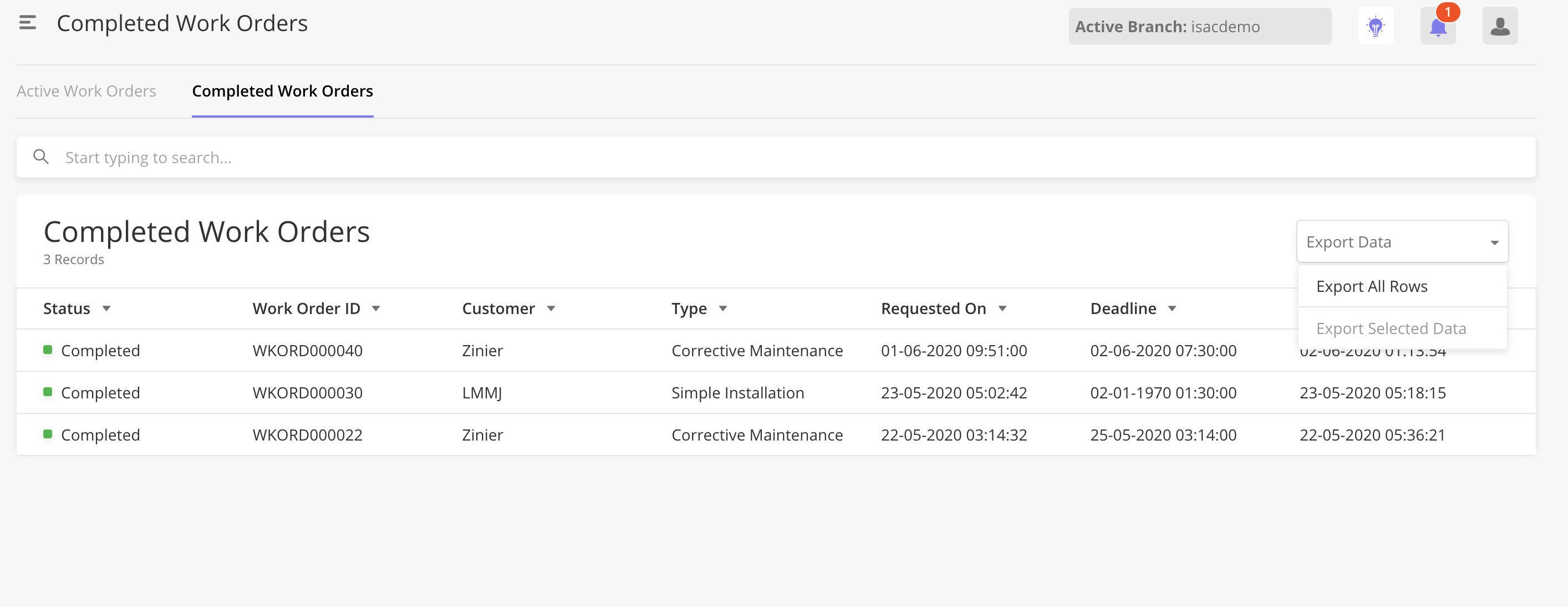
To enable Export in a data grid, Solution Admins can configure the following booleans in the page definition.
"dataWizard": {
  "exportAllRows": true,
  "exportSelectedRows":true
}
Existing Export All Data is backward compatible. As Export All Data exports all the columns within a defined primary model, this may confuse end-users who are unaware of how data is modeled. This functionality is recommended to be phased out and replaced with Export All Rows and/or Export Selected Rows instead.
For details on how to configure: Enhancement : Export all ,Export Selected Export Overlay
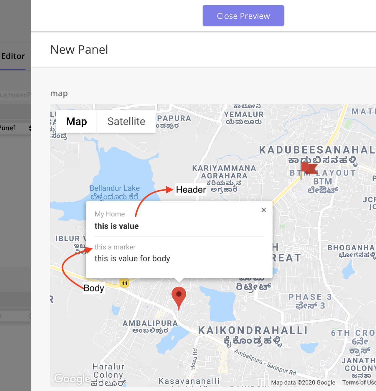
Map Component Tool Tip Configuration & Design changes
Map Component Tool Tips are what users see when they hover over a pin on a map. This new functionality allows Solution Admins to configure different tooltips for different pin types on the map. For example, when users hover over the technician pin, they can see the technician’s name; when they hover task, they can see the task ID.
Solution Admins can configure what fields to show in a tooltip by configuring
fieldsToShowfor each type of pin (task, technicians).Tooltips can now have two sections, Header and Body. Solution Admin can configure one field to be in the Header section and any number of fields in the body section.
How to configure :
https://zinier.atlassian.net/browse/ZPW-107
https://zinier.atlassian.net/browse/ZPW-134
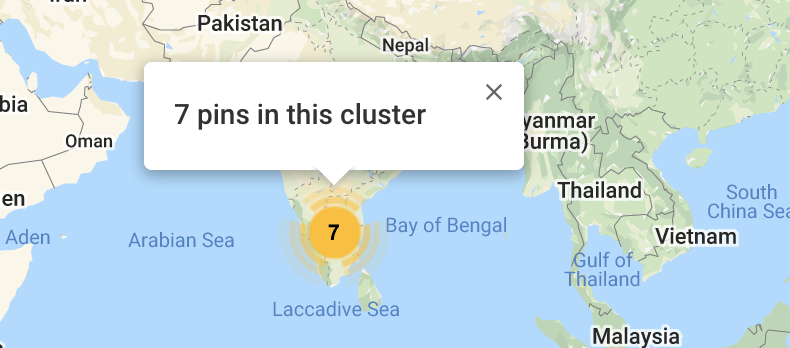
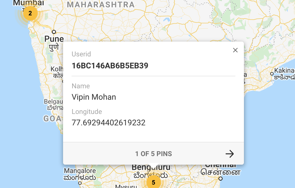
Map Component Cluster Behavior
When pins are close to each other, users cannot get more information for individual pins from the tooltip.
If there are more than 5 pins: When users hover over the pins, the tooltip displays a generic message, “X number of pins in this cluster.”
If there are 5 pins or less: When users hover these pins, the tooltips display ALL the tooltips for the pins inside the cluster. User can toggle left or right to see details of the individual pins
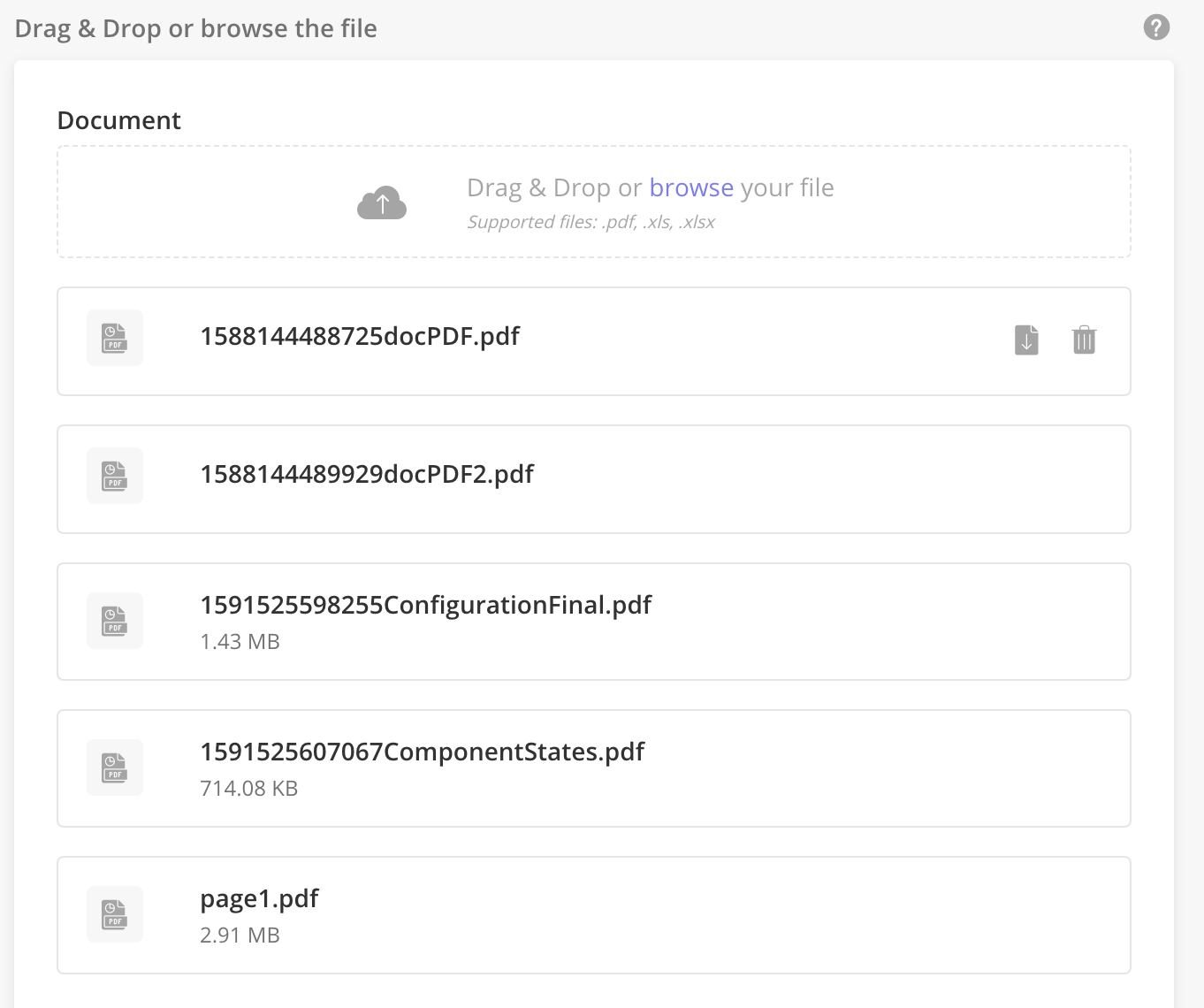
Multiple File Upload Component
Multiple File Upload Component allows users to upload more than one file at a time.
This component only takes care of generating S3 link of the uploaded document. Solution Admin must is responsible for inserting these S3 links in the appropriate Model after the link is generated (e.g. On Save). Solution Admin must also delete the record from the model after uploading.
Features of this component:
User is able to select more than 1 file in when uploading
The loader is visible when the file is being uploaded without the percentage loader.
During upload, if the file is queued and not yet uploaded, the user can cancel the upload.
If an upload fails, user can cancel and retry upload
Users can delete each uploaded file.
User can download each uploaded file
User can disable the download and delete functionaltiy for multiple file upload using the keys in component defintio
isDownloadHidden= {boolean}isDeleteHidden= {boolean}isDownloadDisable= {boolean}isDeleteDisable= {boolean}isDropZoneDisable={boolean}
Users can see data getting rendered in the edit panel from pageContext on passing fileUrl in the object form. On providing the component definition to render the URLs from pageContext, the component
idhas to map with the value used to show data.Users can define the file types that can be uploaded (.pdf,.doc, .docx, etc). All mainstream file types are supported.
There is no limit to the number of files that can be uploaded.
https://zinier.atlassian.net/browse/ZPW-320
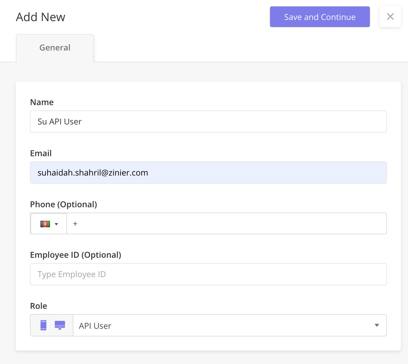
API Only User Role
API Only User Role is a new user role that does not have mobile or web access but can execute actions through APIs. API users will be able to create integrations.
An API Only user will authenticate only through API
An API Only user will have no access to other interfaces such as Web and Mobile.
Can only read the data from system models
Allowed to CRUD on user-defined models/dynamic models
Cannot do any admin action - i.e. user or group creation
Allowed to activate account from web
Can read/fetch the data from the processes but only allowed to save & resume for the processes started by this user
Can log in using user/password and user/token
Calendar Component Tool Tip Configuration
When users hover over a task/event in the calendar component, users can see a tooltip with more information about the task. Solution Admin can now configure fields shown in the tooltip.
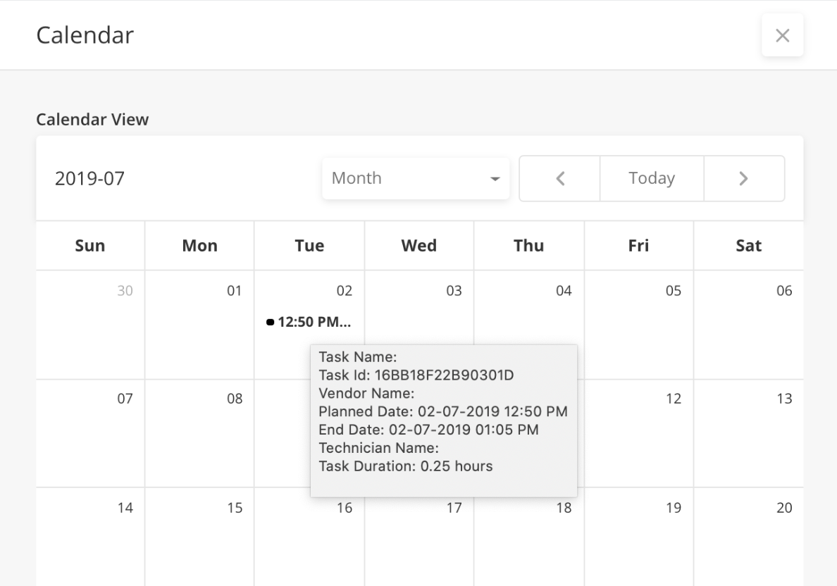
The custom tooltip can be configured under
fieldsToShowkey in the Calendar component definition.The key given in
fieldsToShow, is available in the response object. If the response is not available, users will only see the labelTechnician Name : ___If
fieldsToShowkey is not available, the user sees 5 default fields (Task ID, Planned Date, End Date, Task Duration). This is the existing behavior and will continue to be supported
How to Configure: Calendar Component : Make the hover text configurable and add localization support
Technician Schedule Component - FSE Support
Enhancements needed for the technician schedule component needed for FSE 2.2 Release:
In the tooltip, allow users to
include primary and secondary buttons.
configure fields based on task status via hide/show
configure ‘alert component’ based on some parameter
In Task Card, allow FSE user to configure ‘alert icon’ based on some parameter
Enable Filter by a technician - open a sidepanel with technician input, allow users to multi-select technician
The filter should be saved per session or saved to userid.
Allow FSE user to configure icons beside the technician name based on some parameter (for ie technician is offline)
Allow FSE user to click on an empty slot and open a custom tool-tip
Allow FSE to turn on/off the drag and drop functionality
This component is going through iterations. WIP Documentation - Scheduler (WIP)
Temporary URL generation
Allow Solution Admin to generate a temporary URL via a new API. This temporary URL will have a validity of 10 minutes.
An example use case for temporary URL - Provide Temporary public photo URL which can be assessed in the customer portal.
On click of customer portal link, we will fetch the photo and generate the temporary URL so that user can see technician photo
Once the URL is fetched, the photo will be stored in browser cache so that even if the user is in the Customer Portal for > 10 mins, he can STILL see the photo.
Every time he enters on customer portal, we will regenerate the temporary URL. From a user experience perspective, he will always see technician photo in the customer portal.
This approach solves any data security concerns because if a user tries to access the generated URL without going into the customer portal, the URL throws an error and the user will be unable to see the photo. This ensures that the technician photo cant be spread around by the URL itself.
Request URL:
{{host}}/file/getTemporaryURLRequest Body:
{"data": [{"fileUrl":"https://z2raman.s3.amazonaws.com/000000000139.jpg"}]}Response body:
{
    "data": [
        {
            "tempUrl": "https://z2raman.s3.amazonaws.com/000000000139.jpg?X-Amz-Algorithm=AWS4-HMAC-SHA256&X-Amz-Date=20200520T110050Z&X-Amz-SignedHeaders=host&X-Amz-Expires=1799&X-Amz-Credential=AKIAIYMMF7VXUKZDCV5Q%2F20200520%2Fus-east-1%2Fs3%2Faws4_request&X-Amz-Signature=6f3b6235f53263dcf706b5fcee62909b16908b85676da1cc26e7406a866adfb1"
        }
    ],
    "status": true
}
Implementation details - https://zinier.atlassian.net/browse/ZPS-261
Fixes
Combo Chart widget can now be rendered through workflow input. https://zinier.atlassian.net/browse/ZPW-348
Map Component can consume coordinates data from PageContext https://zinier.atlassian.net/browse/ZPW-309
Base 64 Support in Network Node : https://zinier.atlassian.net/browse/ZPS-262
Studio Z
What’s New
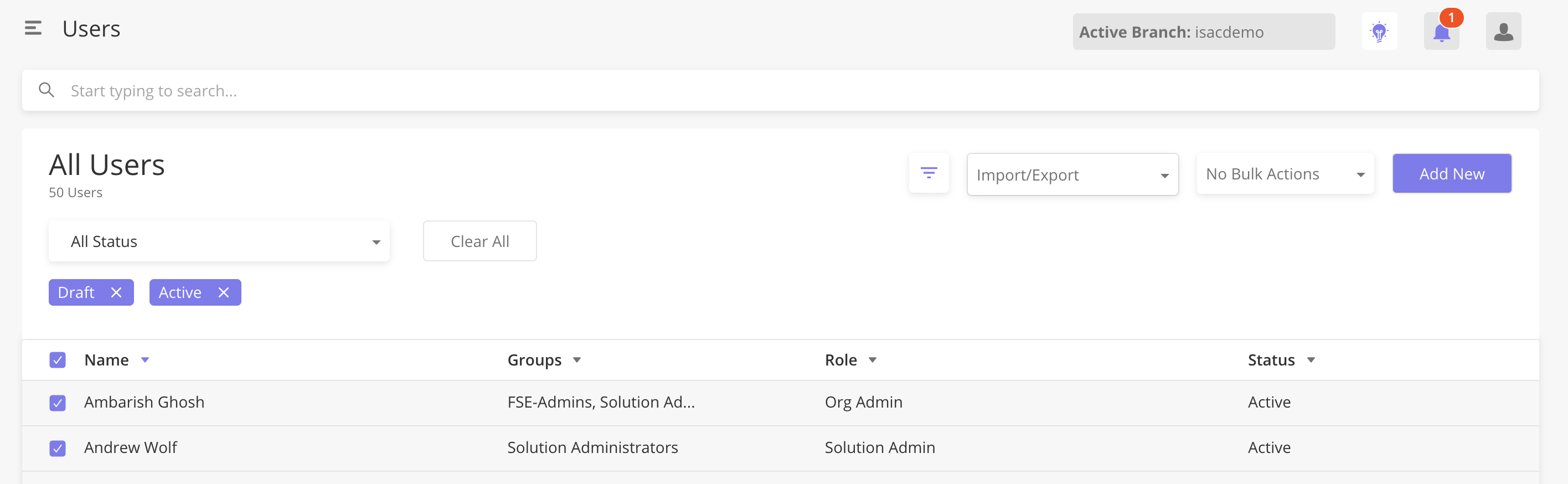
Users and Groups - Web Admin permissions
Web Admins can now view Users & Groups and are able to do User Management tasks such as:
adding/inviting a user
adding groups and adding users to groups
deactivating users
deleting draft users
Recap - User Roles & System App Permissions.
The table below explains which users have what system app permissions
Role | Mobile OR Web Access | Users and Groups Access | Solution Builder Access | Org Config Access | App Stores Access | Role Persona Example |
|---|---|---|---|---|---|---|
Mobile User | Mobile ONLY | No | No | No | No | Technicians who only need mobile access to do mobile tasks |
Project User | Mobile AND Web | No | No | No | No | Coordinators that don't need to do any user management AND also need to do mobile tasks |
Project Admin | Mobile AND Web | No | No | No | No | Same as above. |
Web Admin | Web ONLY | Yes | No | No | No | Coordinators who douser management. |
Org Admin | Mobile AND Web | Yes | No | No | No | Business users need to do user management and mobile to see how a mobile task is seen. |
Solution Admin | Mobile AND Web | Yes | Yes | Yes | Yes | Someone from Zinier Solutions Team or partner devs that configure the solution. |
Solution Developer | Mobile AND Web | Yes | Yes | Yes | Yes | Someone from Zinier Solutions Team or partner devs that configure the solution. |
API Only | NA | No | No | No | No | Integration User. |
For more details on Users & Groups, see Users
Users: Bulk Invite, Reinvite, Deactivate, Delete
Bulk Action is now available in Users. Users can select multiple rows of users and apply a bulk action (Invite, Re-invite, Deactivate, Delete) on all of them at the same time.
For example, users can now add 100 users as a draft and invite them all with one click.
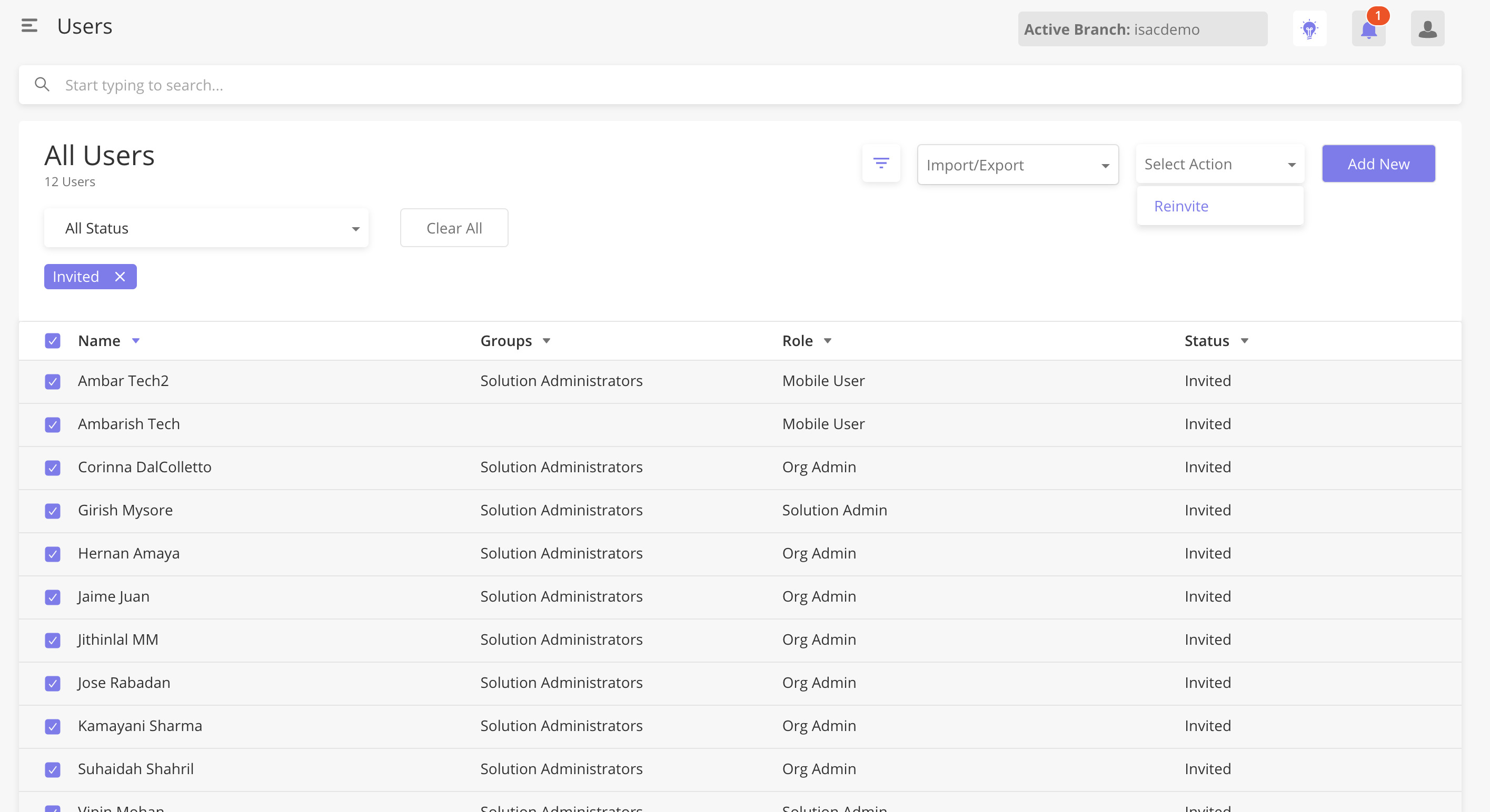
Only common actions across selections are shown.
If there are no common actions that can be applied, No bulk Action will be shown and the user cannot click on the button.
Users - Bulk Import Users (BETA)
Bulk Import of users is now supported. Users can use a .csv template with any number of users and they will be imported in as Draft status users.
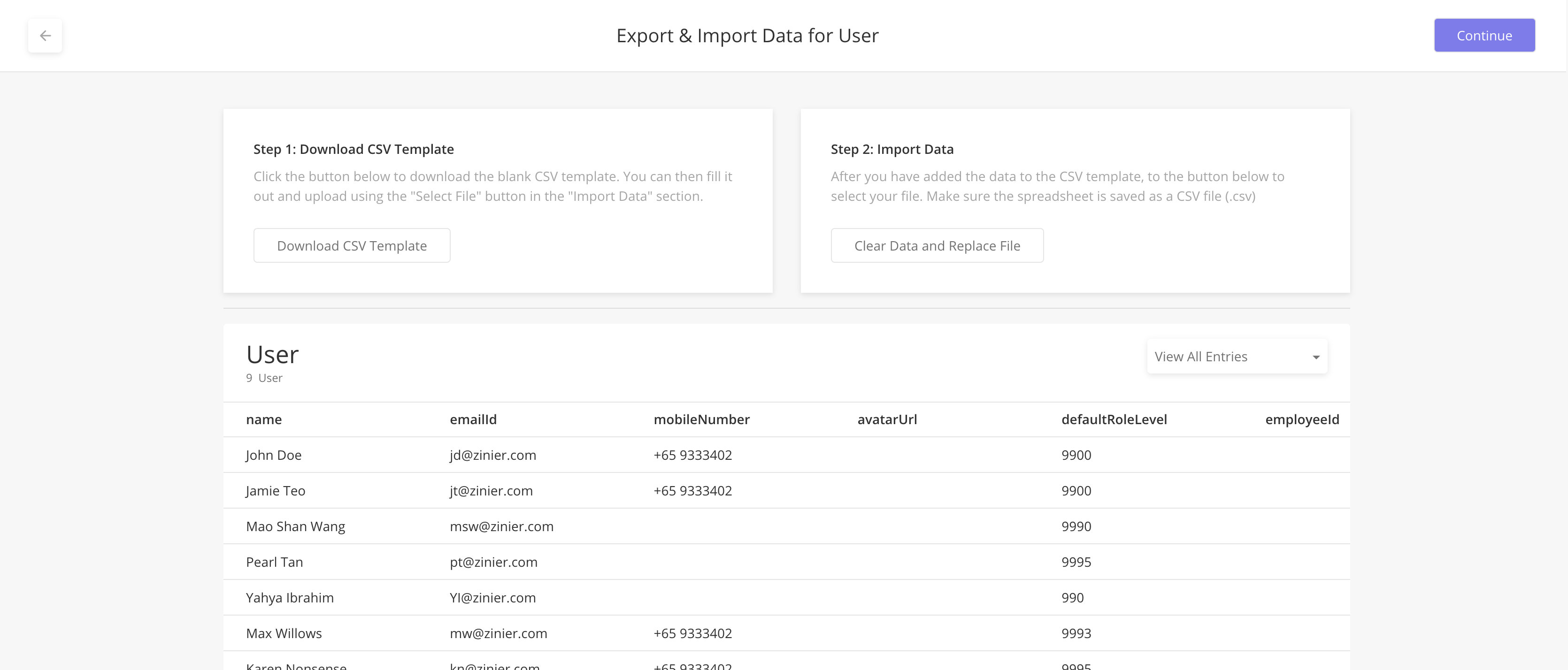
In this BETA version, the default Role Level must be input by number codes instead of names for now.
Reference of role level codes:
Role | Role Level |
|---|---|
Solution Admin | 9995 |
Project Admin | 990 |
Project User | 900 |
Web Admin | 9900 |
Org Admin | 9990 |
Mobile User | 99 |
API Only |
Custom Branding in Web - Logo and Colours
Solution Admin can now configure the logo and colors for the Zinier web platform. This will allow Customers to change the look and feel of the Zinier web platform.
How to configure to add the following keys to Entity Config table:
navLogo: Navigation logo URL. It can be any URL. If this config is not present, the Zinier logo will be shown.collapsedLogo: Collapsed Navigation logo URL. If this config is not present, the Zinier icon will be shown on collapsed navigation.poweredByZinier: Powered By string at the bottom of the main pages. If config is not added or is not true, powered by Zinier will not be shown at the bottomprimaryColor: Primary color used across the platform. Value can be color code or color name. If the config is not added, the colour will be Zinier colors.primaryHoverColor: This refers to the color when hovered on buttons or links. Value can be color code or color name. If the config is not added, the colour will be Zinier colors.
All configs are independent of each other.
entityConfig key | config Scope | value type | value |
|---|---|---|---|
navLogo | org | string | URL of the image to show for the logo on navigation |
collapsedLogo | org | string | URL of the image to show for the logo when navigation is collapsed |
poweredByZinier | org | boolean | true/false |
primaryColor | org | string | Value can be color code or color name |
primaryHoverColor | org | string | Value can be color code or color name |
This release does not include configurable ICON colors. This is planned for 20.6 release.
For more details, see:
Mobile Page Builder V2.0
Mobile Page Builder is a tool in Studio Z which allows Solution Admins to generate mobile Page JSON Definitions easily by dragging and dropping components into a canvas.
In this release, the Mobile Page Builder:
Allow users to write dynamic inputs into keys via MPB JSON view
Added default localization format {%---} into the label, title and placeholder keys in MPB so that it is easier for Solution Admins to remember to localize strings
Show Label in the canvas to mimic how technicians will see it in Mobile
Allow user to change the position of components across the canvas
Added new mobile components
Checklist - Photo Checklist - Photo
Photo Comment or Photo Text - Media Upload with Comments
Video Comment or Video Text- Media Upload with Comments
KMZ - KMZ Viewer
Text Checklist - Checklist - Text
Select Item - Select item
Mobile Page Builder is going through iterations.