Barcode (and QR codes)
UPDATED (25.6)
The Barcode component allows you to scan barcodes and QR codes of assets and inventory instead of having to input the codes manually.
Mobile Configuration
To configure the mobile component, first make sure the “Mobile” icon is selected from the UI toggle at the top, and then drag the component from the Component List to the Canvas to add it to your page. Next, open the Configuration Panel by either double-clicking the component or selecting it and clicking the “Edit” button that appears upon selection. The section below explains the configuration settings associated with the component.
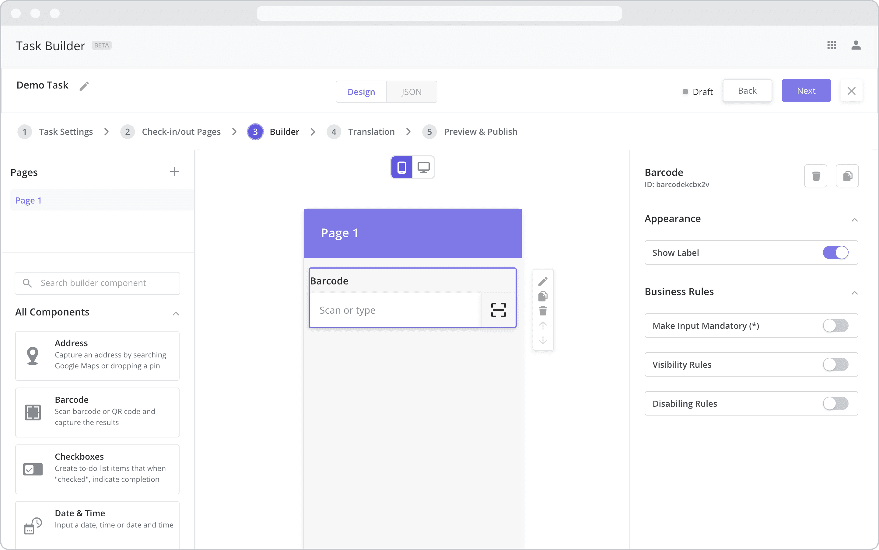
Appearance
Show Label: Enable this toggle to show a label above the component. Disabling the toggle will remove the label. In the example above, the label is enabled and written as “Barcode”. To edit a label, simply double-click the label from the Mobile Canvas to bring up the in-line text editor.
Web Configuration
To configure the web component, first make sure the “Web” icon is selected from the UI toggle at the top, and then drag the component from the Component List to the Canvas to add it to your page. Next, open the Configuration Panel by either double-clicking the component or selecting it and clicking the “Edit” button that appears upon selection. The section below explains the configuration settings associated with the component.
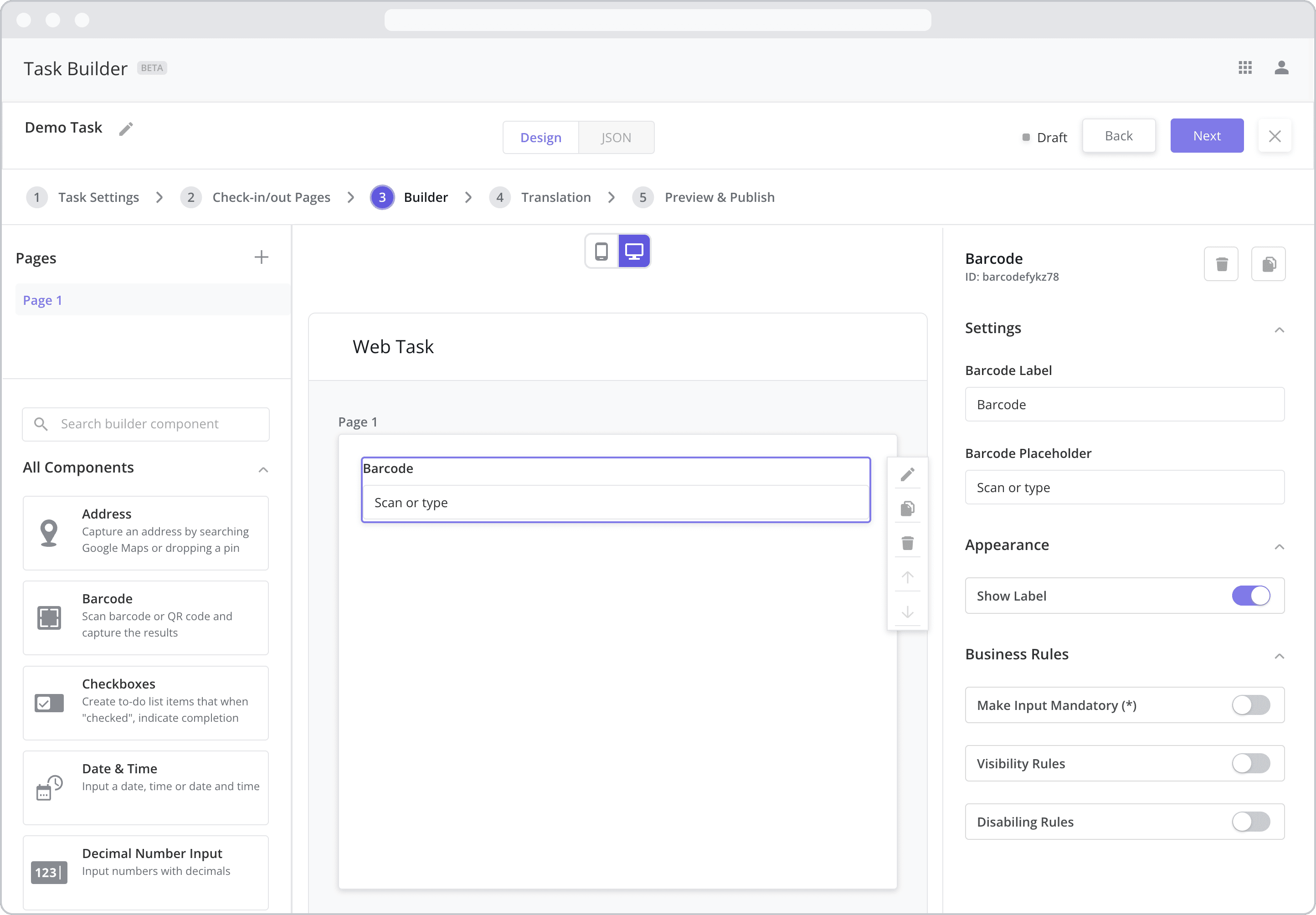
Settings
Label (“Barcode Label”): The label is the bold text that appears above the component, which can be used to help end-users understand the purpose of the component. With “Web” components, users enter the label text from the Configuration Panel within this input field, which becomes visible when the “Show Label” toggle is turned on. In the example above, the label is enabled and written as “Barcode”.
Placeholder (“Address Placeholder”): The grey placeholder text that appears within the input box before a user has filled in the field. This is often used to provide additional direction for the user filling out the form. In the example above, the placeholder is written as “Scan or type”.
Appearance
Show Label: Enable this toggle to show a label above the component. Disabling the toggle will remove the label. In the example above, the label is enabled and written as “Barcode”. To edit a label, enter the text in the “Label” field.
Business Rules
Business Rules | Make-Input-Mandatory Enable this toggle if you wish to make it mandatory for mobile users to fill in this field before navigating to the next page of the task.
Business Rules | Visibility-Rules Enable this toggle to set up Visibility Rules, which allow you to show or hide a component based on inputs captured from a component elsewhere in the task.
Business Rules | Disabling-Rules Enable this toggle to set up Disabling Rules, which allow you to disable a component based on inputs captured from a component elsewhere in the task.