Business Rules
UPDATED (25.6)
The Business Rules section in the Configuration Panel allows you to define more advanced workflow logic for a component. While some components have additional settings within Business Rules, this section explains how the “Make Input Mandatory”, “Visibility Rules”, and “Disabling Rules” features work as they are common to most components in the builder.
Web Tasks vs. Mobile Tasks: For the sake of brevity and clarity, the documentation below uses Mobile Tasks in its examples. But do note that the business rules outlined below also apply to Web Tasks and have the exact same results on the Web as on Mobile. For more information, visit Web Tasks vs. Mobile Tasks
Make Input Mandatory
This setting determines whether or not a mobile user is required to fill in the field associated with the mobile component:
Enabled: If “Make Input Mandatory” is enabled, the field MUST be filled in by the mobile user before navigating to the next page of the task. If the page contains a required field and the user attempts to move to the next page, an error message will appear below the required field. Once the required field is completed, the error message will disappear and the user will be permitted to move to the next page.
Disabled: If left disabled (the default setting), the mobile user is free to navigate to the next mobile page without completing the field.
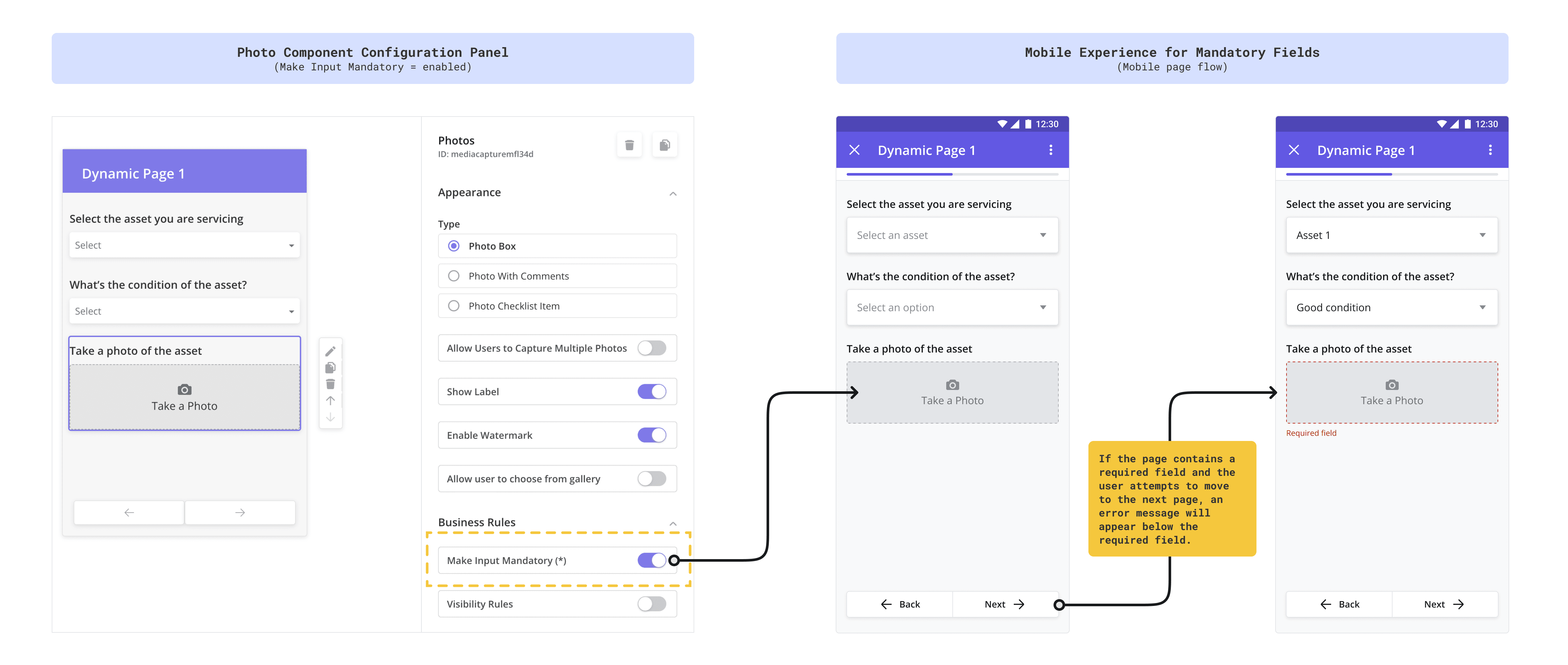
In the example below, the Photo component is marked as mandatory via the component’s Configuration Panel. The mobile screens on the right display the resulting mobile interaction when a user fails to complete a mandatory field.
Visibility Rules
Visibility Rules allow you to show or hide a component based on inputs captured from a component elsewhere in the task.
Enabled: When Visibility Rules are enabled, a “Configure Visibility Rules” button appears. Clicking this button opens a pop-up where you can define the logic to disable the component based on specific conditions.
Disabled: If Visibility Rules are not enabled, the “Configure Visibility Rules” button remains hidden.
Because Visibility Rules depend on inputs from other components, we recommend completing all dynamic page configurations before setting up these rules.
Visibility Rules Example
To explain how Visibility Rules work, let’s use an example.
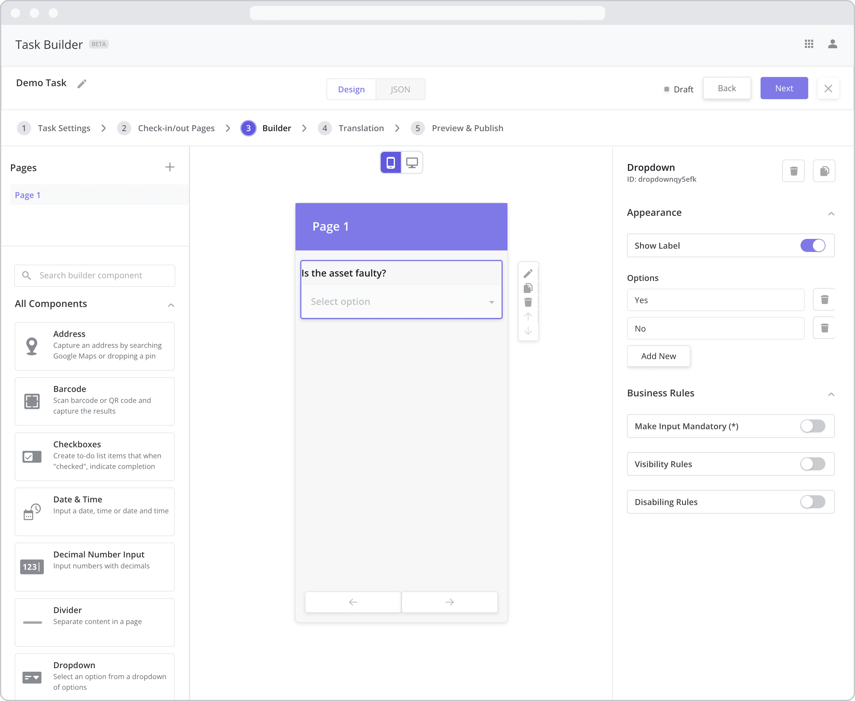
Suppose I have two fields on a dynamic page: a dropdown and a photo component
Dropdown: The dropdown component asks the user to answer the question, “Is the asset faulty?“ with a “Yes” or “No” answer
Photo: The photo component asks the user to “Take a picture of the broken asset”
Condition: In this scenario, I only need to capture the photo of the faulty asset if it is faulty. In other words, if the user selects “No” from the dropdown menu, I want to hide the photo component as I don’t need it.
To define visibility rules in this scenario, I would do the following:
Step 1: Configure the Input Component that sets the visibility condition
Drag and drop a dropdown component onto the Mobile Canvas of a dynamic page
Double-click the label from the canvas to edit it and type “Is the asset faulty?”
Open the Configuration Panel by double-clicking the dropdown component
Add “Yes” and “No” as answer options from the Options setting
Step 2: Add the component you wish to show/hide
Drag and drop a Photo component to your Mobile Canvas and place it below the dropdown component
Double-click the label from the canvas to edit it and type “Take a picture of the fault”
Open the Configuration Panel by double-clicking the Photo component
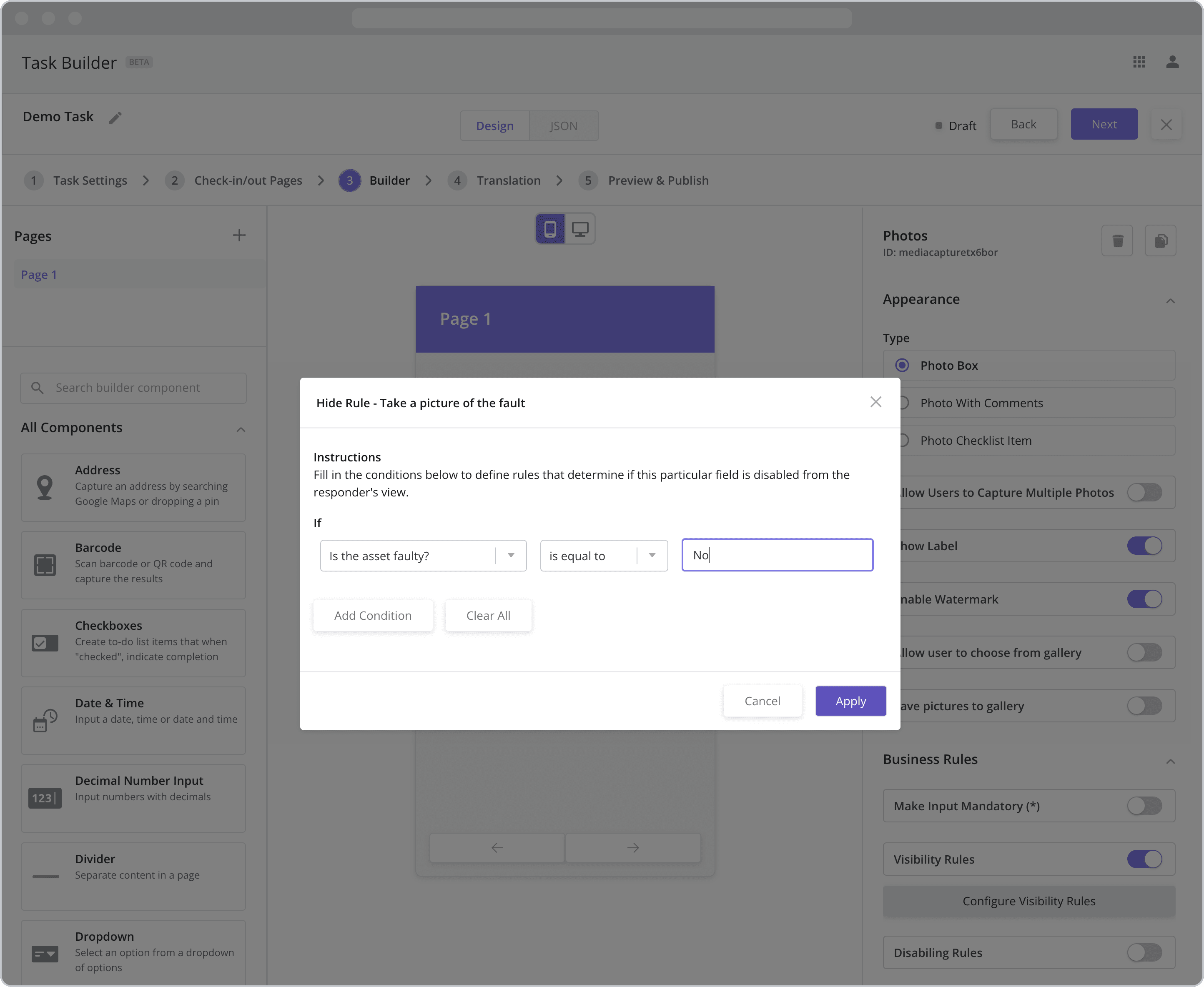
Step 3: Define the Visibility Rules
Enable Visibility Rules for the photo component by clicking on the Visibility Rules toggle
Click on the Configure Visibility Rules button to open the Visibility Rules pop-up
Fill in the “If” condition fields. The component will be hidden from the mobile user if the conditions are met:
*Reference question: The dropdown menu below “If” lists all of the existing input components in the mobile task. Select the “Is the asset faulty?” component from the list as the “reference question”.
Operator: The next dropdown contains a list of operators (“is equal to”, “is not equal to”, etc.) that act upon the value you choose below. Select “is equal to” from the list.
Value: Enter “No” as the value. The condition will be met and the photo component hidden if the mobile user selects an answer option that “is equal to” “No” from the “Is the asset faulty” dropdown/reference question.
Adding Additional Conditions: In this example, there is no need to add additional conditions, but for other use cases, you can do just that but clicking the “Add Condition” button.
Click Apply to save the rule
*To be visible as a Reference question in the first field above, the component MUST have a label as the label is used to identify it in the list.
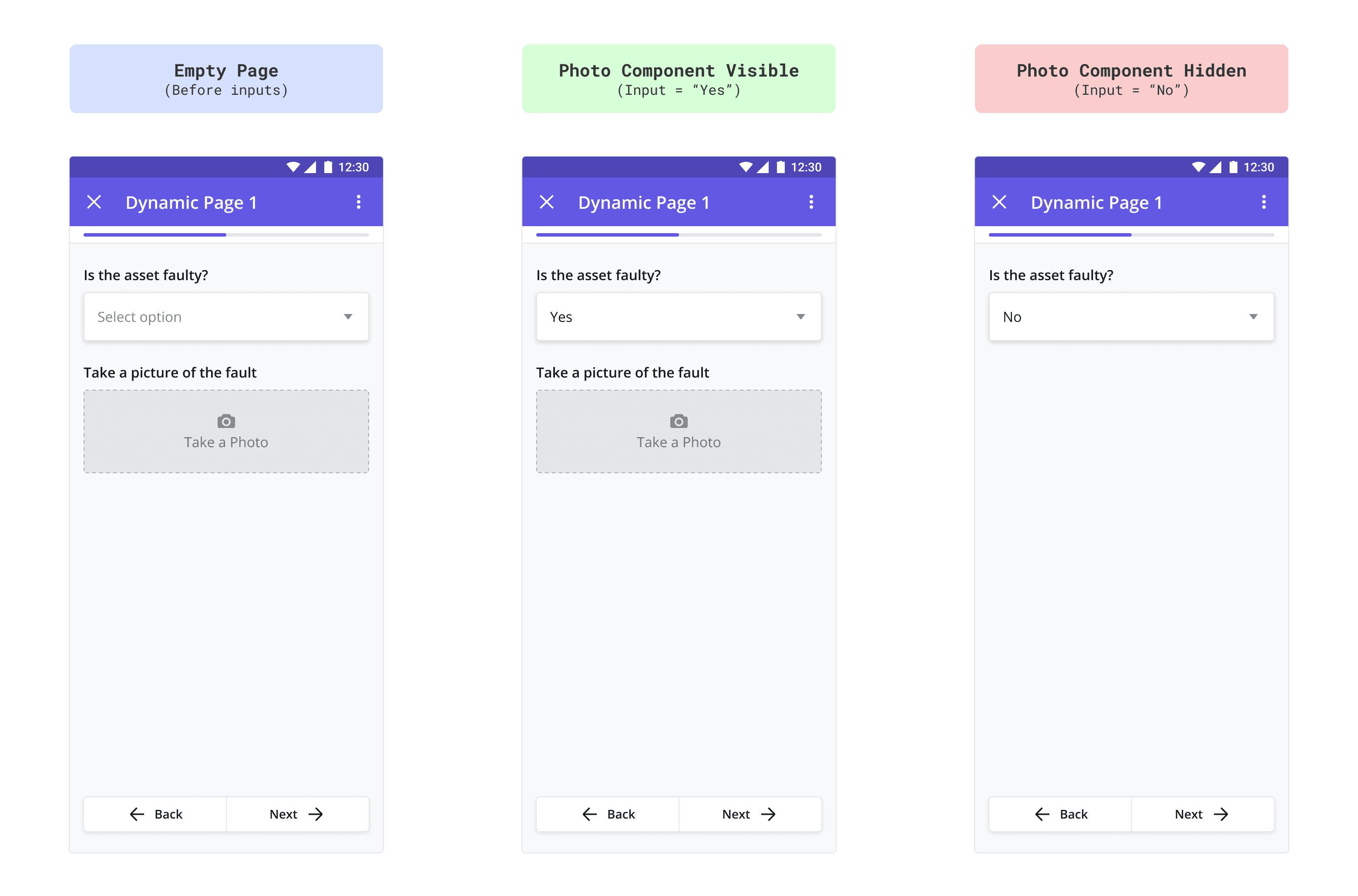
Resulting Mobile Workflow Pages from the Example
The mobile screens below show the page before and after filling in the dropdown menu. In the last screen, because the user selected “No” from the dropdown menu, the Visibility Rules are met and the photo component is hidden.
Disabling Rules NEW (25.6)
When a component is disabled, it remains visible but becomes read-only and non-interactive. Disabling Rules let you dynamically disable a component based on inputs from other components within the task.
Enabled: When Disabling Rules are enabled, a “Configure Disabling Rules” button appears. Clicking this button opens a pop-up where you can define the logic to disable the component based on specific conditions.
Disabled: If Disabling Rules are not enabled, the “Configure Disabling Rules” button remains hidden.
Because Disabling Rules depend on inputs from other components, we recommend completing all dynamic page configurations before setting up these rules.
Disabling Rules Example
To explain how Disabling Rules work, let’s use an example.
Suppose I have two dropdown fields on a dynamic page.
Dropdown 1: The dropdown component asks the user to answer the question, “What caused the issue?“ with a list of possible causes, one of which is “Unable to identify the cause”
Dropdown 2: The dropdown component asks the user to answer the question, “What was the resolution?“ with a list of possible resolutions
Condition: In this scenario, I want to disable the list of resolutions if the technician was unable to determine what caused the issue. In other words, if the technician selects “Unable to identify the cause” from the dropdown menu, I want Dropdown 2 to be disabled, as I don’t need the technician to fill in the resolution.
To define disabling rules in this scenario, I would do the following:
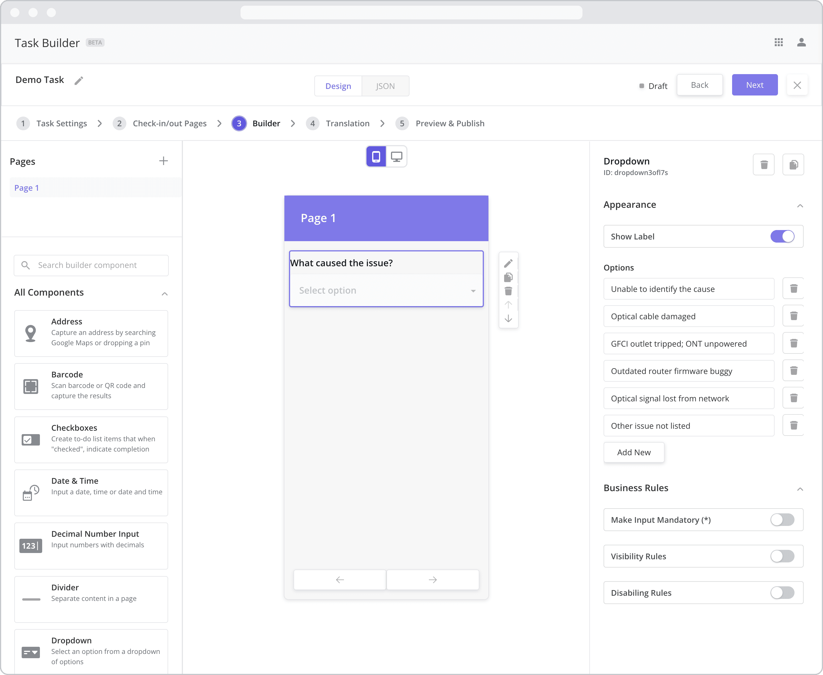
Step 1: Configure the Input Component that sets the disabling condition
Drag and drop a dropdown component onto the Canvas of a dynamic page
Double-click the label from the canvas to edit it and type “What caused the issue?”
Open the Configuration Panel by double-clicking the dropdown component
As answer options, add a list of possible causes for the technician to select from, one of which should be “Optical cable damaged”
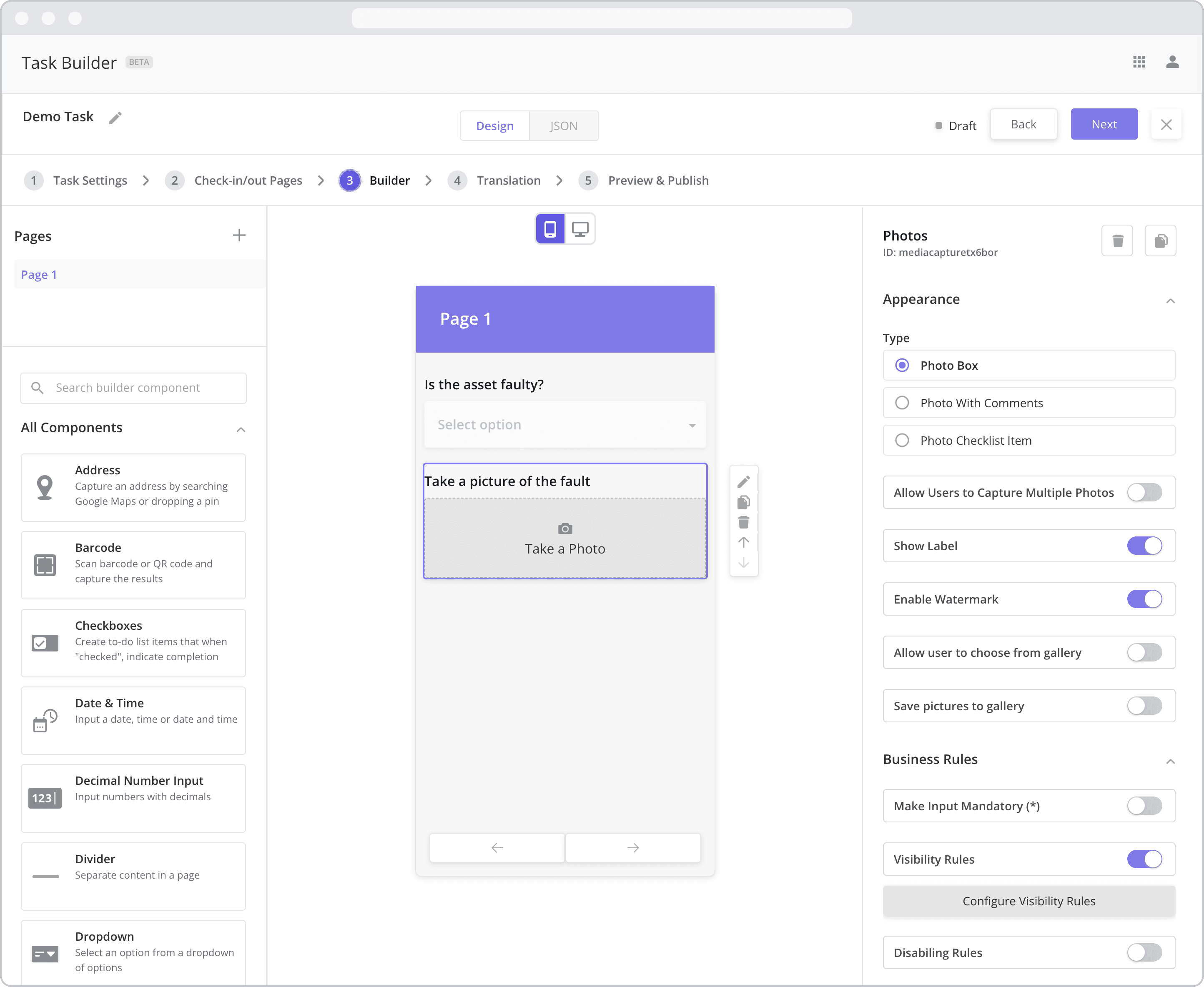
Step 2: Add the component you wish to disable
Drag and drop another dropdown component to your Mobile Canvas and place it below the first dropdown component
Double-click the label from the canvas to edit it and type “What was the resolution?”
Open the Configuration Panel by double-clicking the component
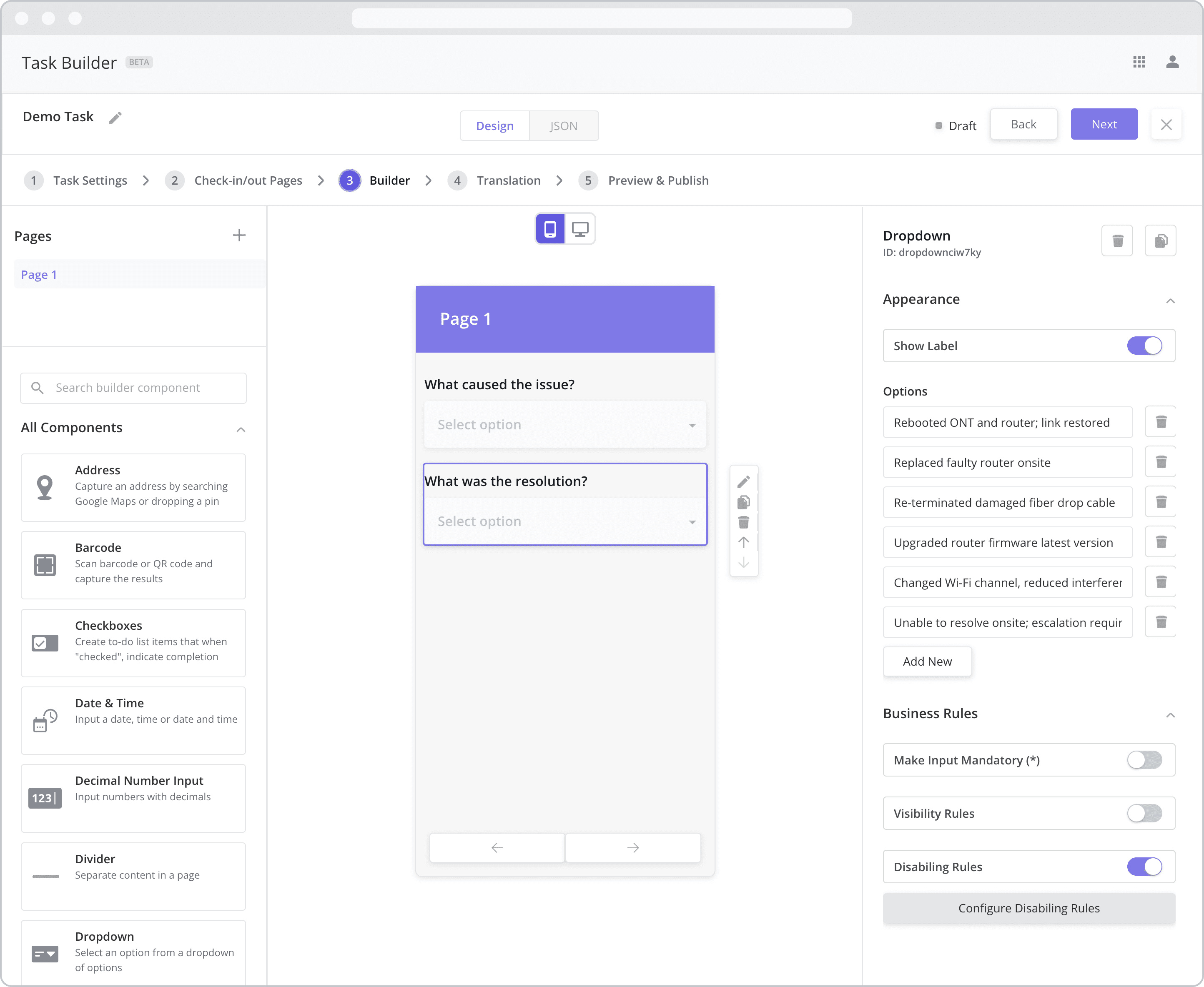
Step 3: Define the Disabling Rules
Enable Disabling Rules for the second dropdown component by clicking on the Disabling Rules toggle
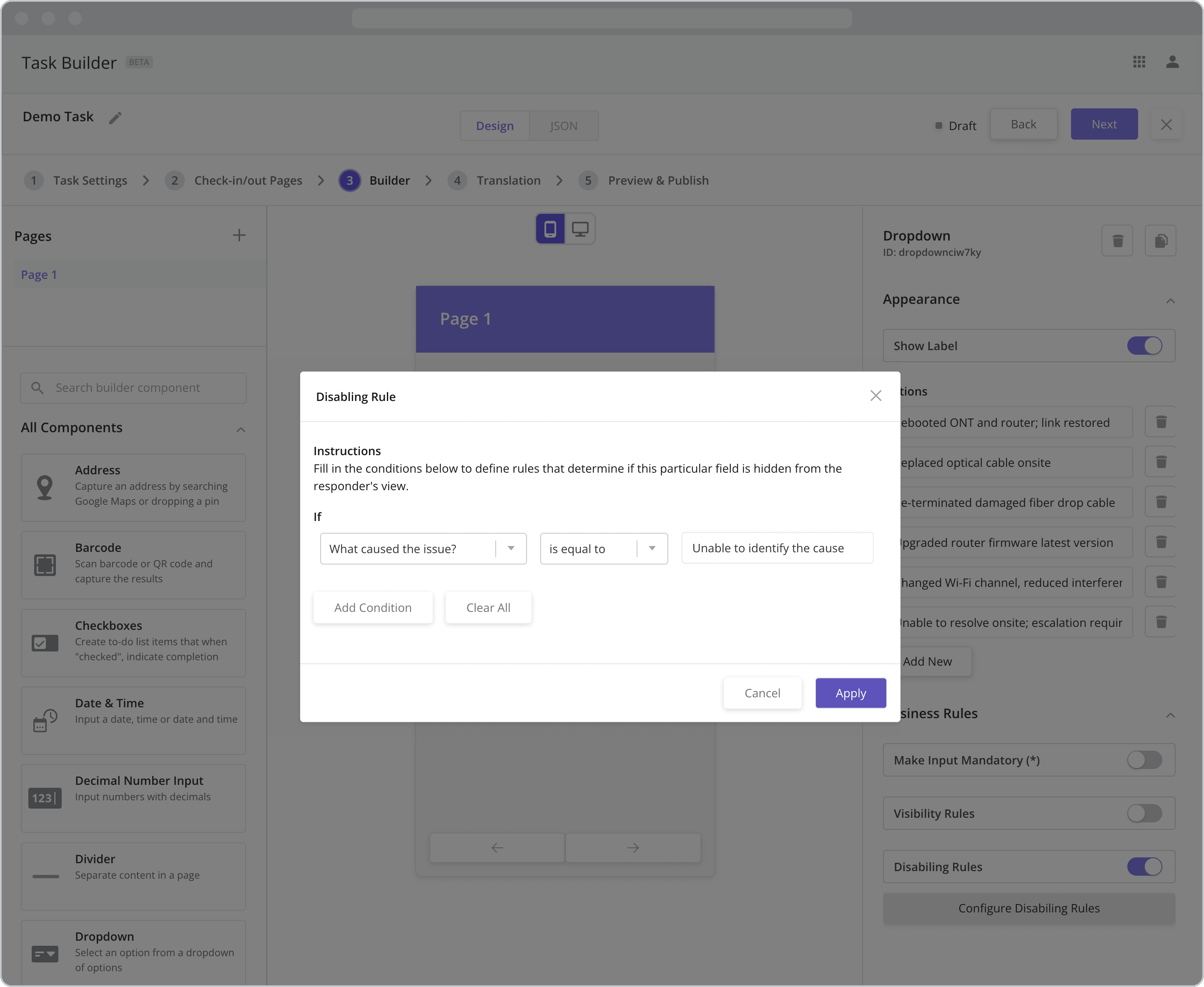
Click on the Configure Disabling Rules button to open the Disabling Rules pop-up
Fill in the “If” condition fields. The component will be disabled for the mobile user if the conditions are met:
*Reference question: The dropdown menu below “If” lists all of the existing input components in the mobile task. Select the “What caused the issue?” component from the list as the “reference question”.
Operator: The next dropdown contains a list of operators (“is equal to”, “is not equal to”, etc.) that act upon the value you choose below. Select “is equal to” from the list.
Value: Enter “Unable to identify the cause” as the value. The condition will be met and the component disabled if the mobile user selects an answer option that “is equal to” “Unable to identify the cause” from the “What caused the issue?” dropdown/reference question.
Adding Additional Conditions: In this example, there is no need to add additional conditions, but for other use cases, you can do just that but clicking the “Add Condition” button.
Click Apply to save the rule
*To be visible as a Reference question in the first field above, the component MUST have a label as the label is used to identify it in the list.
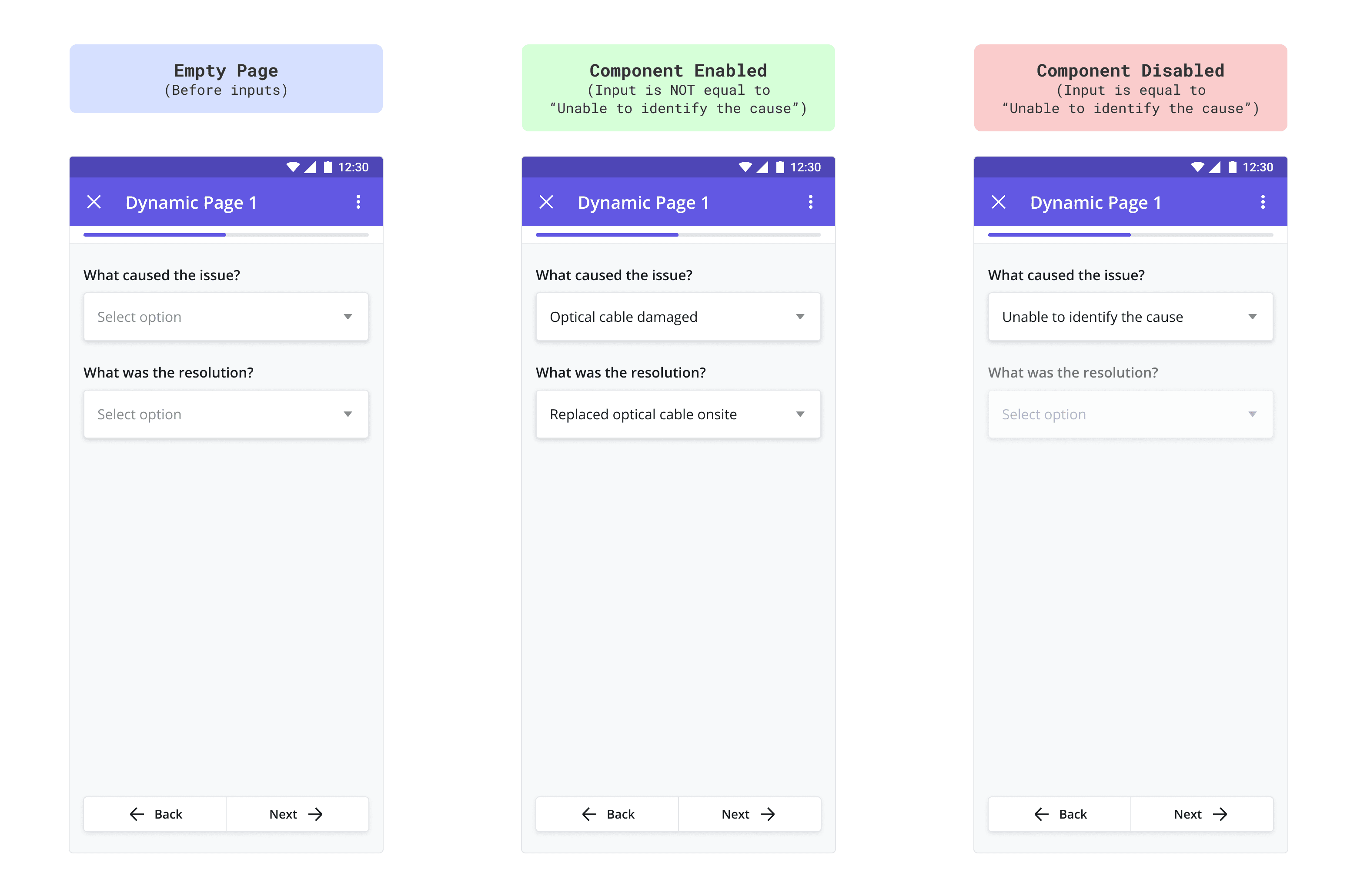
Resulting Mobile Workflow Pages from the Example
The mobile screens below show the page before and after filling in the dropdown menus for both disabled and non-disabled scenarios. In the last screen, because the user selected “Unable to identify the cause” from the dropdown menu, the Disabling Rules are met, and the second dropdown menu is disabled.