Step 3: The Page Builder
After configuring the Check-in / Check-out Pages, click the Next button on the top navigation bar of the wizard. Doing so takes you to the third step of the process: using the Builder to create the dynamic pages and subpages you’d like to add to the mobile workflow template.
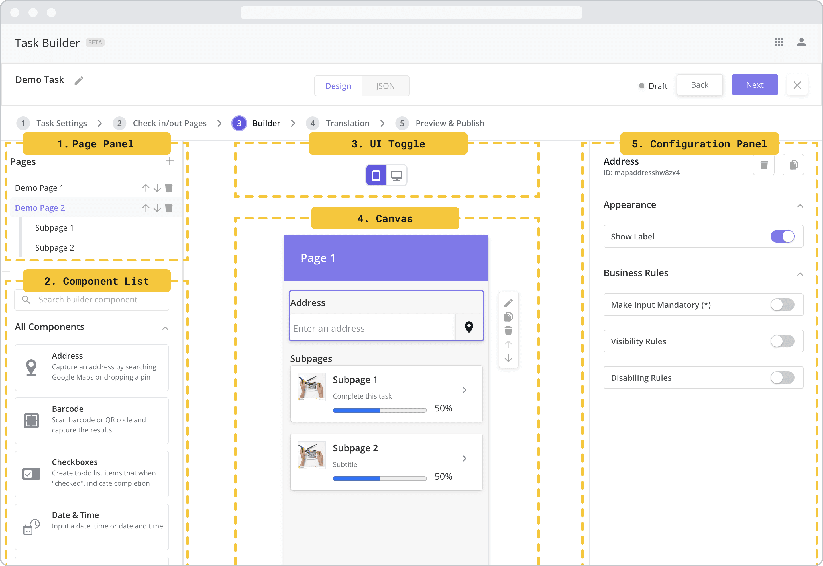
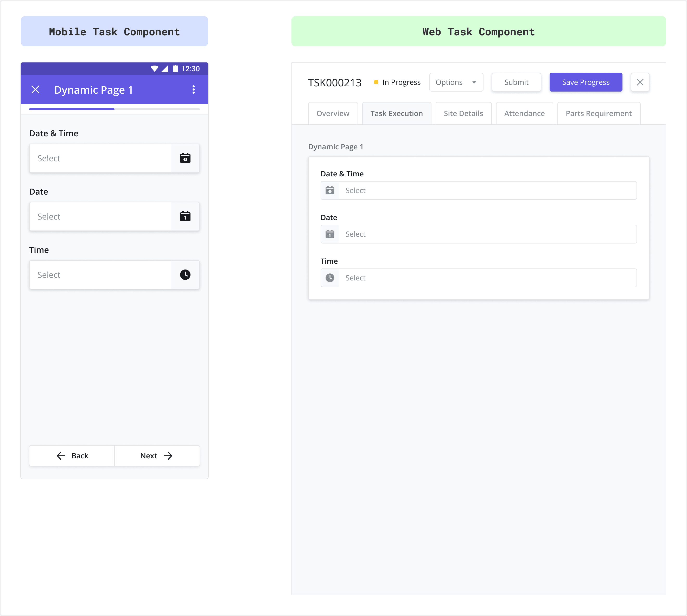
Builder Layout NEW (25.6)
The builder is composed of a few different sections (see image below) which we will refer to in the pages that follow:
Page Panel: This section shows the dynamic pages and subpages in the task. Clicking on a page from this panel opens the Mobile Canvas associated with that page.
Components List: This section displays a list of mobile components that can be dragged to the Mobile Canvas of the selected dynamic page/subpage. This list is also searchable using the search bar.
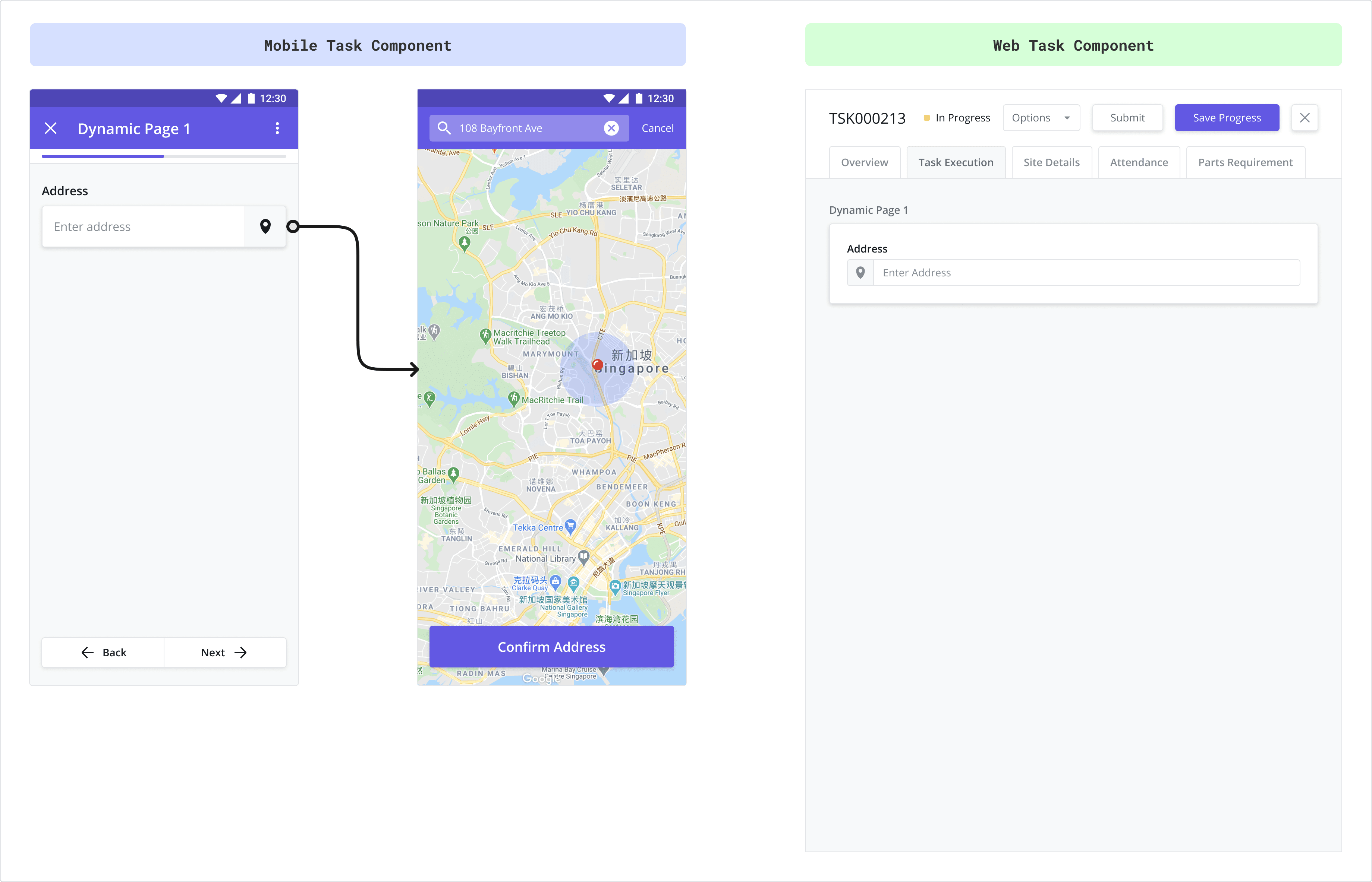
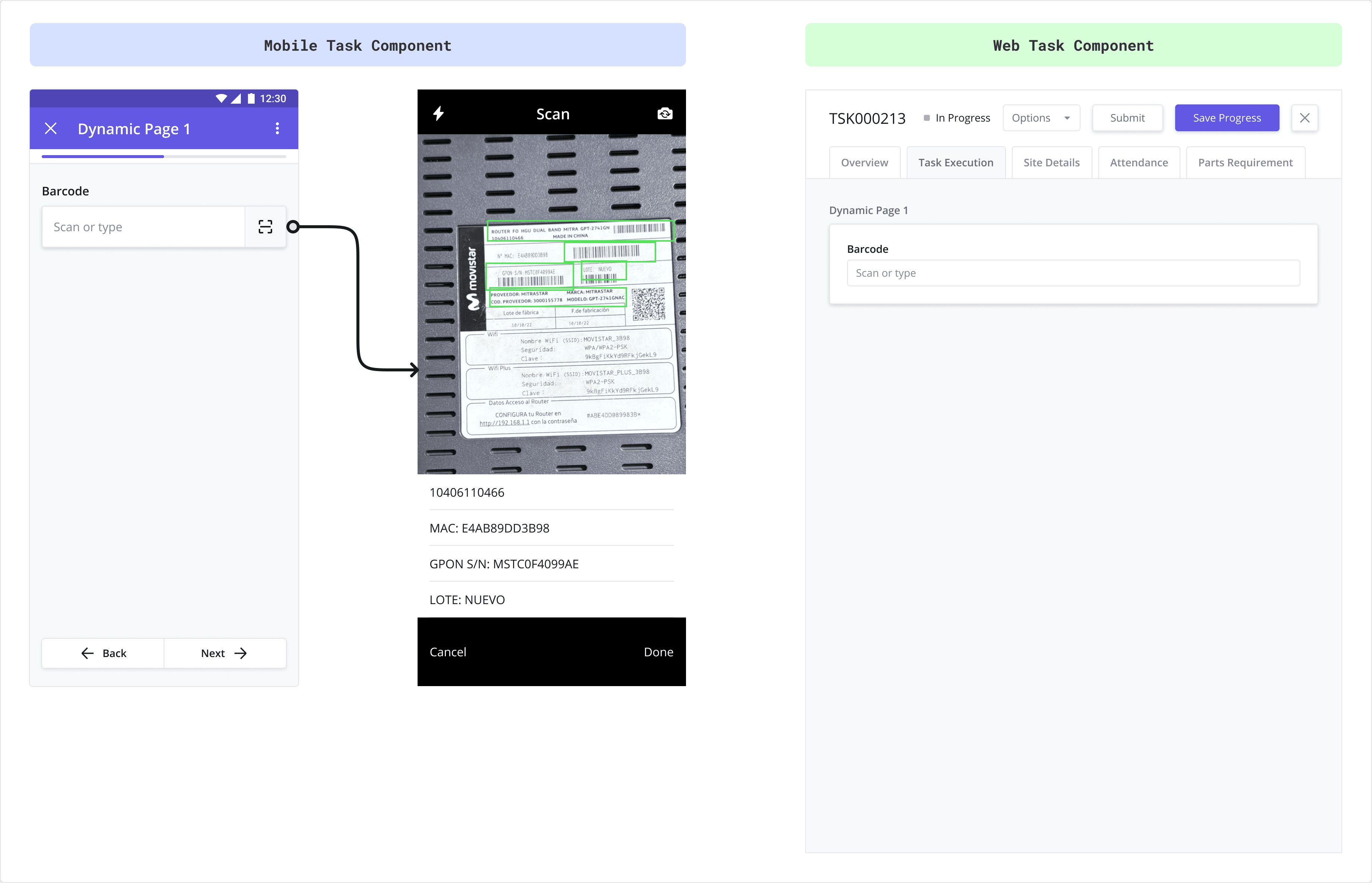
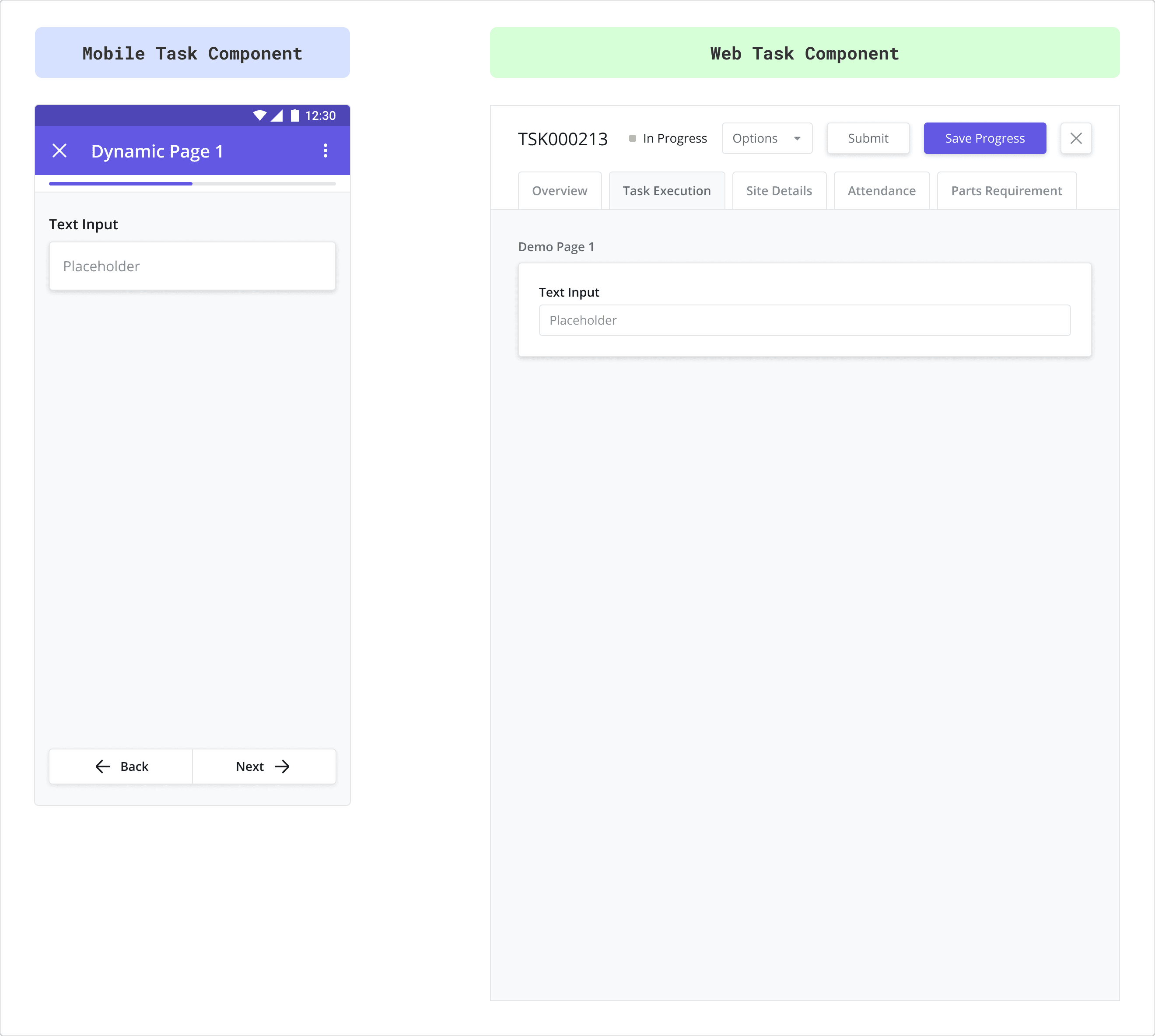
UI Toggle: Allows you to switch between previewing the task as a Web Task (how it will look in the sidepanel using the Web App) and a Mobile Task (how it will look on the mobile app).
Canvas: This section shows a preview of what the page will look like to technicians viewing the page from the mobile app or from the web app – depending on which UI toggle is selected. Click and drag components from the Component List here to build your page.
Configuration Panel: This section appears when you either double-click a component that has been added to the Mobile Canvas or when you click the “Edit” icon that appears after selecting a component.
Editing Basics
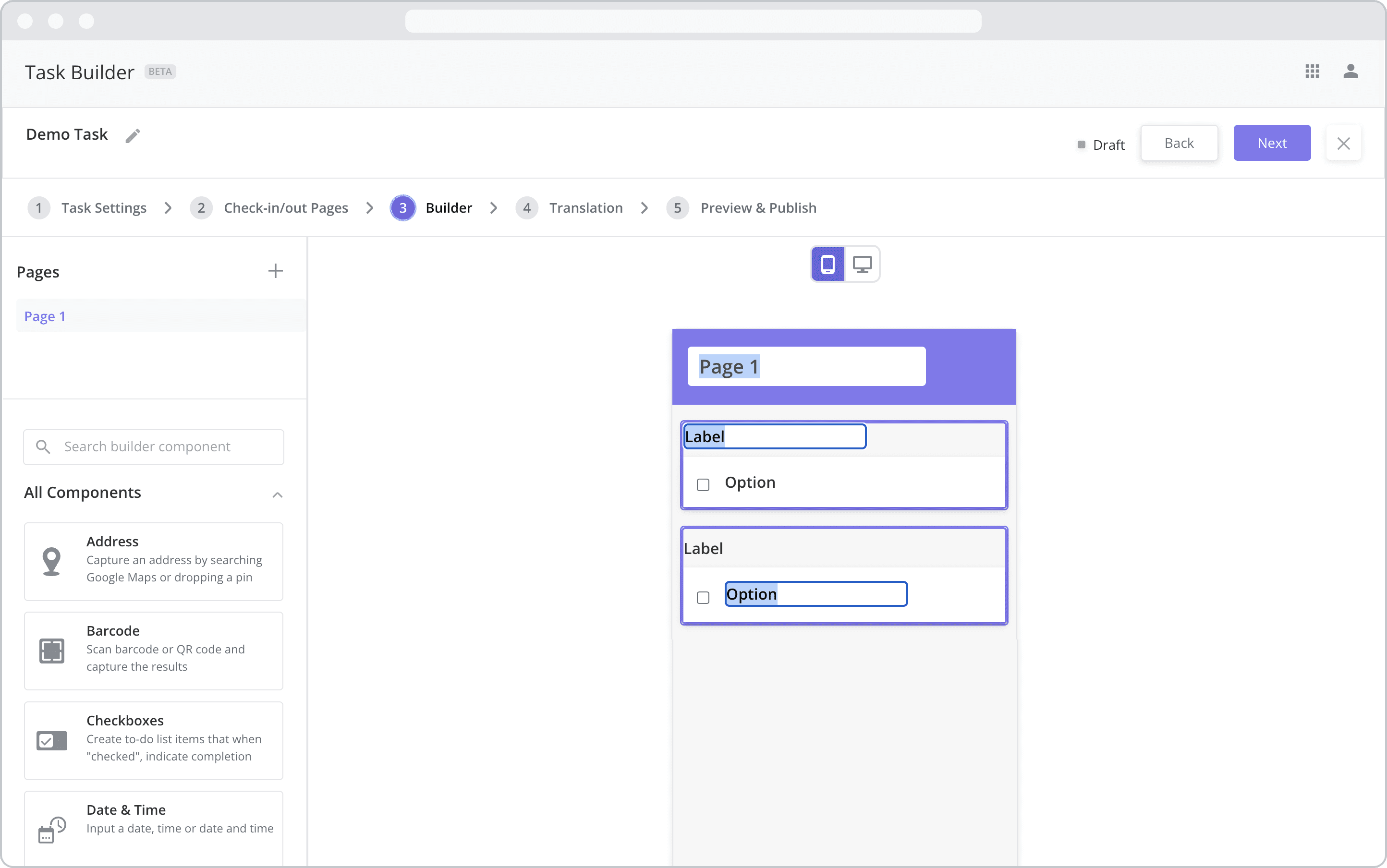
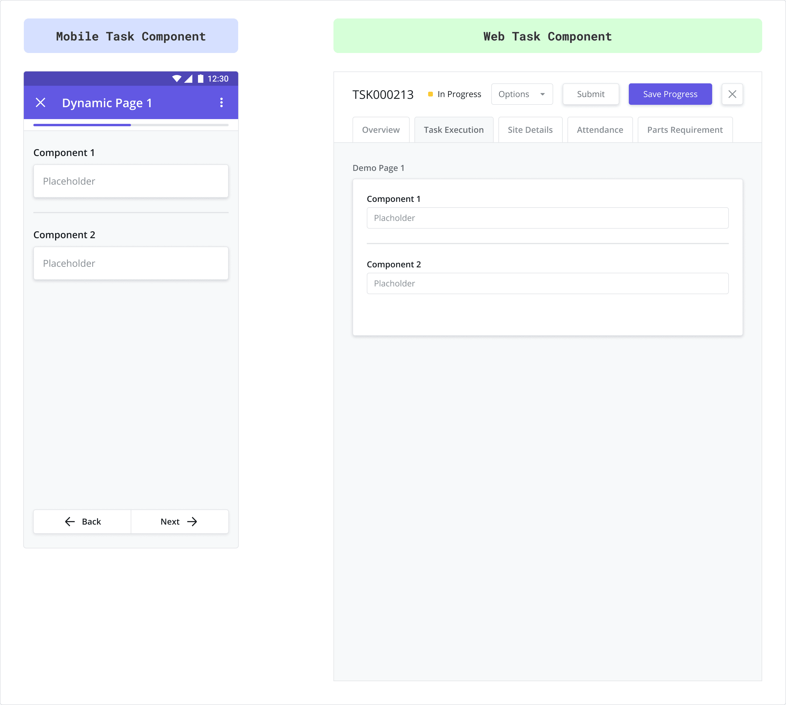
In-line Text Editing and Editing Page Names
When creating a new task, the Builder will automatically generate an initial page called “Page 1”. To edit the page name in-line, simply click on the name in mobile canvas to bring up the text editor. In fact, most of the text fields associated with the components can be edited by double-clicking the text from the canvas and editing the text in-line.
Certain fields – such as answer options for the Single Select component – must be edited from the configuration panel.
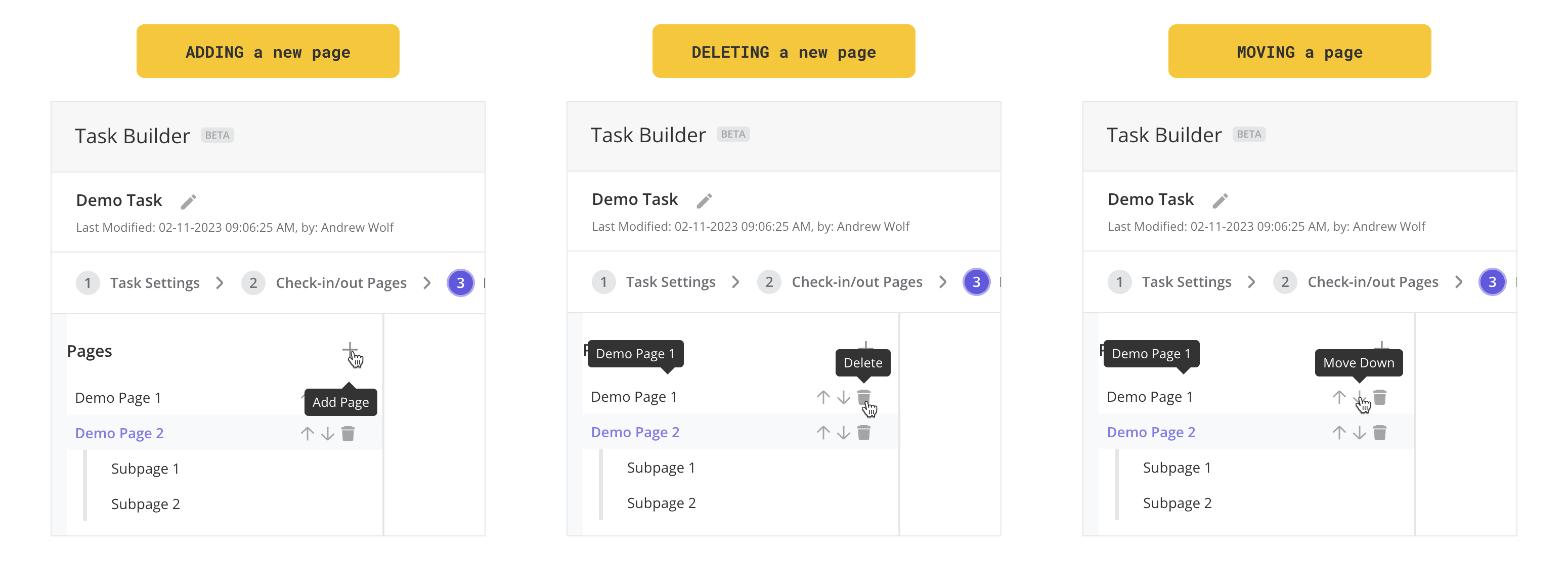
Managing Pages
Dynamic pages and subpages are managed from the Page Panel where you can perform the following actions:
Add a new dynamic page: To add a new dynamic page, click the “+” button at the top right of the panel.
Delete a dynamic page: To delete a dynamic page, click the “delete” button which becomes visible once the page is selected.
Re-order pages: To change the order of a dynamic page, click the “up” and “down” arrows which become visible once the page is selected.
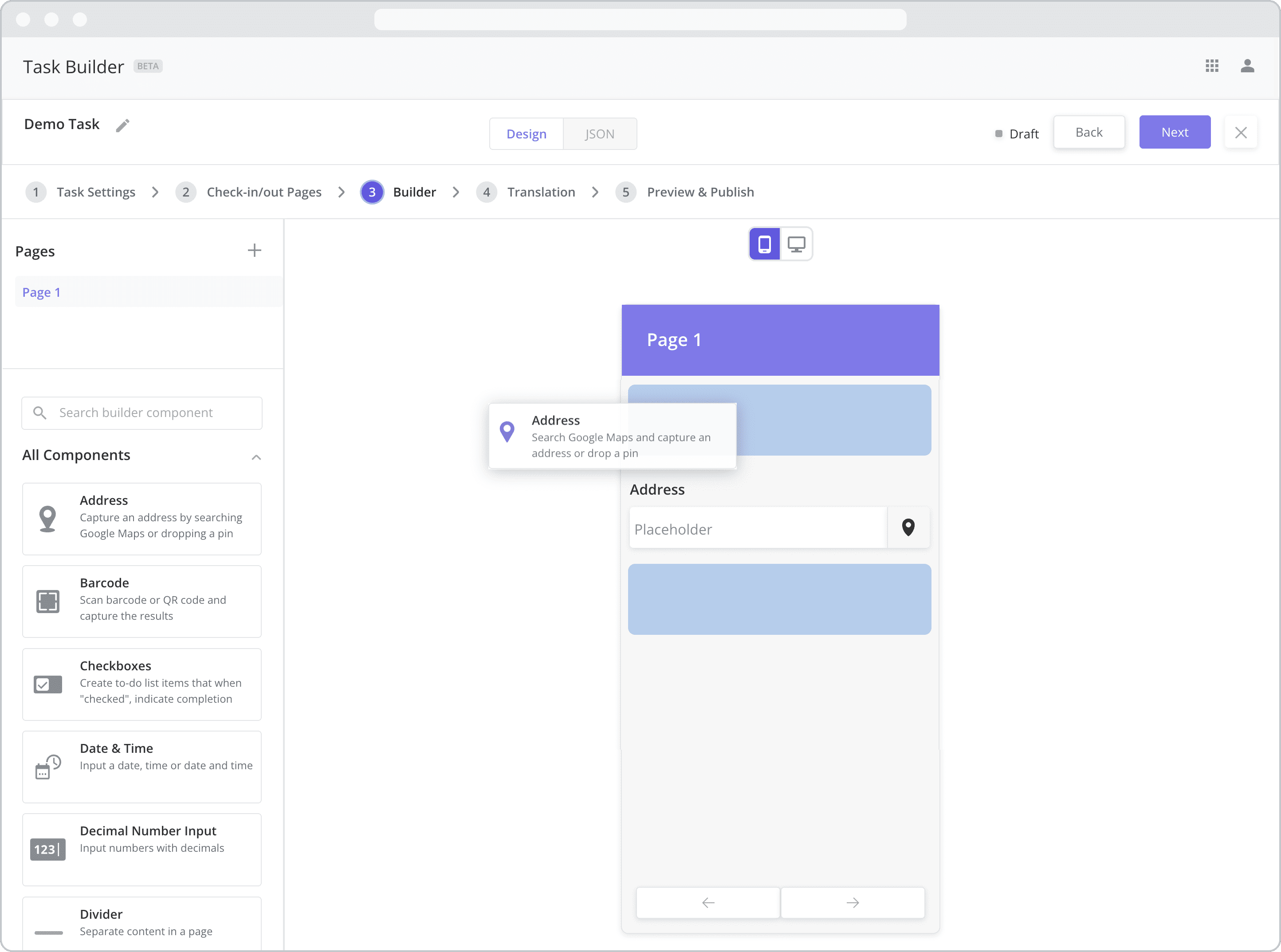
Adding Components to a Page
To add a component to a page, do the following:
Click and hold the component in the Component List that you wish to insert
Drag your cursor to the place on the Mobile Canvas where you wish to insert it. Blue “helper” boxes will appear on the canvas to indicate the location where the component can be inserted.
Release your mouse to drop the component
Managing Components on a Page
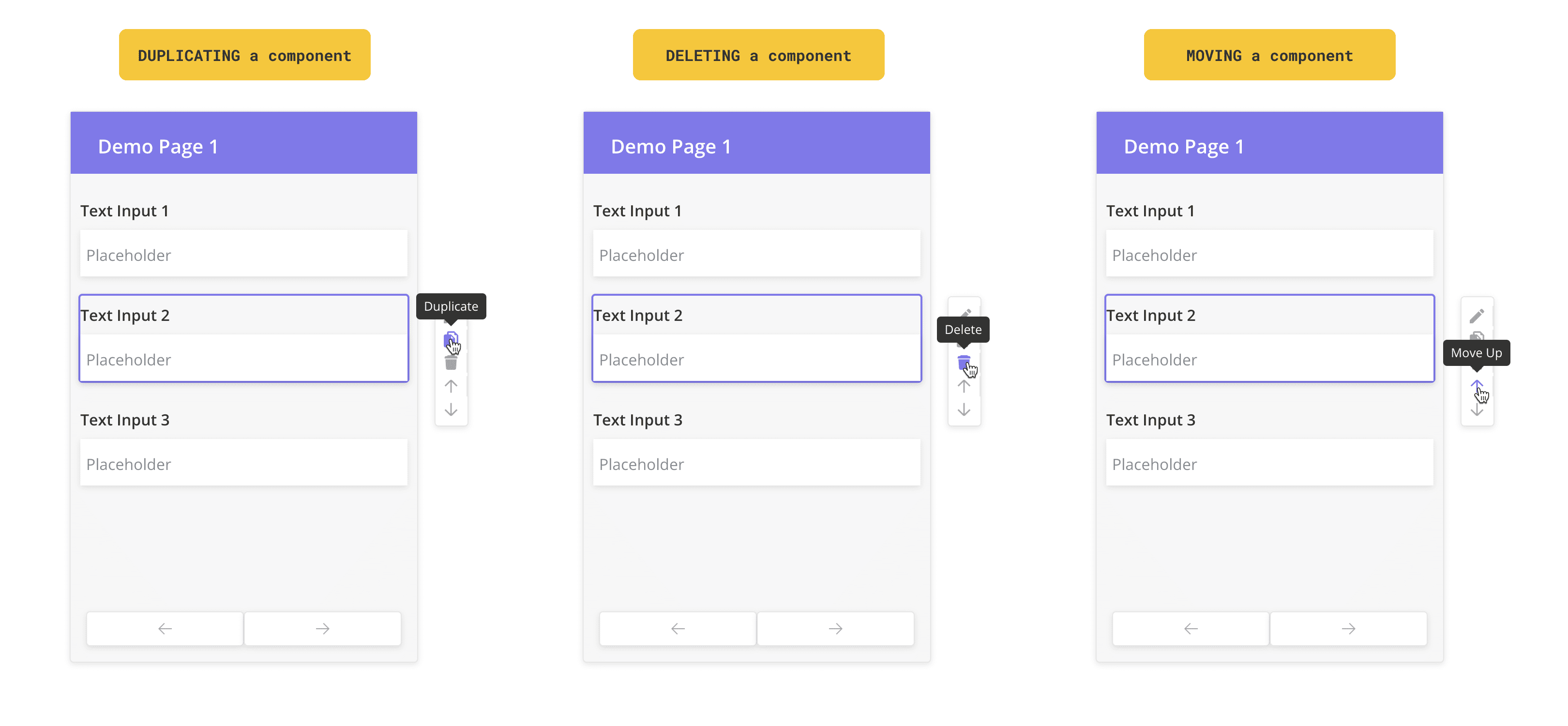
Components can also be copied, deleted, and re-arranged after they have been added to the Mobile Canvas:
Duplicate a component: To duplicate a component on a page, click the “Copy” button which becomes visible once the component is selected from the Mobile Canvas.
Delete a component: To delete a component from a page, click the “delete” button which becomes visible once the component is selected from the Mobile Canvas.
Re-ordering components: To change the order of components on a page, click the “up” and “down” arrows that become visible once the component is selected from the Mobile Canvas.
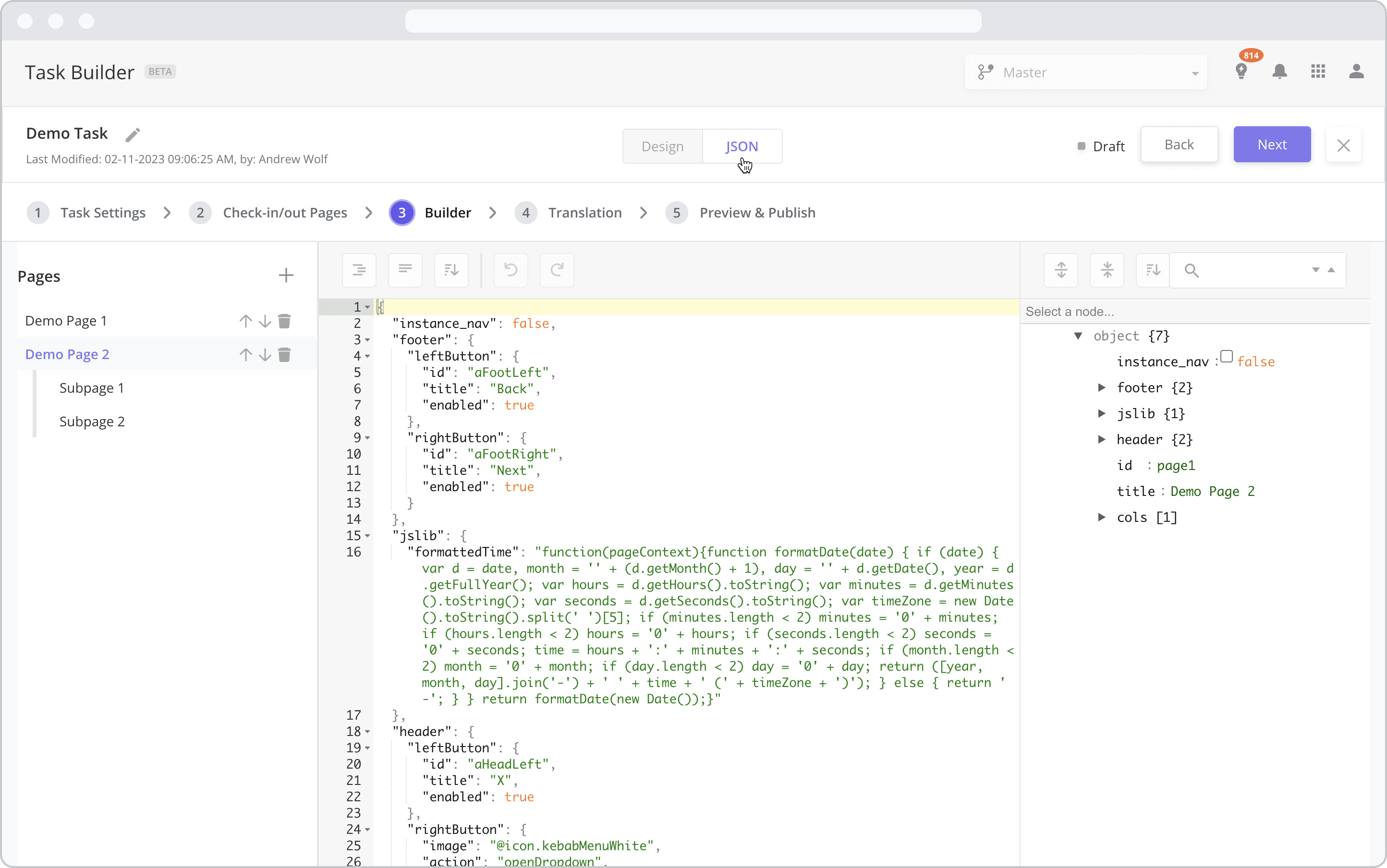
Design Mode vs. JSON Mode
Advanced users can view and edit the JSON code associated with the mobile workflow by clicking the JSON button at the top of the canvas. Doing so opens a JSON editor, allowing developers to inject custom code and leverage more advanced configurations. To switch back to drag-and-drop builder (“Design” mode), click the Design button.
In order to view the JSON editor in the Task Builder, the Entity Config “enableTaskBuilderJsonEditor” must be set to “true”. This is done by navigating to the Admin App > Org Config module and editing the “enableTaskBuilderJsonEditor” record. JSON editing is for advanced users only, so if you don’t see the JSON button and wish to access it, please contact your administrator to make the change.
WARNING: Changes you make to the JSON are automatically saved, so it is not recommended that you use JSON mode if you are not familiar with it. Changes you make to the JSON code will be reflected in Design mode where possible.
Component List
The Component List displays a list of mobile components that can be dragged onto the Mobile Canvas of the selected dynamic page/subpage. The table below lists the components currently supported by the Builder.
For detailed instructions on how to configure each component, click on the hyperlink of the component or navigate to the respective component’s page.
Search Google Maps and capture an address or drop a pin at a specific lat/long on a map and store the address and coordinates in the system.
The Barcode component allows you to scan barcodes and QR codes of assets and inventory instead of having to input the codes manually.
Use this component to select multiple answers from a list of answer choices.

This component captures the date and/or time. Tapping on it brings up a calendar and a clock popup. The time displayed to the user will be in the corresponding timezone and locale of the user's device.
A field that takes only numbers as an input. Rules can be set to define the number of integers required and to mandate a minimum and maximum value for the number being entered.

The Divider component is a UI component that can be used to help separate and organize components within a page.
The dropdown component allows mobile users to select a single value from the list of options.

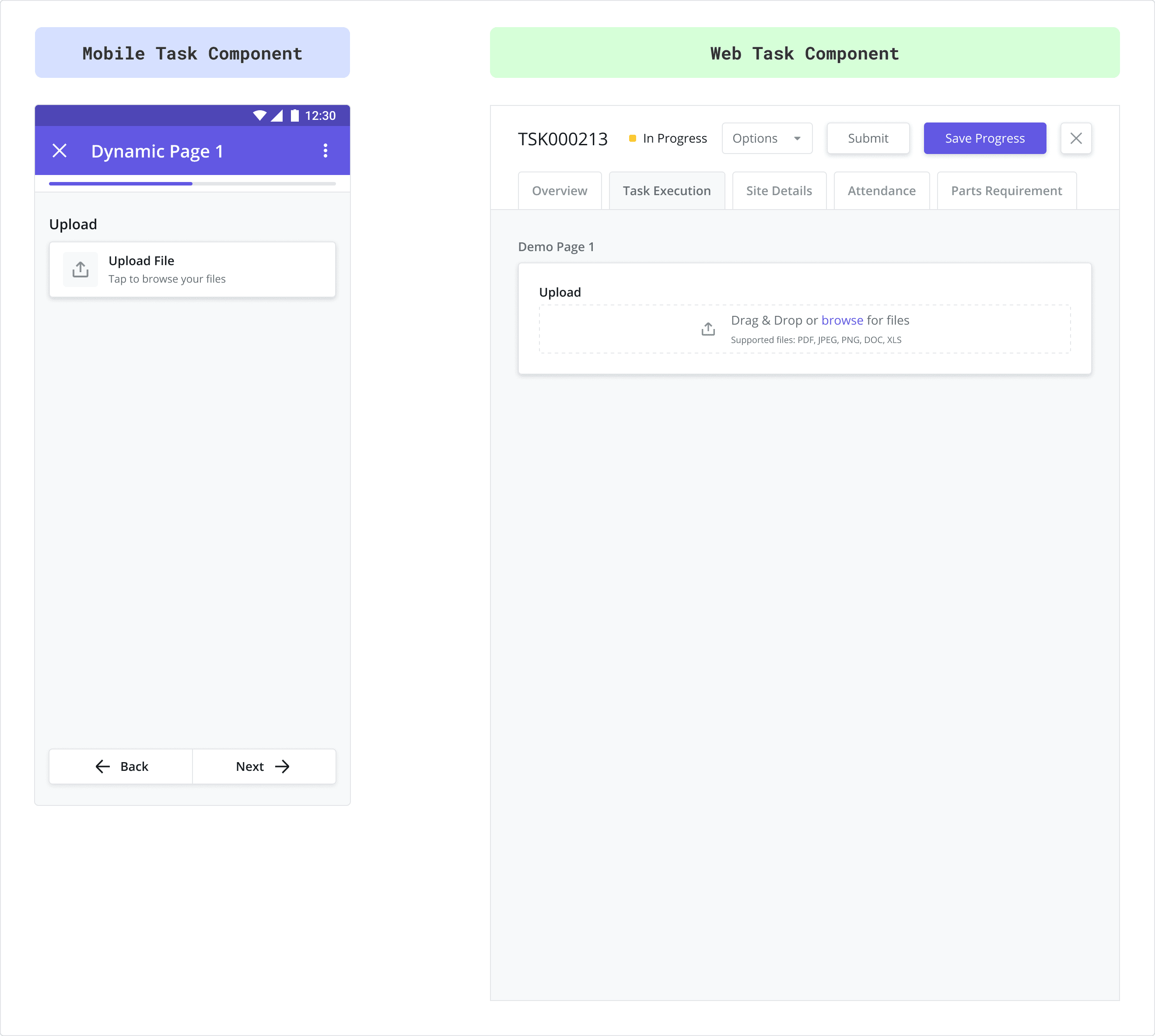
Use this component to upload files and other documents.
Use this component to display a specific, read-only image to the user (configured by entering the URL of the image). Typically used to provide instructions or guidance, this differs from the “Photo” component, which asks the user to take a photo.
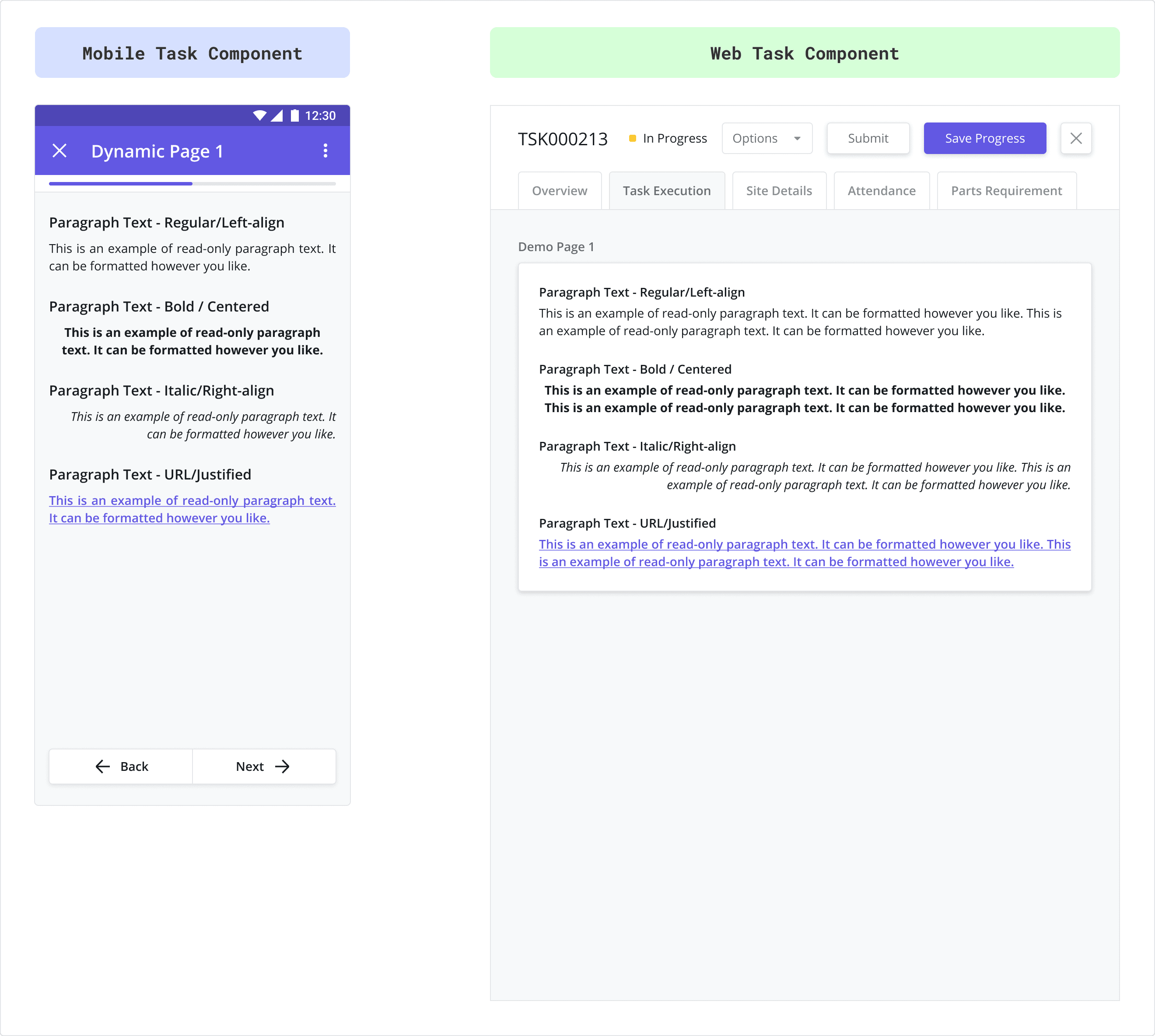
Use this component to display formatted, read-only text to the user. Typically used to provide instructions or guidance, this differs from the “Text Input” component, which captures text entered by the user.
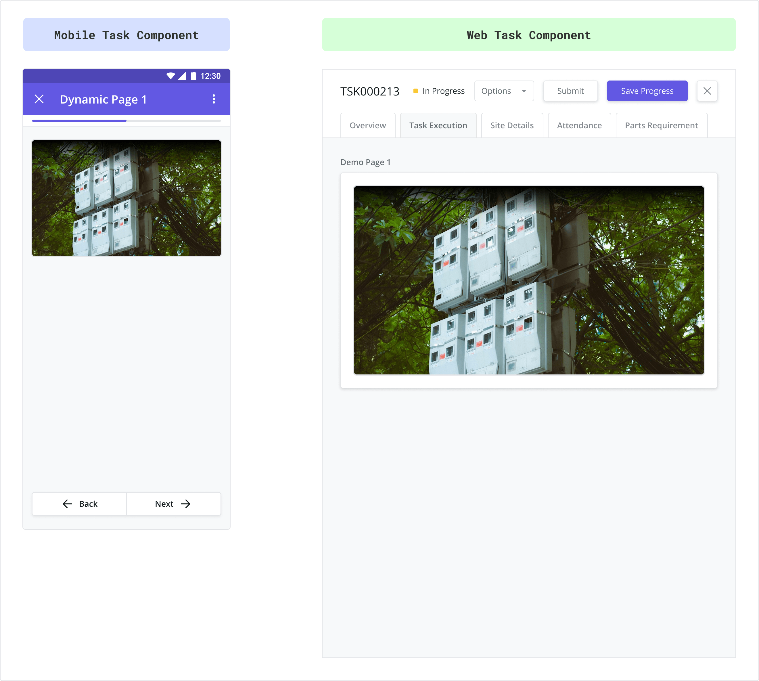
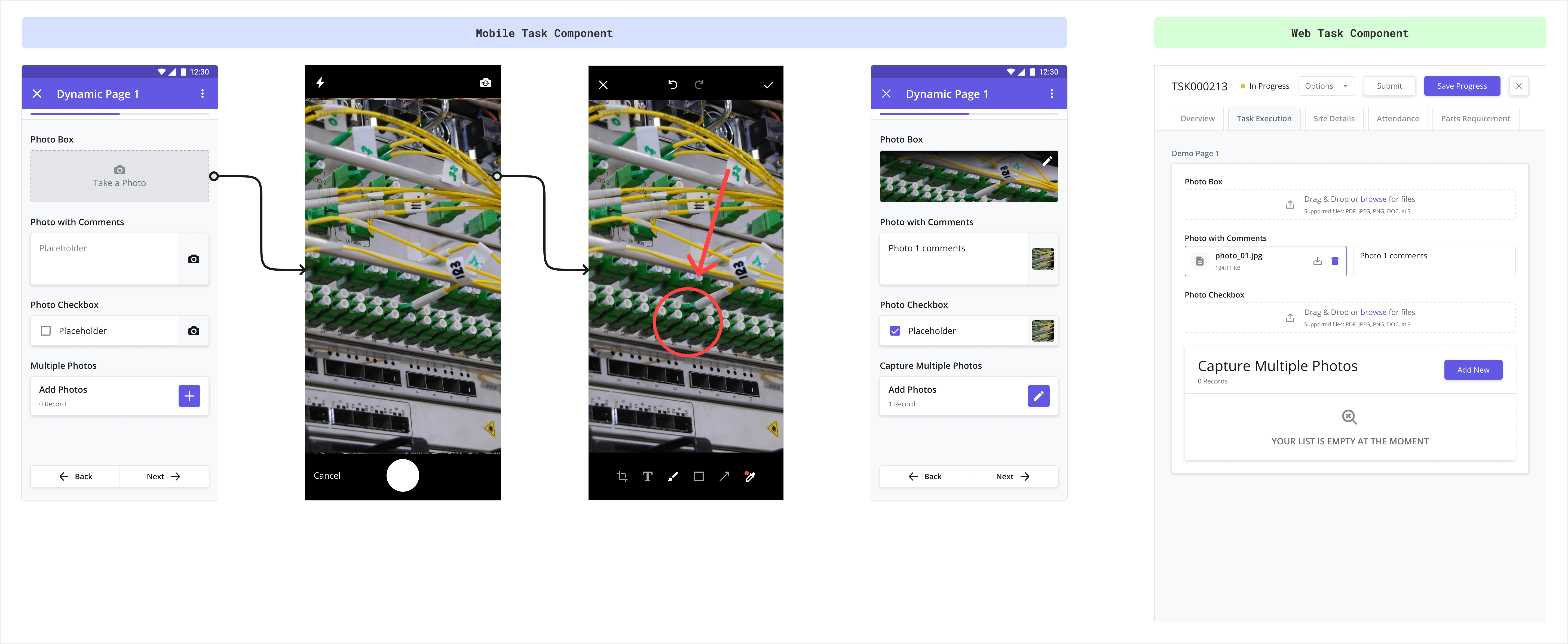
Photo
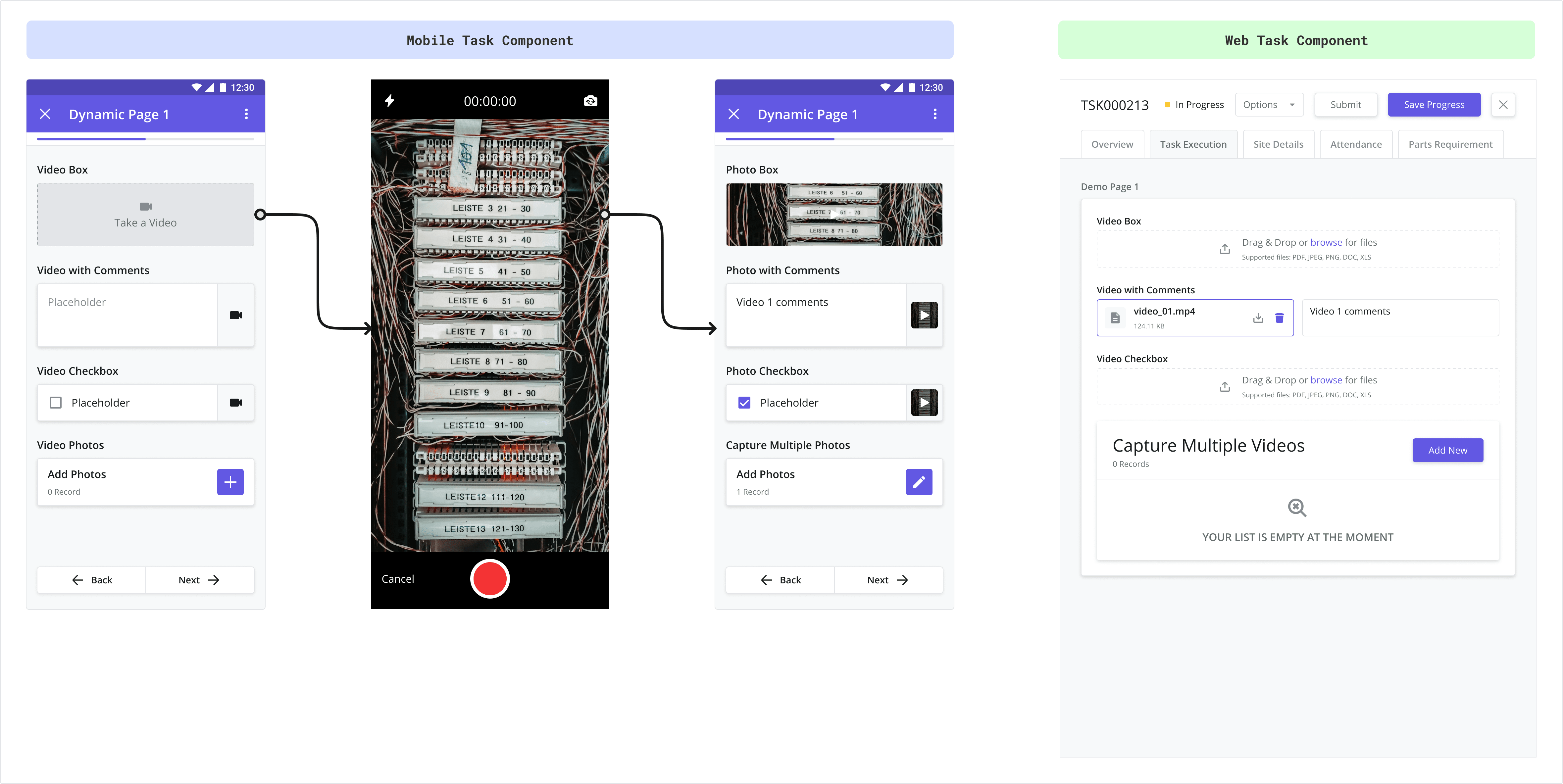
Photo components are used to capture one or more photos from the user’s mobile camera or device gallery.
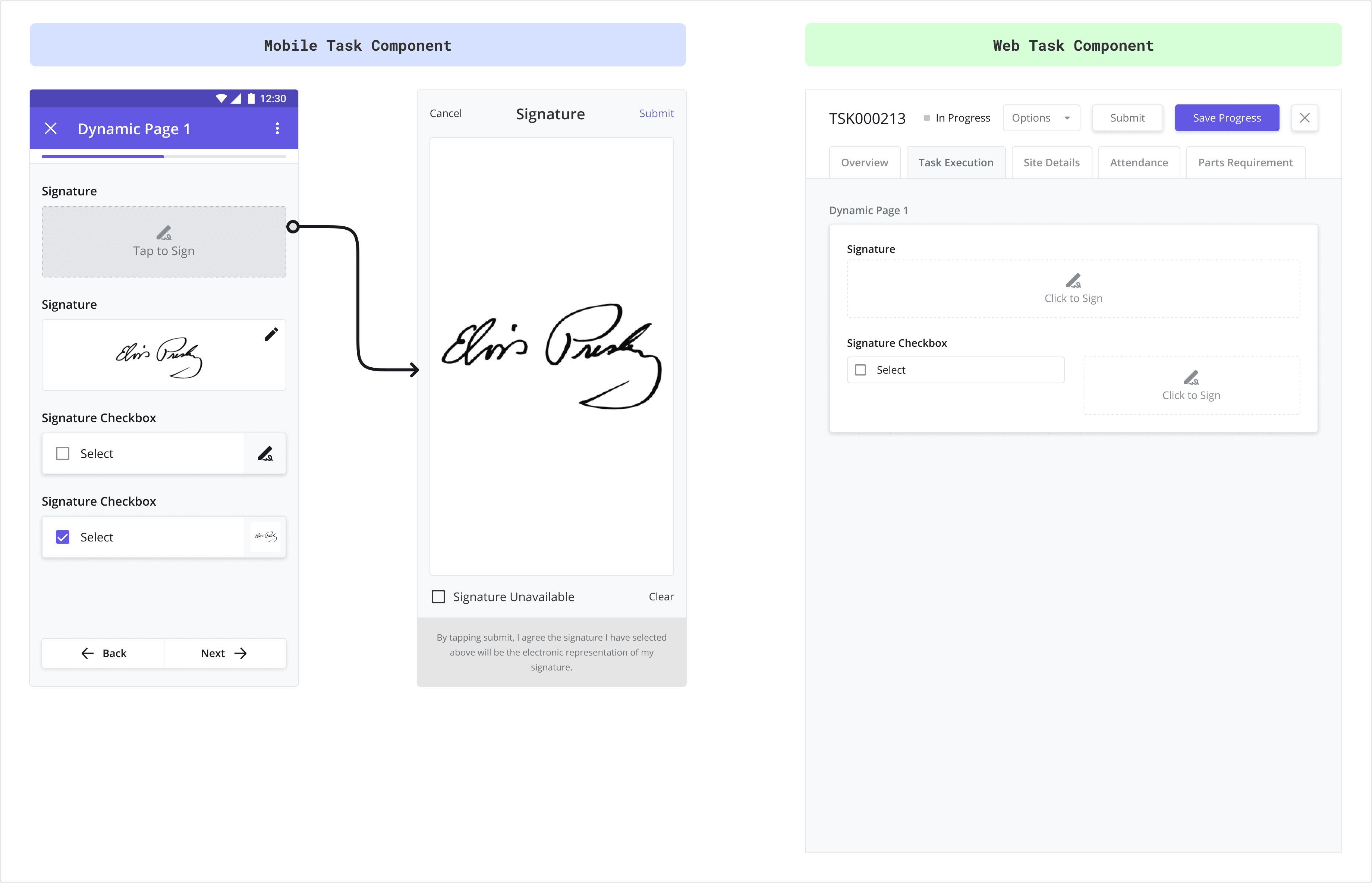
Use this component to capture a signature (i.e. a customer’s signature) using the touch screen of your mobile device.
Use this component to select a single option from a list of options. It works similarly to the dropdown component.
The best practice is to use the Single Select component when there are only a few options available for the user to choose from.

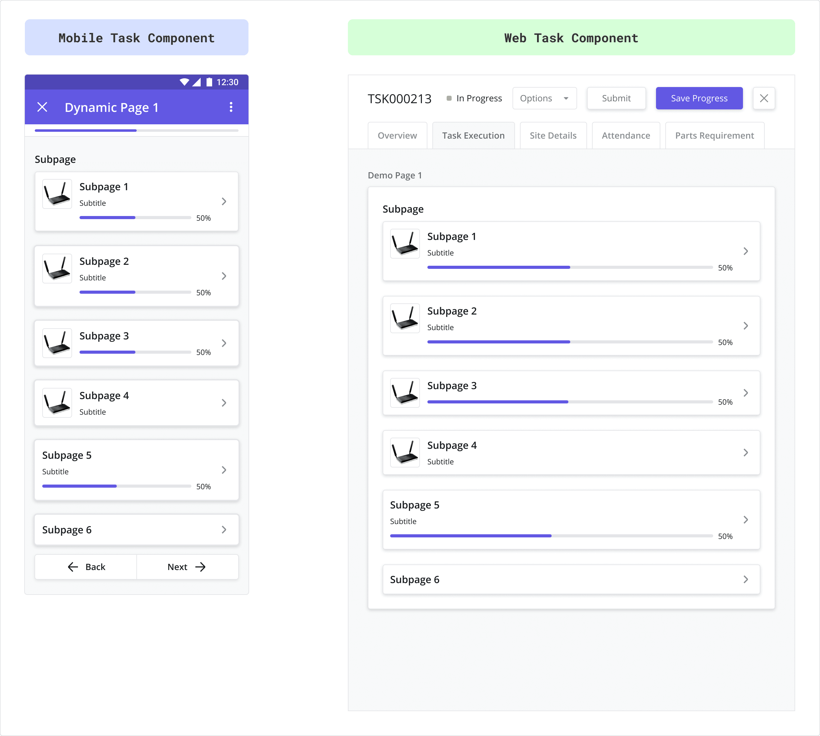
Use Subpages to split your task into distinct, configurable pages. You can configure the subpage card to show varying levels of detail by showing/hiding different elements in the card (i.e. show/hide the progress bar, image, subheader, etc.).
Adding a Subpage component to your layout automatically generates a corresponding Subpage (a child page) to the builder, which can be configured as if it were a blank page.
Use this component to capture a block of text spanning more than one line. Great for capturing comments.
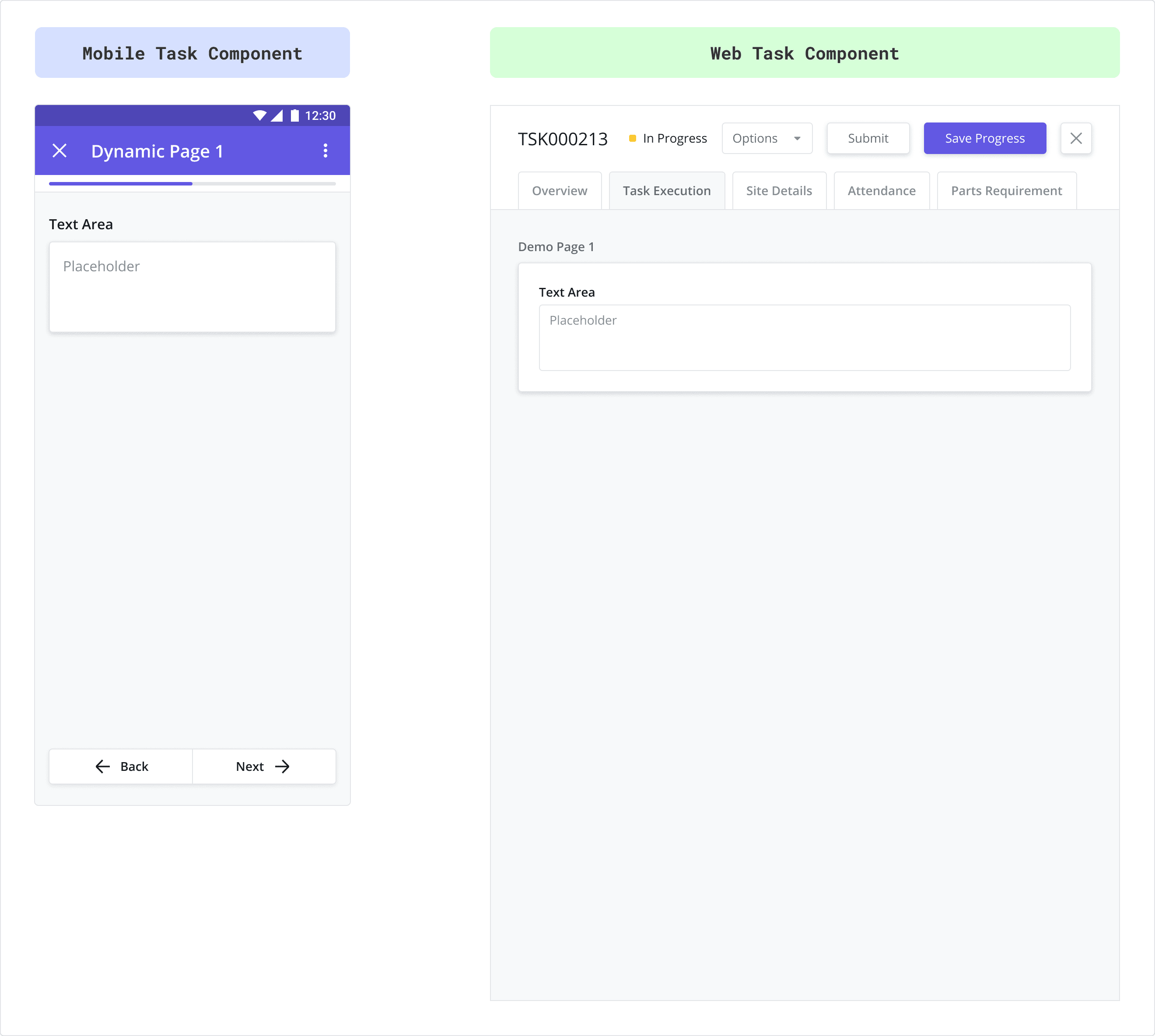
Use this component to capture a small block of text spanning a single line or less.
Video
Video components are used to capture one or more videos from the user’s mobile camera or device gallery. Videos stored on the platform for Task Review are converted to .MP4 format.
After completing Step 3, continue to Step 4: Translations