Subpage
UPDATED (25.6)
Subpages are dynamic pages that can be linked to a main page to split your task into distinct, configurable pages. Adding a Subpage component to your layout automatically generates a corresponding Subpage (a child page) to the builder, which can be configured as if it were a blank dynamic page.
Mobile Configuration
To configure the mobile component, first make sure the “Mobile” icon is selected from the UI toggle at the top, and then drag the component from the Component List to the Canvas to add it to your page. Next, open the Configuration Panel by either double-clicking the component or selecting it and clicking the “Edit” button that appears upon selection. The section below explains the configuration settings associated with the component.

Appearance
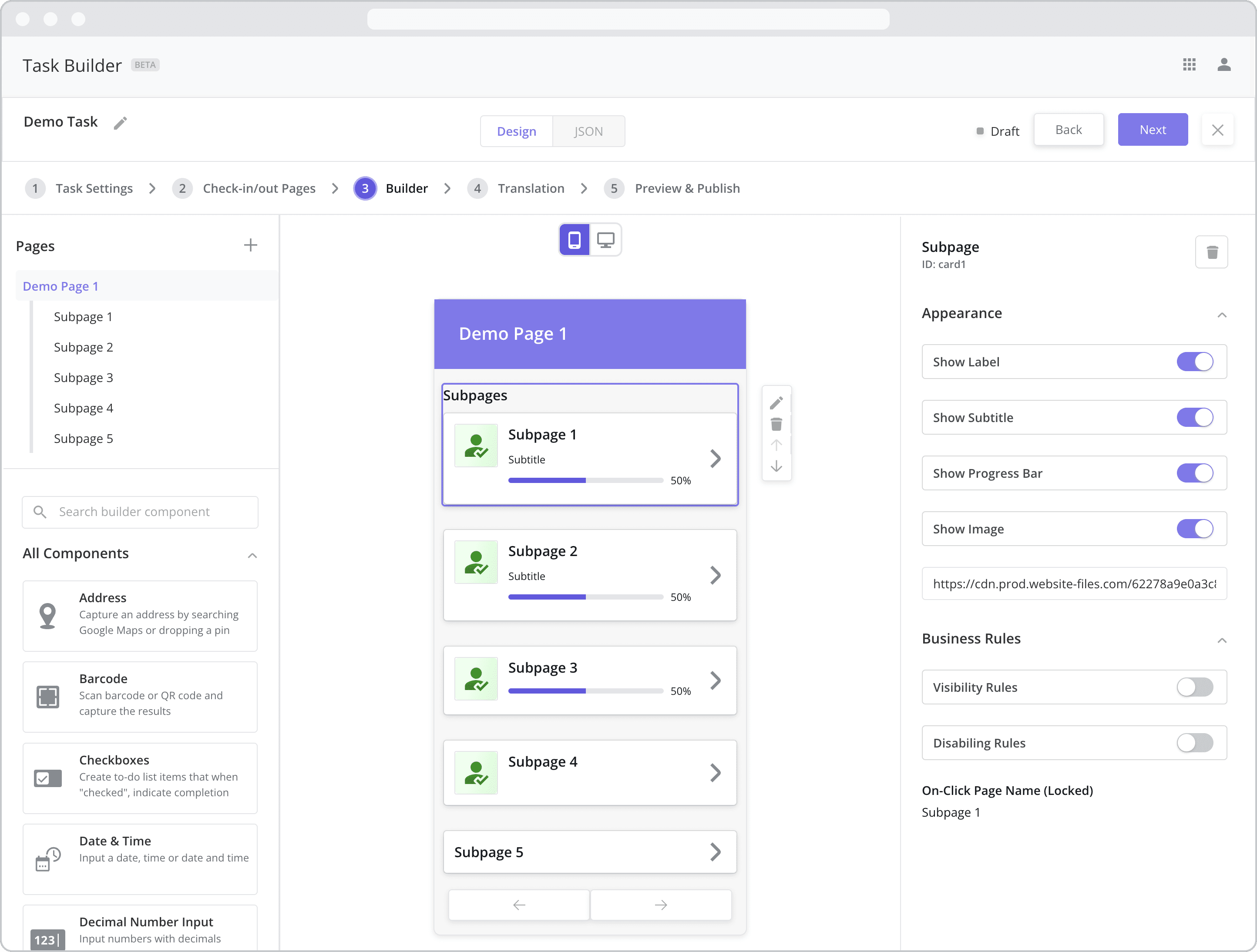
The example above shows all variations of a Subpages appearance. At the top, all appearance settings are enabled. With each subsequent subpage, an additional appearance setting is disabled in the order in which they appear in the configuration panel.
Show Label: Enable this toggle to show a label above the component. Disabling the toggle will remove the label. In the example above, the first subpage’s label is enabled and written as “Subpages”. To edit a label, simply double-click the label from the Mobile Canvas to bring up the in-line text editor.
Title / Page Name: The first text field in bold within the component is the Title or Page Name. It is displayed on both the component as above and on the page associated with the component (as the page name). In the first subpage component in the example above, the title is written as “Subpage 1”. To edit the text, simply double-click the title from the Canvas to bring up the in-line text editor. Alternatively, you can navigate to the subpage from the page panel and edit the page name. Changing it in either place will change it in both places.
Show Subtitle: Enable this toggle to show the subtitle – the next level of smaller, grey text within the component. Disabling the toggle will remove the subtitle. In the example above, “Subpage 1” and “Subpage 2” have subtitles enabled, while “Subpage 3”, “Subpage 4”, and “Subpage 5” have subtitles disabled. To edit the subtitle, simply double-click the text from the Canvas to bring up the in-line text editor. Subtitles are often used to provide a more detailed description of the contents of the subpage.
Show Progress Bar: Progress bars help mobile users track the level of completeness of the associated subpage and are calculated as follows: Progress (%) = Number of completed components in the subpage / Total number of components in the subpage. Enable this toggle to show the progress bar. Disabling the toggle will remove the progress bar.
Show Image: Enable this toggle to add an image to the component. Disabling the toggle will remove the image. Images are often used as visual cues to indicate the contents of the subpage.
Adding an Image: To add an image, enter the URL associated with the image. For example, if you have images stored in dropbox, you can add the dropbox URL of the image here. Doing so will load the image into the component using the URL.
Business Rules
Business Rules | Visibility-Rules Enable this toggle to set up Visibility Rules, which allow you to show or hide a component based on inputs captured from a component elsewhere in the task.
Business Rules | Disabling-Rules Enable this toggle to set up Disabling Rules, which allow you to disable a component based on inputs captured from a component elsewhere in the task.
On-Click Page Name (Locked): This setting displays the page name used in the JSON code to point to the subpage. It is for reference only and applicable to advanced users/developers.
Example Mobile Flow
The example below shows the mobile workflow associated with the dynamic pages as built from the screenshot above.
NOTE: Tapping the “x” button or “Save Changes” button from a dynamic subpage brings you back to the main page containing the Subpage component – in this case, Dynamic Page 1.

Web Configuration
To configure the web component, first make sure the “Web” icon is selected from the UI toggle at the top, and then drag the component from the Component List to the Canvas to add it to your page. Next, open the Configuration Panel by either double-clicking the component or selecting it and clicking the “Edit” button that appears upon selection. The section below explains the configuration settings associated with the component.

Settings
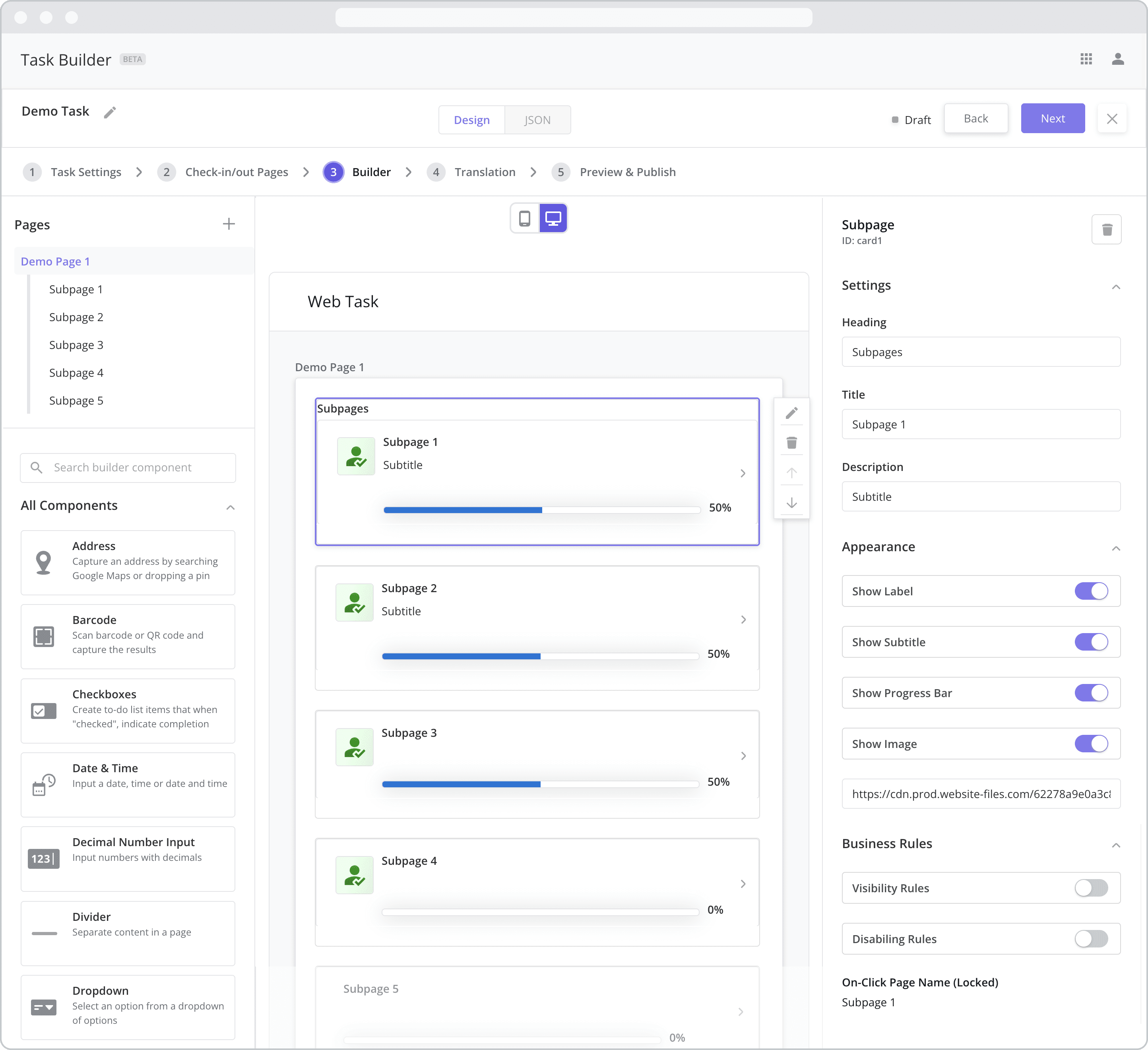
Heading: The label is the bold text that appears above the component, which can be used to help end-users understand the purpose of the component. With “Web” components, users enter the label text from the Configuration Panel within this input field, which becomes visible when the “Show Label” toggle is turned on. In the example above, the label is enabled and written as “Subpages”.
Title / Page Name: The first text field in bold within the component is the Title or Page Name. It is displayed on both the component per the screenshot and on the page associated with the component (as the page name). In the first subpage component in the example above, the title is written as “Subpage 1”. To edit the text, click on the “Title” input field from the Configuration Panel. Alternatively, you can navigate to the subpage from the page panel and edit the page name. Changing it in either place will change it in both places.
Description (Subtitle): This represents the Subtitle of the component which is the grey text just below the Title. This is often used to provide additional direction for the user. In the example above, the description/subtitle is written as “Subtitle” on the screen for Subpage 1 and Subpage 2.
Appearance
The example above shows all variations of a Subpages appearance. At the top, all appearance settings are enabled. With each subsequent subpage, an additional appearance setting is disabled in the order in which they appear in the configuration panel.
Show Label: Enable this toggle to show a label above the component. Disabling the toggle will remove the label. In the example above, the label is enabled and written as “Subpages” for the Subpage 1 component. To edit a label, enter the text in the “Heading” field.
Show Subtitle: Enable this toggle to show the subtitle – the next level of smaller, grey text within the component. Disabling the toggle will remove the subtitle. In the example above, “Subpage 1” and “Subpage 2” have subtitles enabled, while “Subpage 3”, “Subpage 4”, and “Subpage 5” have subtitles disabled. To edit a subtitle, enter the text in the “Description” field. Subtitles are often used to provide a more detailed description of the contents of the subpage.
Show Progress Bar: Progress bars help mobile users track the level of completeness of the associated subpage and are calculated as follows: Progress (%) = Number of completed components in the subpage / Total number of components in the subpage. Enable this toggle to show the progress bar. Disabling the toggle will remove the progress bar.
Show Image: Enable this toggle to add an image to the component. Disabling the toggle will remove the image. Images are often used as visual cues to indicate the contents of the subpage.
Adding an Image: To add an image, enter the URL associated with the image. For example, if you have images stored in dropbox, you can add the dropbox URL of the image here. Doing so will load the image into the component using the URL.
Business Rules
Business Rules | Visibility-Rules Enable this toggle to set up Visibility Rules, which allow you to show or hide a component based on inputs captured from a component elsewhere in the task.
Business Rules | Disabling-Rules Enable this toggle to set up Disabling Rules, which allow you to disable a component based on inputs captured from a component elsewhere in the task.
On-Click Page Name (Locked): This setting displays the page name used in the JSON code to point to the subpage. It is for reference only and applicable to advanced users/developers.
Example Web Flow
The example below shows the web pages associated with the dynamic pages as built from the screenshot above.
NOTE: Tapping the “Back” arrow or “Save” button from a dynamic subpage brings you back to the main page containing the Subpage component – in this case, Dynamic Page 1.

