Date & Time
UPDATED (25.6)
This component captures the date and/or time. Tapping on it brings up a calendar and a clock popup. The time displayed to the user will be in the corresponding timezone and locale of the user's device.
Mobile Configuration
To configure the mobile component, first make sure the “Mobile” icon is selected from the UI toggle at the top, and then drag the component from the Component List to the Canvas to add it to your page. Next, open the Configuration Panel by either double-clicking the component or selecting it and clicking the “Edit” button that appears upon selection. The section below explains the configuration settings associated with the component.
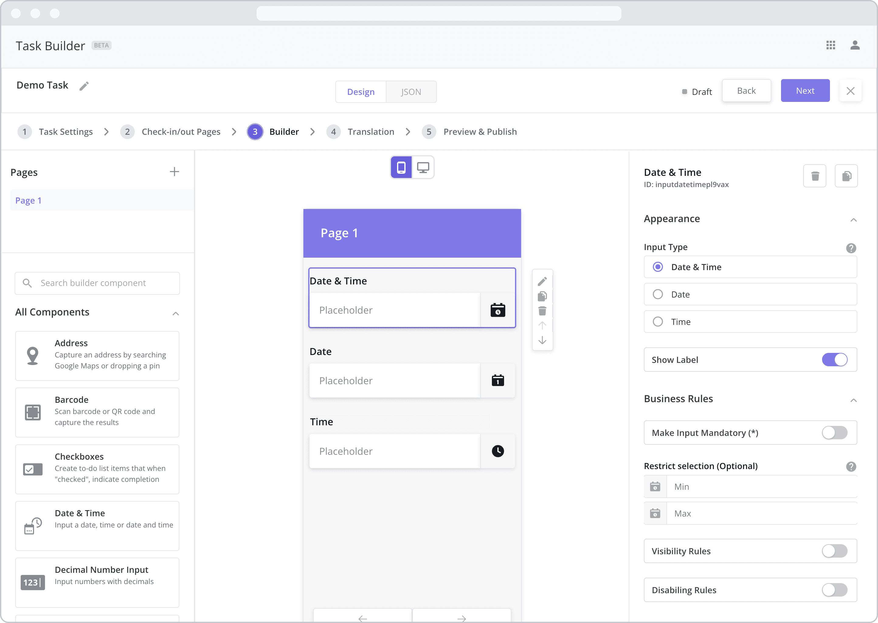
Appearance
Input Type: This setting dictates the type of input required by the mobile user when interacting with the component. Select from the following options:
Date & Time: If selected, the mobile user will be asked to select both a date AND a time from the popup box that appears after tapping the field.
Date: If selected, the mobile user will be asked to select a date from the popup box that appears after tapping the field.
Time: If selected, the mobile user will be asked to select a time from the popup box that appears after tapping the field.
Show Label: Enable this toggle to show a label above the component. Disabling the toggle will remove the label. In the example above, the labels for all three components are enabled and written according to the Input Type (“Date & Time”, “Date” and “Time”). To edit a label, simply double-click the label from the Canvas to bring up the in-line text editor.
Web Configuration
To configure the web component, first make sure the “Web” icon is selected from the UI toggle at the top, and then drag the component from the Component List to the Canvas to add it to your page. Next, open the Configuration Panel by either double-clicking the component or selecting it and clicking the “Edit” button that appears upon selection. The section below explains the configuration settings associated with the component.
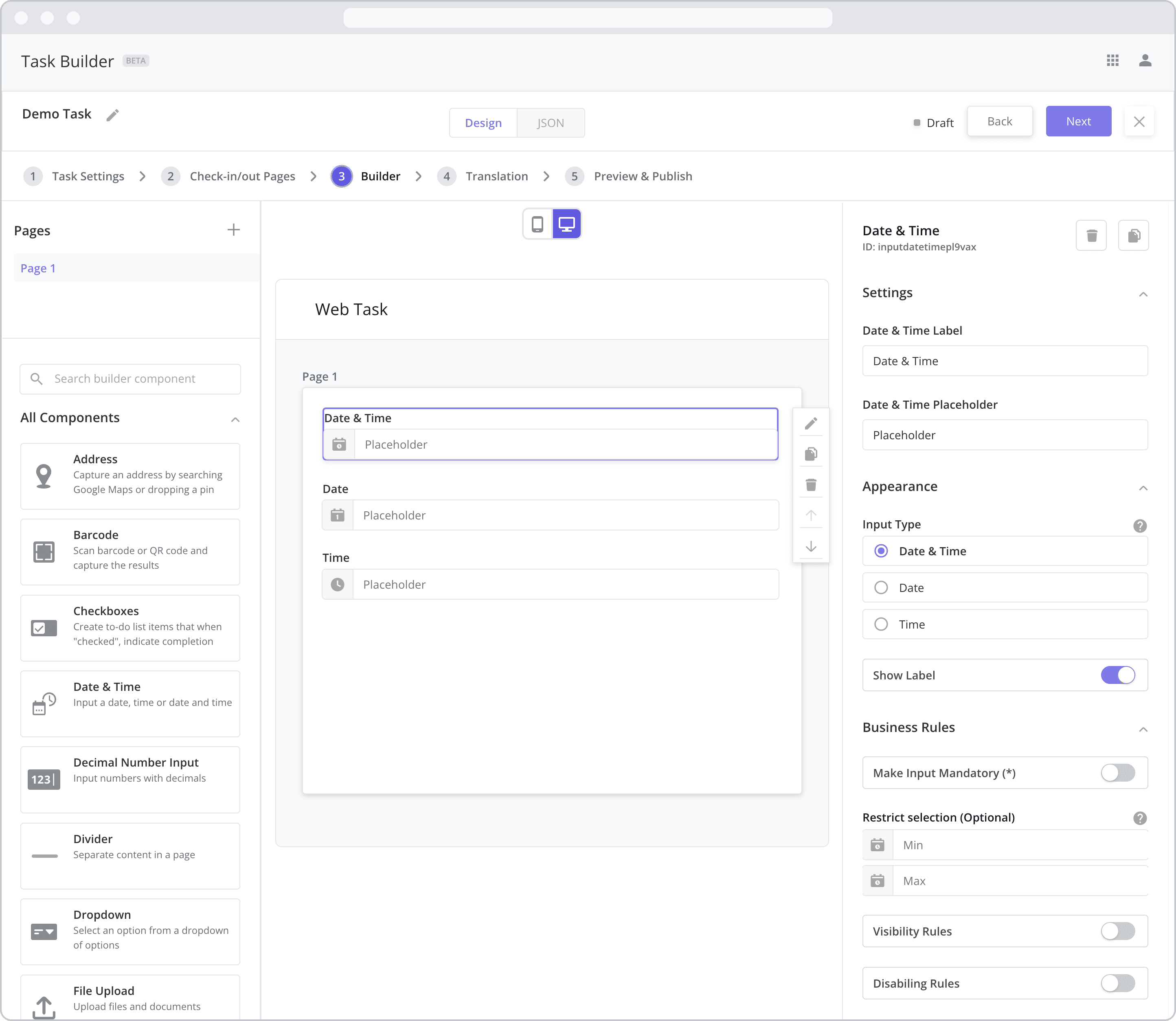
Settings
Label: The label is the bold text that appears above the component, which can be used to help end-users understand the purpose of the component. With “Web” components, users enter the label text from the Configuration Panel within this input field, which becomes visible when the “Label” toggle is turned on. In the example above, the labels for all three components are enabled and written according to the Input Type (“Date & Time”, “Date” and “Time”).
Placeholder: The grey placeholder text that appears within the input box before a user has filled in the field. This is often used to provide additional direction for the user filling out the form. In the example above, the placeholder is written as “Placeholder”.
Appearance
Input Type: This setting dictates the type of input required by the user when interacting with the component. Select from the following options:
Date & Time: If selected, the user will be asked to select both a date AND a time from the popup box that appears after tapping the field.
Date: If selected, the user will be asked to select a date from the popup box that appears after tapping the field.
Time: If selected, the user will be asked to select a time from the popup box that appears after tapping the field.
Show Label: Enable this toggle to show a label above the component. Disabling the toggle will remove the label. In the example above, the labels for all three components are enabled and written according to the Input Type (“Date & Time”, “Date” and “Time”). To edit a label, enter the text in the “Label” field.
Business Rules
Business Rules | Make-Input-Mandatory Enable this toggle if you wish to make it mandatory for mobile users to fill in this field before navigating to the next page of the task.
Restrict selection (Optional): You have the options of restricting the user’s date / time selection to a minimum (Min) and maximum (Max) date/time.
Min: Select a minimum date/time. For example, If I don’t want the mobile user to select a date/time before a certain date, enter that date here. If the mobile user tries to enter a date occurring before the Min, an error message will appear below the field.
Max: Select a maximum date/time. For example, If I don’t want the mobile user to select a date/time after a certain date, enter that date here. If the mobile user tries to enter a date occurring after the Max, an error message will appear below the field.
Business Rules | Visibility-Rules Enable this toggle to set up Visibility Rules, which allow you to show or hide a component based on inputs captured from a component elsewhere in the task.
Business Rules | Disabling-Rules Enable this toggle to set up Disabling Rules, which allow you to disable a component based on inputs captured from a component elsewhere in the task.