Checkboxes
UPDATED (25.6)
Use this component to select multiple answers from a list of answer choices.
Mobile Configuration
To configure the mobile component, first make sure the “Mobile” icon is selected from the UI toggle at the top, and then drag the component from the Component List to the Canvas to add it to your page. Next, open the Configuration Panel by either double-clicking the component or selecting it and clicking the “Edit” button that appears upon selection. The section below explains the configuration settings associated with the component.
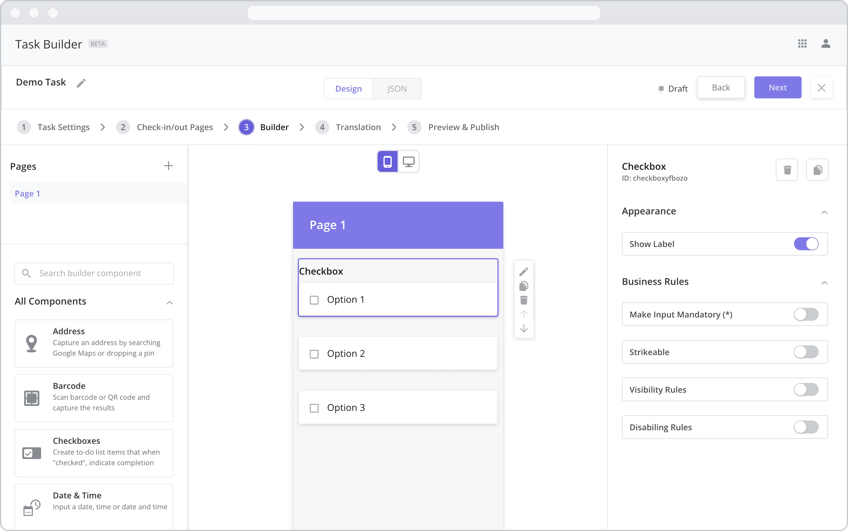
Appearance
Show Label: Enable this toggle to show a label above the component. Disabling the toggle will remove the label. In the example above, the first component has an enabled label and written as “Checkbox”. The next two components have their label disabled. To edit a label, simply double-click the label from the Canvas to bring up the in-line text editor.
Web Configuration
To configure the web component, first make sure the “Web” icon is selected from the UI toggle at the top, and then drag the component from the Component List to the Canvas to add it to your page. Next, open the Configuration Panel by either double-clicking the component or selecting it and clicking the “Edit” button that appears upon selection. The section below explains the configuration settings associated with the component.
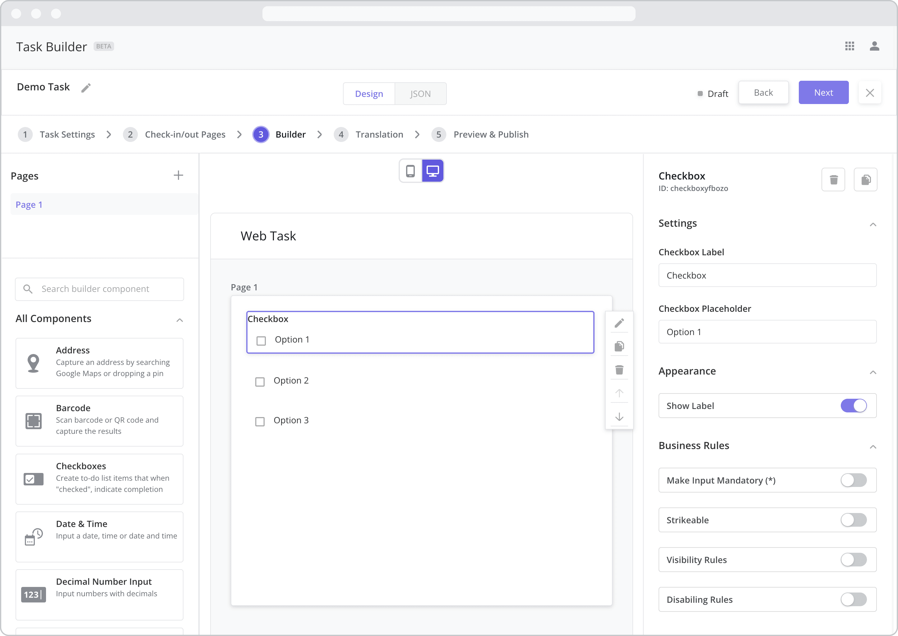
Settings
Label (“Checkbox Label”): The label is the bold text that appears above the component, which can be used to help end-users understand the purpose of the component. With “Web” components, users enter the label text from the Configuration Panel within this input field, which becomes visible when the “Show Label” toggle is turned on. In the example above, the label is enabled and written as “Checkbox”.
Checkbox Placeholder: Enter the text contents of the checkbox here. In the example above, the placeholder is written as “Option 1”.
Appearance
Show Label: Enable this toggle to show a label above the component. Disabling the toggle will remove the label. In the example above, the label is enabled and written as “Checkbox”. To edit a label, enter the text in the “Label” field.
Business Rules
Business Rules | Make-Input-Mandatory Enable this toggle if you wish to make it mandatory for mobile users to fill in this field before navigating to the next page of the task.
Strikeable: When enabled, checking the box will apply a strikethrough to the checkbox text, visually indicating that the item has been completed.
Business Rules | Visibility-Rules Enable this toggle to set up Visibility Rules, which allow you to show or hide a component based on inputs captured from a component elsewhere in the task.
Business Rules | Disabling-Rules Enable this toggle to set up Disabling Rules, which allow you to disable a component based on inputs captured from a component elsewhere in the task.