Decimal Input Number
NEW (25.6)
Use this component to capture a number as input. The user has the option of requiring a certain number of decimal places and defining a minimum/maximum value for the input.
Mobile Configuration
To configure the mobile component, first make sure the “Mobile” icon is selected from the UI toggle at the top, and then drag the component from the Component List to the Canvas to add it to your page. Next, open the Configuration Panel by either double-clicking the component or selecting it and clicking the “Edit” button that appears upon selection. The section below explains the configuration settings associated with the component.

Appearance
Show Label: Enable this toggle to show a label above the component. Disabling the toggle will remove the label. In the example above, the label is enabled and written as “Decimal Number Input”. To edit a label, simply double-click the label from the Canvas to bring up the in-line text editor.
Number of Decimals increment: Allows the user to define how many decimal points to capture. For example, if you select 2, then the user would enter a number such as “3.25” with 2 decimal places.
Placeholder (hidden): For mobile components, please note that the grey placeholder text that appears within the input box before a user has filled in the field is auto-generated and can not be changed via regular in-line editing. The automatically generated text shows a number with the same number of decimal points as entered in the “Number of Decimals increment” field. In the example above, the placeholder is written as “1”, which is a number with “0” decimal points. If the “Number of Decimals increment” field were to be equal to “2”, the placeholder text would change to “0.01” and so forth.
Add Limit: If enabled, the user can define a Minimum Limit and a Maximum Limit for the number the user enters. If the number entered falls outside of the defined limits, an error message will appear below the component.
Web Configuration
To configure the web component, first make sure the “Web” icon is selected from the UI toggle at the top, and then drag the component from the Component List to the Canvas to add it to your page. Next, open the Configuration Panel by either double-clicking the component or selecting it and clicking the “Edit” button that appears upon selection. The section below explains the configuration settings associated with the component.
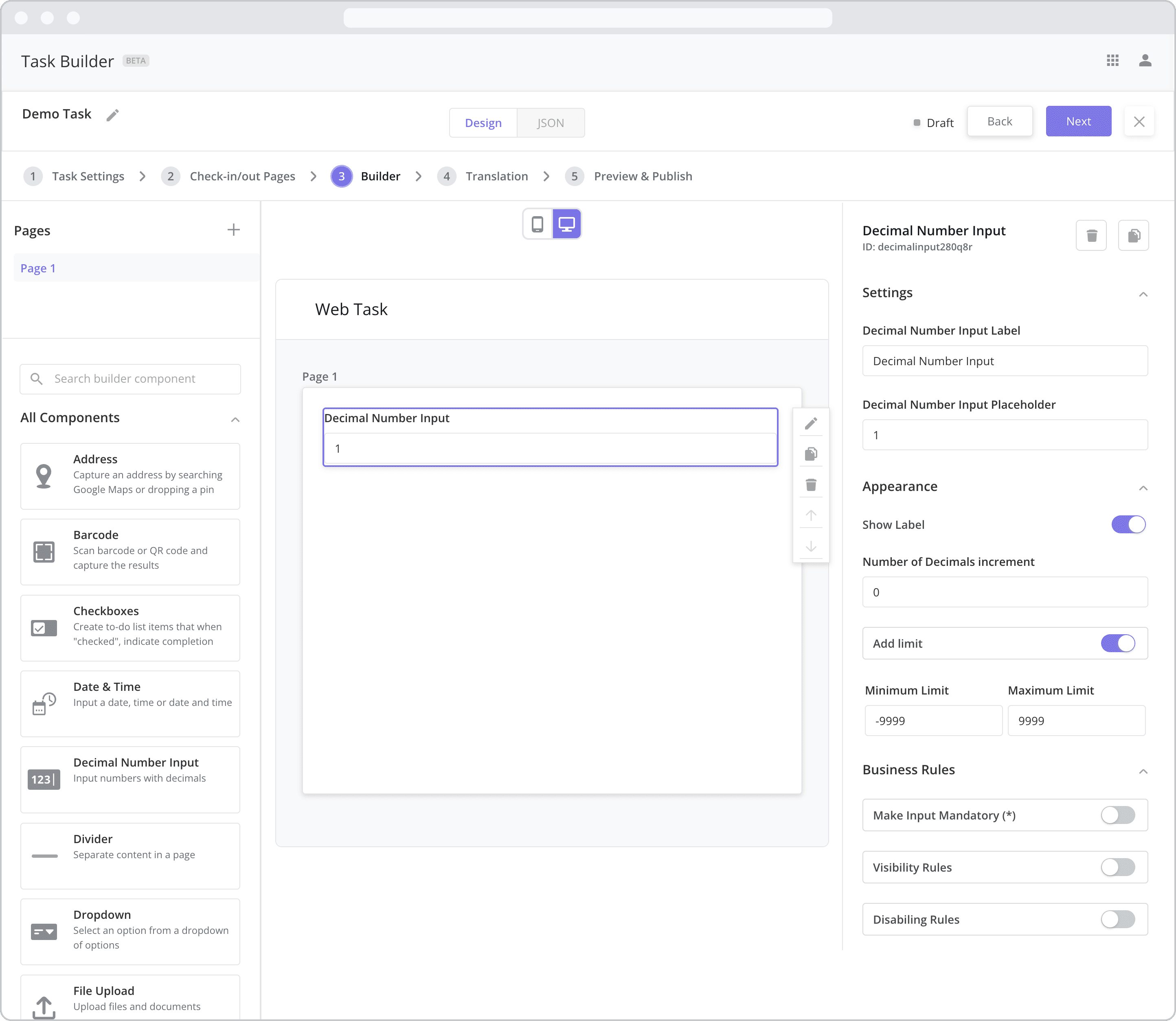
Settings
Label (“Decimal Number Input Label”): The label is the bold text that appears above the component, which can be used to help end-users understand the purpose of the component. With “Web” components, users enter the label text from the Configuration Panel within this input field, which becomes visible when the “Show Label” toggle is turned on. In the example above, the label is enabled and written as “Decimal Number Input”.
Placeholder (“Decimal Number Input Placeholder”): The grey placeholder text that appears within the input box before a user has filled in the field. This is often used to provide additional direction for the user filling out the form. In this case, the placeholder text is automatically generated to show a number with the same number of decimal points as entered in the “Number of Decimals increment” field below. In the example above, the placeholder is written as “1”, which is a number with “0” decimal points. If the “Number of Decimals increment” field were to be equal to “2”, the placeholder text would change to “0.01” and so forth. Please note that you always have the option to override the auto-generated text by editing it from this field.
Appearance
Show Label: Enable this toggle to show a label above the component. Disabling the toggle will remove the label. In the example above, the label is enabled and written as “Decimal Number Input”. To edit a label, enter the text in the “Label” field.
Number of Decimals increment: Allows the user to define how many decimal points to capture. For example, if you select 2, then the user would enter a number such as “3.25” with 2 decimal places.
Add Limit: If enabled, the user can define a Minimum Limit and a Maximum Limit for the number the user enters. If the number entered falls outside of the defined limits, an error message will appear below the component.
Business Rules
Business Rules | Make-Input-Mandatory Enable this toggle if you wish to make it mandatory for mobile users to fill in this field before navigating to the next page of the task.
Business Rules | Visibility-Rules Enable this toggle to set up Visibility Rules, which allow you to show or hide a component based on inputs captured from a component elsewhere in the task.
Business Rules | Disabling-Rules Enable this toggle to set up Disabling Rules, which allow you to disable a component based on inputs captured from a component elsewhere in the task.