File Upload
NEW (25.6)
Use this component to upload files and other documents.
Upload Size Limit: Please note that the file being uploaded can NOT exceed 1 MB in size
File Type Restrictions: Please note that at the moment, the only file type that can be uploaded from a Web Tasks is a PDF. Mobile Tasks allow users to upload any file type.
Mobile Configuration
To configure the mobile component, first make sure the “Mobile” icon is selected from the UI toggle at the top, and then drag the component from the Component List to the Canvas to add it to your page. Next, open the Configuration Panel by either double-clicking the component or selecting it and clicking the “Edit” button that appears upon selection. The section below explains the configuration settings associated with the component.
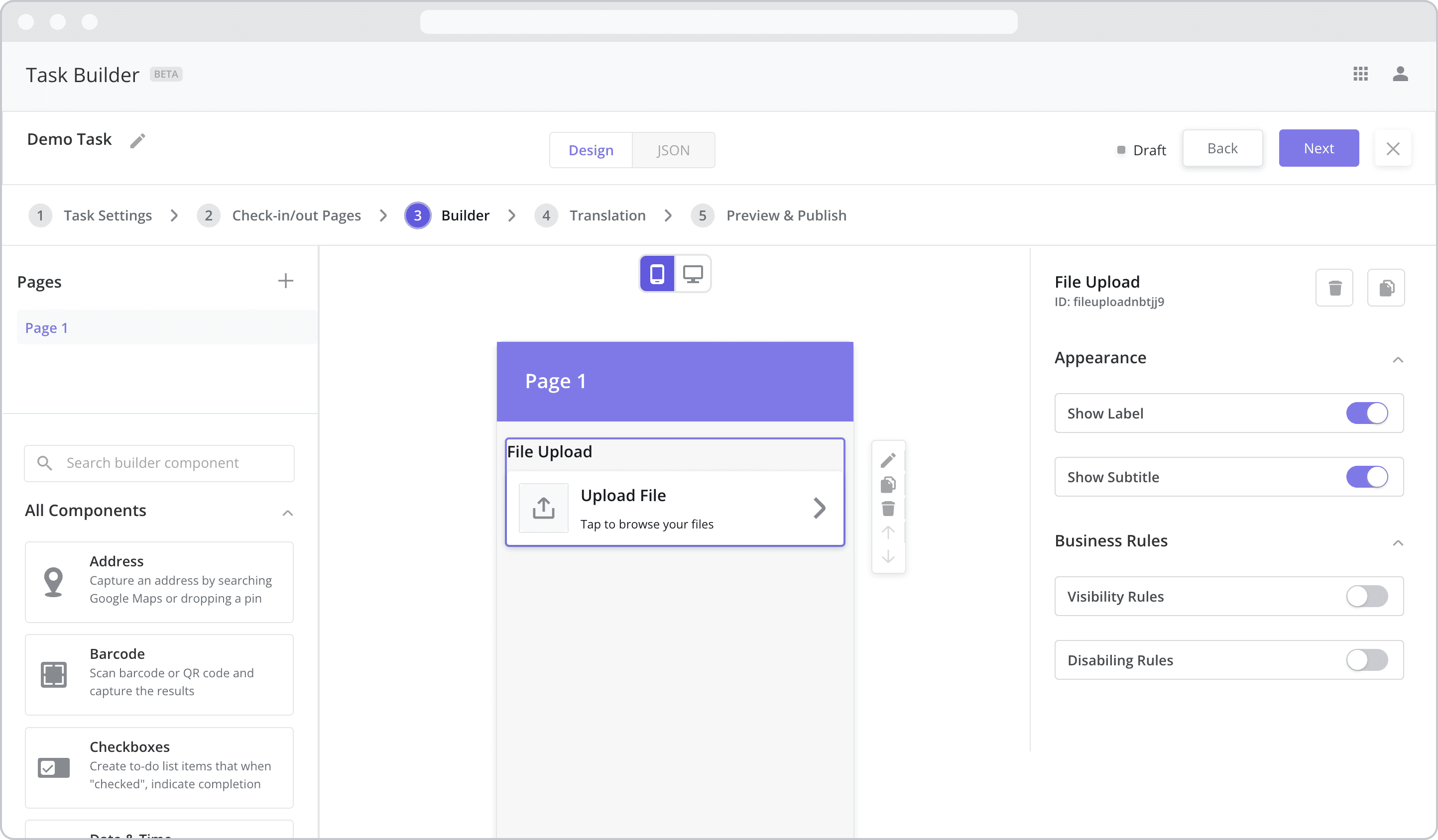
Appearance
Show Label: Enable this toggle to show a label above the component. Disabling the toggle will remove the label. In the example above, the label is enabled and written as “File Upload”. To edit a label, simply double-click the label from the Canvas to bring up the in-line text editor.
Show Subtitle: Subtitles are often used to provide a more detailed description of the contents of the subpage. Enable this toggle to show the subtitle – the next level of smaller, grey text within the component. Disabling the toggle will remove the subtitle. In the example above, “Tap to browse your files” represents the subtitle. To edit the subtitle, simply double-click the text from the Canvas to bring up the in-line text editor.
Web Configuration
To configure the web component, first make sure the “Web” icon is selected from the UI toggle at the top, and then drag the component from the Component List to the Canvas to add it to your page. Next, open the Configuration Panel by either double-clicking the component or selecting it and clicking the “Edit” button that appears upon selection. The section below explains the configuration settings associated with the component.
File Type Restrictions (PDF): Please note that at the moment, the only file type that can be uploaded via Web Tasks is a PDF. Mobile Tasks allow users to upload any file type.
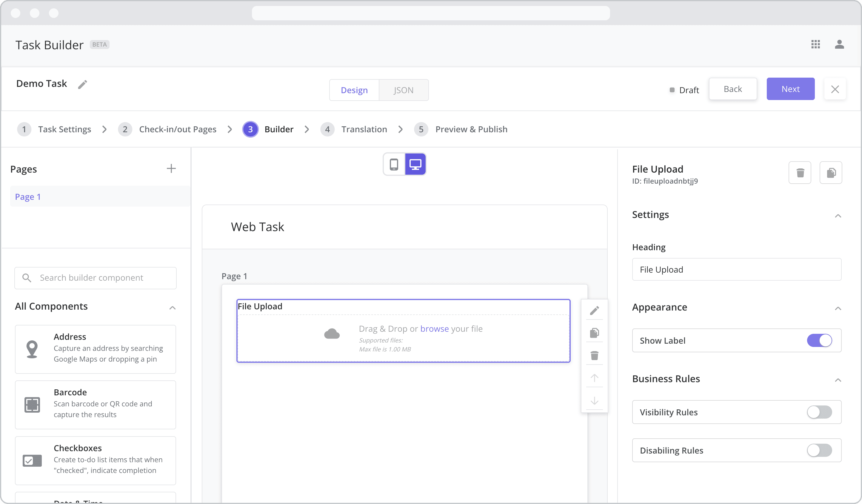
Settings
Heading: The label is the bold text that appears above the component, which can be used to help end-users understand the purpose of the component. With “Web” components, users enter the label text from the Configuration Panel within this input field, which becomes visible when the “Show Label” toggle is turned on. In the example above, the label is enabled and written as “File Upload”.
Appearance
Show Label: Enable this toggle to show a label (“Heading”) above the component. Disabling the toggle will remove the label. In the example above, the label is enabled and written as “File Upload”. To edit a label, enter the text in the “Heading” field.
Business Rules
Business Rules | Visibility-Rules Enable this toggle to set up Visibility Rules, which allow you to show or hide a component based on inputs captured from a component elsewhere in the task.
Business Rules | Disabling-Rules Enable this toggle to set up Disabling Rules, which allow you to disable a component based on inputs captured from a component elsewhere in the task.