Paragraph Text
NEW (25.6)
Use this component to display formatted, read-only text to the user. Typically used to provide instructions or guidance, this differs from the “Text Input” component, which captures text entered by the user.
Mobile Configuration
To configure the mobile component, first make sure the “Mobile” icon is selected from the UI toggle at the top, and then drag the component from the Component List to the Canvas to add it to your page. The content of the text is edited by double-clicking the text from the canvas and editing the text in-line. Next, open the Configuration Panel by either double-clicking the component or selecting it and clicking the “Edit” button that appears upon selection. The section below explains the configuration settings associated with the component.
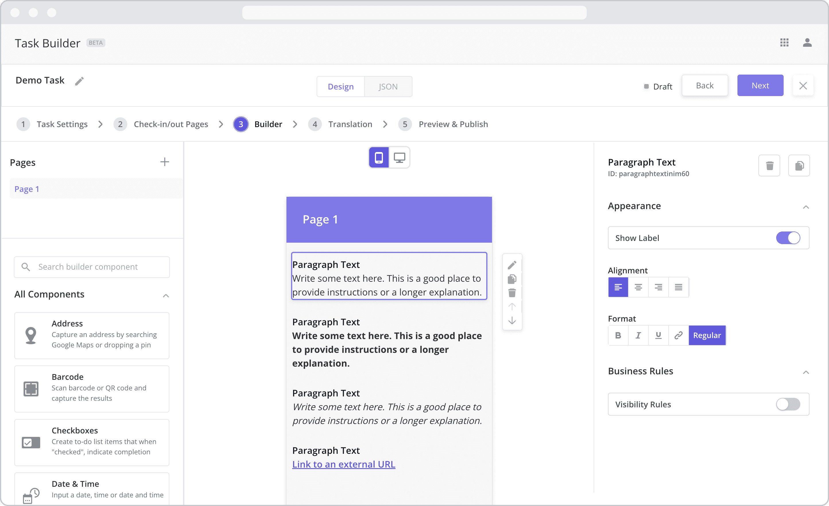
Appearance
Show Label: Enable this toggle to show a label above the component. Disabling the toggle will remove the label. In the example above, the label is enabled and written as “Text Input”. To edit a label, simply double-click the label from the Mobile Canvas to bring up the in-line text editor.
Alignment: Allows you to set the text alignment. Select from the following options: Left-align, Center-align, Right-align, Justified.
Format: Allows you to set the text format. Select from the following options: Regular (default), Bold, Italic, URL.
Enter ULR: If URL is selected, an input field will appear, allowing you to enter the URL that you wish the text to link to.
Web Configuration
To configure the web component, first make sure the “Web” icon is selected from the UI toggle at the top, and then drag the component from the Component List to the Canvas to add it to your page. Next, open the Configuration Panel by either double-clicking the component or selecting it and clicking the “Edit” button that appears upon selection. The section below explains the configuration settings associated with the component.
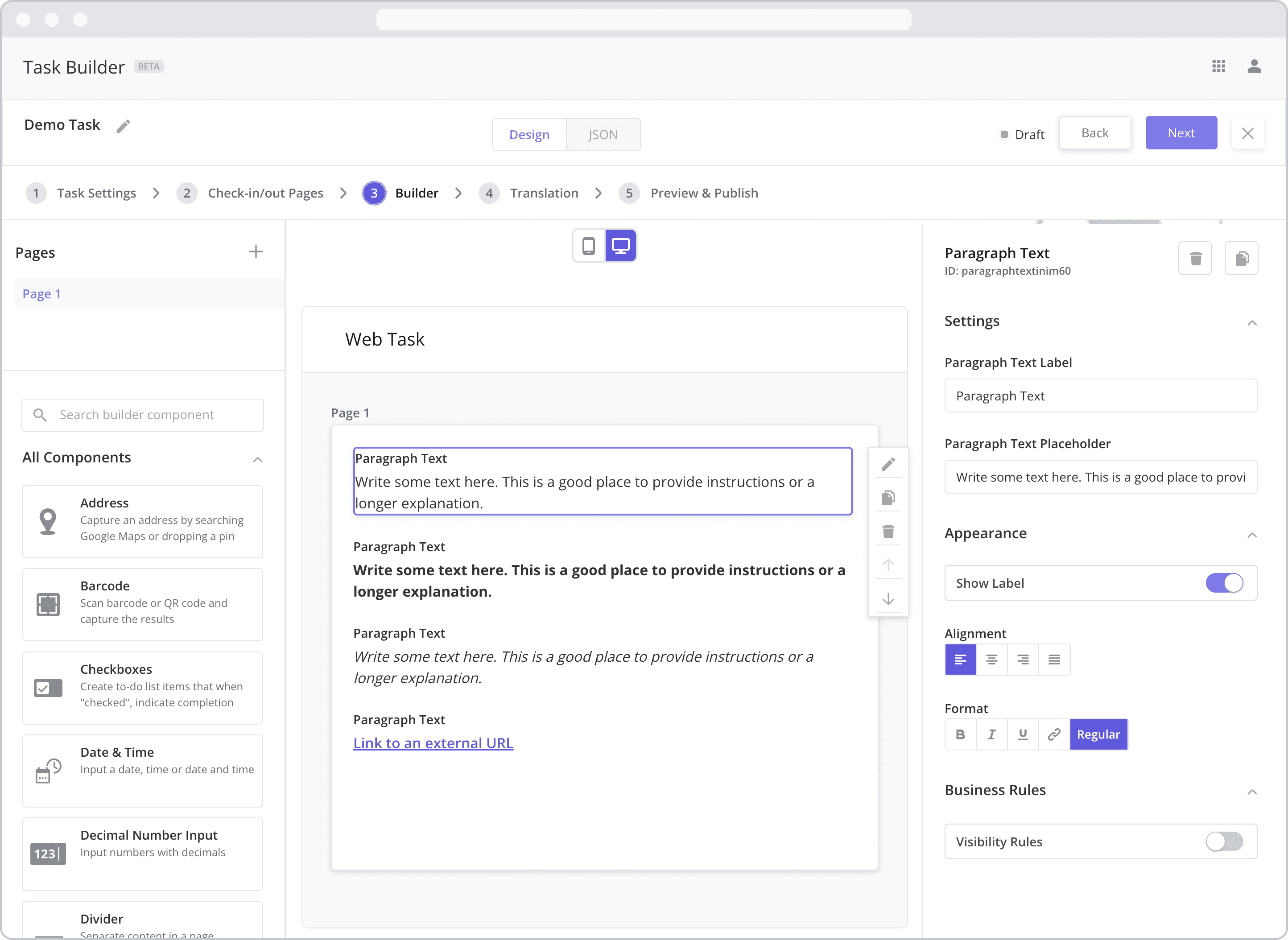
Settings
Label (“Paragraph Text Label”): The label is the bold text that appears above the component, which can be used to help end-users understand the purpose of the component. With “Web” components, users enter the label text from the Configuration Panel within this input field, which becomes visible when the “Show Label” toggle is turned on. In the example above, the label is enabled and written as “Paragraph Text”.
Paragraph Text Placeholder: Enter the text you wish the user to see here.
Appearance
Show Label: Enable this toggle to show a label above the component. Disabling the toggle will remove the label. In the example above, the label is enabled and written as “Text Input”. To edit a label, simply double-click the label from the Mobile Canvas to bring up the in-line text editor.
Alignment: Allows you to set the text alignment. Select from the following options: Left-align, Center-align, Right-align, Justified.
Format: Allows you to set the text format. Select from the following options: Regular (default), Bold, Italic, URL.
Enter ULR: If URL is selected, an input field will appear, allowing you to enter the URL that you wish the text to link to.
Business Rules
Business Rules | Visibility-Rules Enable this toggle to set up Visibility Rules, which allow you to show or hide a component based on inputs captured from a component elsewhere in the task.