Image
NEW (25.6)
Use this component to display a specific, read-only image to the user (configured by entering the URL of the image). Typically used to provide instructions or guidance, this differs from the “Photo” component, which asks the user to take a photo.
Mobile Configuration
To configure the mobile component, first make sure the “Mobile” icon is selected from the UI toggle at the top, and then drag the component from the Component List to the Canvas to add it to your page. Next, open the Configuration Panel by either double-clicking the component or selecting it and clicking the “Edit” button that appears upon selection. The section below explains the configuration settings associated with the component.

Appearance
Aspect Ratio Height: Controls the vertical proportions of the image by setting its height relative to its width. Use this setting to maintain consistent visual alignment across devices and prevent distortion when resizing the image. A common example is setting a square aspect ratio (1:1) or widescreen ratio (16:9) depending on the context in which the image appears.
Use a context field instead of image URL: Allows the user to display an image based on the inputs or context capture elsewhere in the task. For example, if the user has captured a photo elsewhere in the task, this setting can be used to display that photo here.
Please note that “Use a context field instead of image URL” is an advanced configuration and should only be selected by technical users who have prior experience with context variables.
Image URL: To add an image, enter the URL associated with the image. For example, if you have images stored in dropbox, you can add the dropbox URL of the image here. Doing so will load the image into the component using the URL.
Web Configuration
To configure the web component, first make sure the “Web” icon is selected from the UI toggle at the top, and then drag the component from the Component List to the Canvas to add it to your page. Next, open the Configuration Panel by either double-clicking the component or selecting it and clicking the “Edit” button that appears upon selection. The section below explains the configuration settings associated with the component.
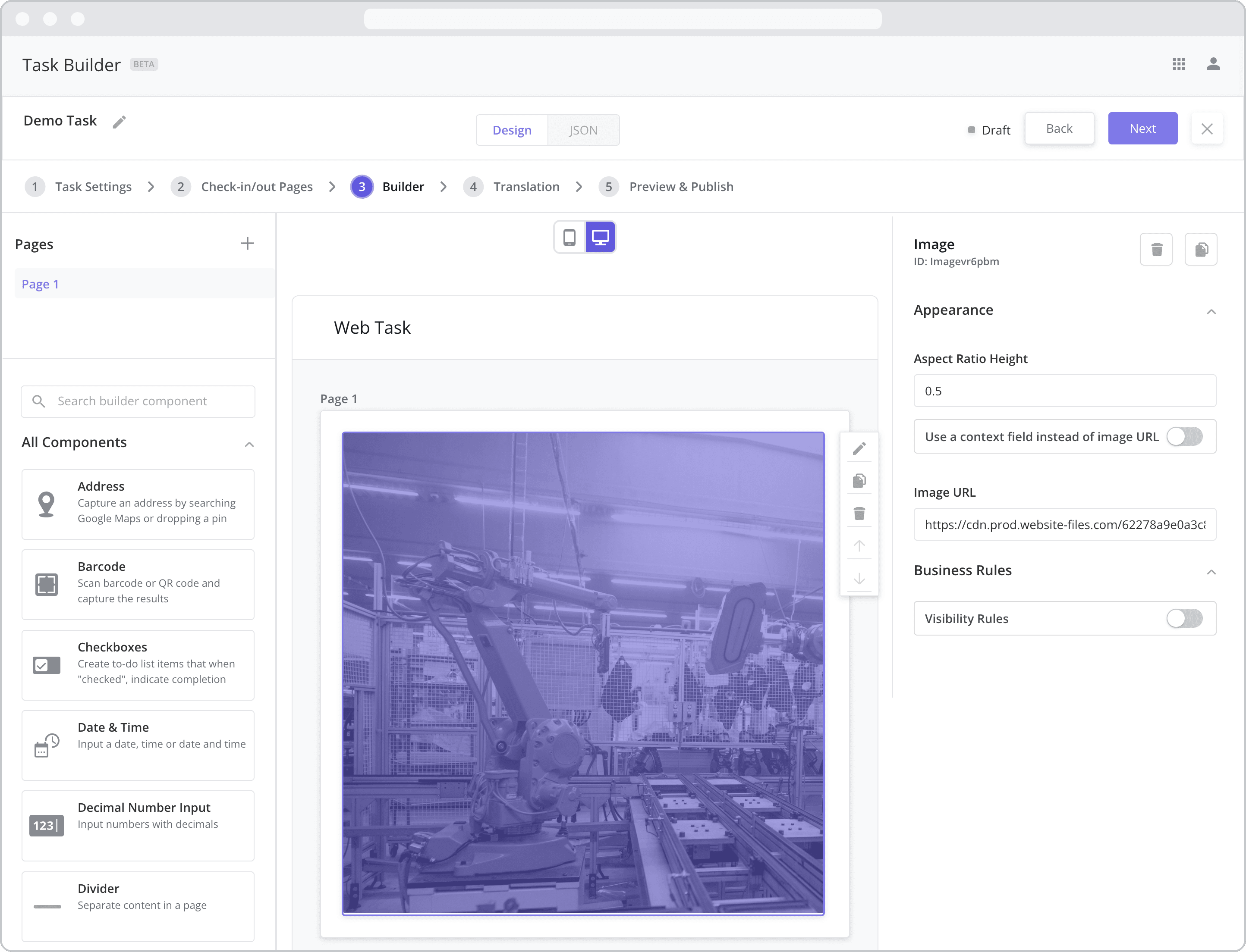
Appearance
Aspect Ratio Height: Controls the vertical proportions of the image by setting its height relative to its width. Use this setting to maintain consistent visual alignment across devices and prevent distortion when resizing the image. A common example is setting a square aspect ratio (1:1) or widescreen ratio (16:9) depending on the context in which the image appears.
Use a context field instead of image URL: Allows the user to display an image based on the inputs or context capture elsewhere in the task. For example, if the user has captured a photo elsewhere in the task, this setting can be used to display that photo here.
Please note that “Use a context field instead of image URL” is an advanced configuration and should only be selected by technical users who have prior experience with context variables.
Image URL: To add an image, enter the URL associated with the image. For example, if you have images stored in dropbox, you can add the dropbox URL of the image here. Doing so will load the image into the component using the URL.
Business Rules
Business Rules | Visibility-Rules Enable this toggle to set up Visibility Rules, which allow you to show or hide a component based on inputs captured from a component elsewhere in the task.