Photo
UPDATED (25.6)
Photo components are used to capture one or more photos from the user’s mobile camera or device gallery.
Mobile Configuration
To configure the mobile component, first make sure the “Mobile” icon is selected from the UI toggle at the top, and then drag the component from the Component List to the Canvas to add it to your page. Next, open the Configuration Panel by either double-clicking the component or selecting it and clicking the “Edit” button that appears upon selection. The section below explains the configuration settings associated with the component.
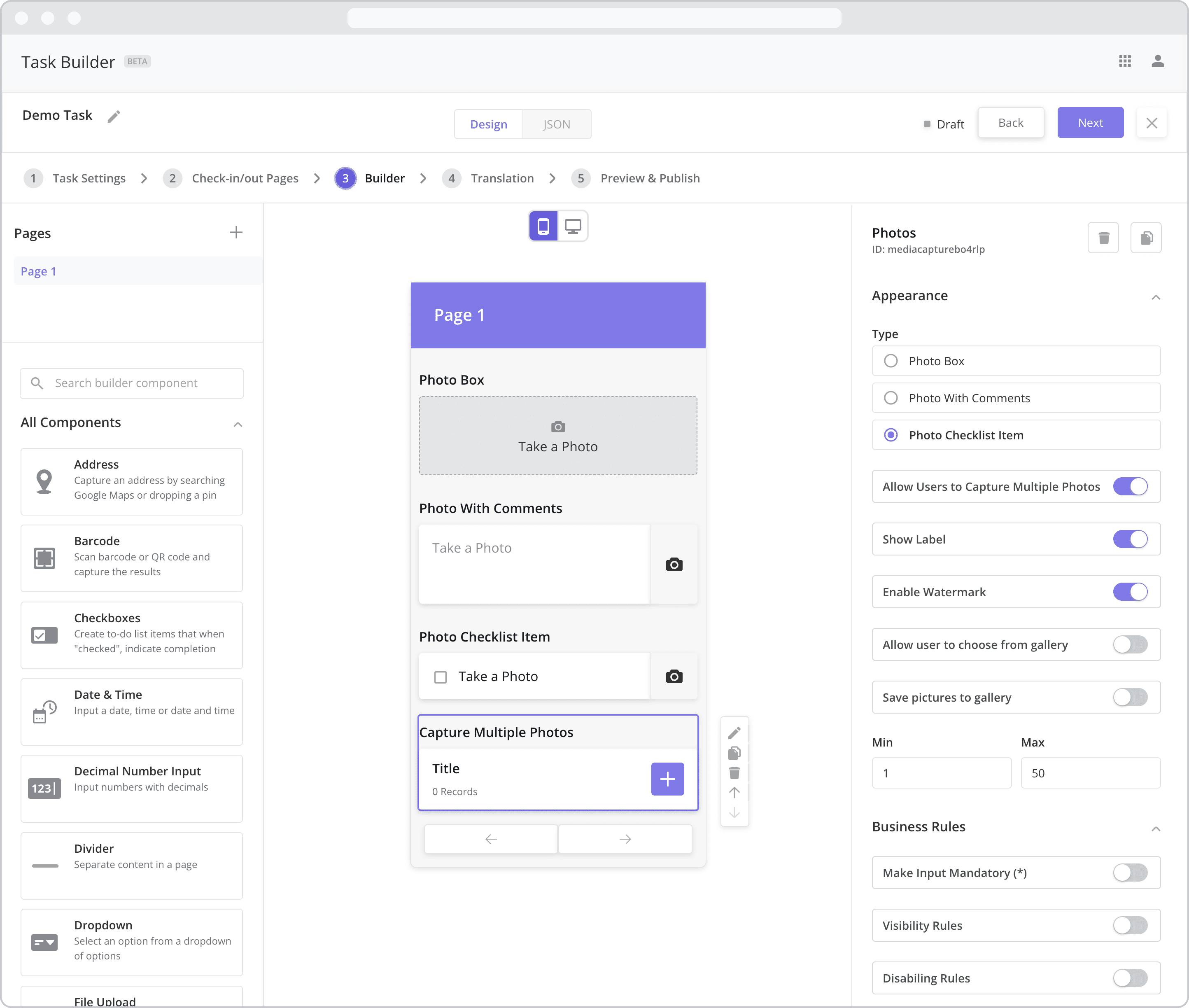
Appearance
Type: This setting dictates the type of input required by the mobile user when interacting with the component. Select from the following options:
Photo Box: If selected, the mobile user will be asked to take a photo after tapping the component. After the photo is taken/selected, the photo will appear within the photo box frame as a preview.
Photo with Comments: If selected, the mobile user will be asked to take a photo after tapping the component and will be given the option to include comments with the photo.
Photo Checklist Item: If selected, the mobile user will be asked to take a photo after tapping the checklist item. After the photo is taken/selected, the checklist item will be marked as complete. The functionality is the same as the Photo Box but takes up less vertical space on the user’s mobile screen.
Use a Photo Box when you only need to capture 1-2 photos and as it takes up more vertical space. Use a Photo Checklist Item when you need to capture many photos as it takes up less vertical space.
Allow Users to Capture Multiple Photos: If selected, the mobile user will be able to add as many photos as he or she likes. The photos are stored in a separate “Subpage” which can be accessed and updated by tapping the component. The type of photo component in the subpage adheres to the type selected above.
Min / Max: If “Allow Users to Capture Multiple Photos” is enabled, an additional setting appears allowing you to set a minimum and a maximum number of photos that can be added to the component.
Note that no more than 50 photos can be added to the component. This limit is in place to reduce the chance of the user’s mobile device running out of memory and crashing.
Show Label: Enable this toggle to show a label above the component. Disabling the toggle will remove the label. In the example above, the labels for all four components are enabled and written according to the Type (“Photo Box”, “Photo with Comments”, “Photo Checklist Item” and “Capture Multiple Photos”). To edit a label, simply double-click the label from the Canvas to bring up the in-line text editor.
Enable Watermark: If enabled (by default), a watermark is placed on the photo and visible to backoffice users reviewing the task results. Typically used for audit purposes, the watermark contains the following information by default:
Latitude and longitude of the location where the photo was captured
Mobile user’s name and user ID
Date and time the photo was captured
Allow user to choose from gallery: Determines whether or not the mobile user can select a photo from their device’s photo gallery as an input.
Enabled: If enabled, the mobile user will be permitted to use their device’s photo gallery to select the photo.
Disabled: If disabled (by default), the mobile user will NOT be permitted to use their device’s photo gallery to select the photo. Instead, the user will be required to take a photo using their device’s camera.
The “Allow user to choose from gallery” setting is typically disabled when you want to ensure that the technician takes the photo onsite.
Save pictures to gallery NEW (23.9): Determines whether or not the mobile user can save the photo to their device’s photo gallery for access later on.
Enabled: If enabled, the mobile user will be permitted to save the photo to their device’s photo gallery.
Disabled: If disabled, the mobile user will NOT be permitted to save the photo to their device’s photo gallery.
Web Configuration
To configure the web component, first make sure the “Web” icon is selected from the UI toggle at the top, and then drag the component from the Component List to the Canvas to add it to your page. Next, open the Configuration Panel by either double-clicking the component or selecting it and clicking the “Edit” button that appears upon selection. The section below explains the configuration settings associated with the component.
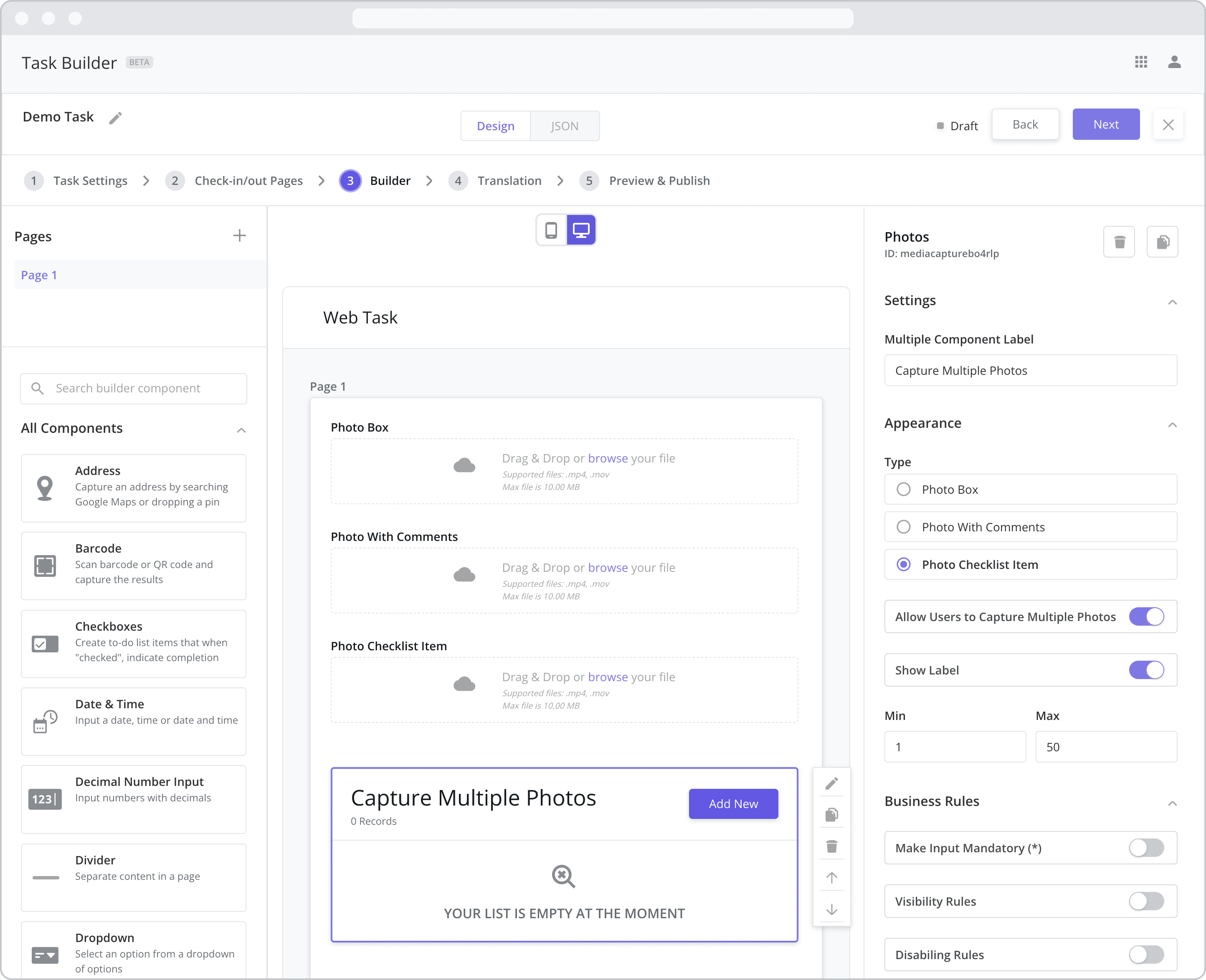
Settings
Label: The label is the bold text that appears above the component, which can be used to help end-users understand the purpose of the component. With “Web” components, users enter the label text from the Configuration Panel within this input field, which becomes visible when the “Show Label” toggle is turned on. In the example above, the labels for all four components are enabled and written according to the Type (“Photo Box”, “Photo with Comments”, “Photo Checklist Item” and “Capture Multiple Photos”).
Appearance
Type: This setting dictates the type of input required by the user when interacting with the component. Select from the following options:
Photo Box: If selected, the user will be asked to take a photo after tapping the component. After the photo is taken/selected, the photo will appear within the photo box frame as a preview.
Photo with Comments: If selected, the user will be asked to take a photo after tapping the component and will be given the option to include comments with the photo.
Photo Checklist Item: If selected, the user will be asked to take a photo after tapping the checklist item. After the photo is taken/selected, the checklist item will be marked as complete. The functionality is the same as the Photo Box but takes up less vertical space on the user’s mobile screen.
Use a Photo Box when you only need to capture 1-2 photos and as it takes up more vertical space. Use a Photo Checklist Item when you need to capture many photos as it takes up less vertical space.
Allow Users to Capture Multiple Photos: If selected, the user will be able to add as many photos as he or she likes. The photos are stored in a separate “Subpage” which can be accessed and updated by tapping the component. The type of photo component in the subpage adheres to the type selected above.
Show Label: Enable this toggle to show a label above the component. Disabling the toggle will remove the label. In the example above, the labels for all three components are enabled and written according to the Type (“Photo Box”, “Photo with Comments”, “Photo Checklist Item” and “Capture Multiple Photos”).
Min / Max: If “Allow Users to Capture Multiple Photos” is enabled, an additional setting appears allowing you to set a minimum and a maximum number of photos that can be added to the component.
Note that no more than 50 photos can be added to the component. This limit is in place to reduce the chance of the user’s mobile device running out of memory and crashing.
Business Rules
Business Rules | Make-Input-Mandatory Enable this toggle if you wish to make it mandatory for mobile users to fill in this field before navigating to the next page of the task.
Business Rules | Visibility-Rules Enable this toggle to set up Visibility Rules, which allow you to show or hide a component based on inputs captured from a component elsewhere in the task.
Business Rules | Disabling-Rules Enable this toggle to set up Disabling Rules, which allow you to disable a component based on inputs captured from a component elsewhere in the task.